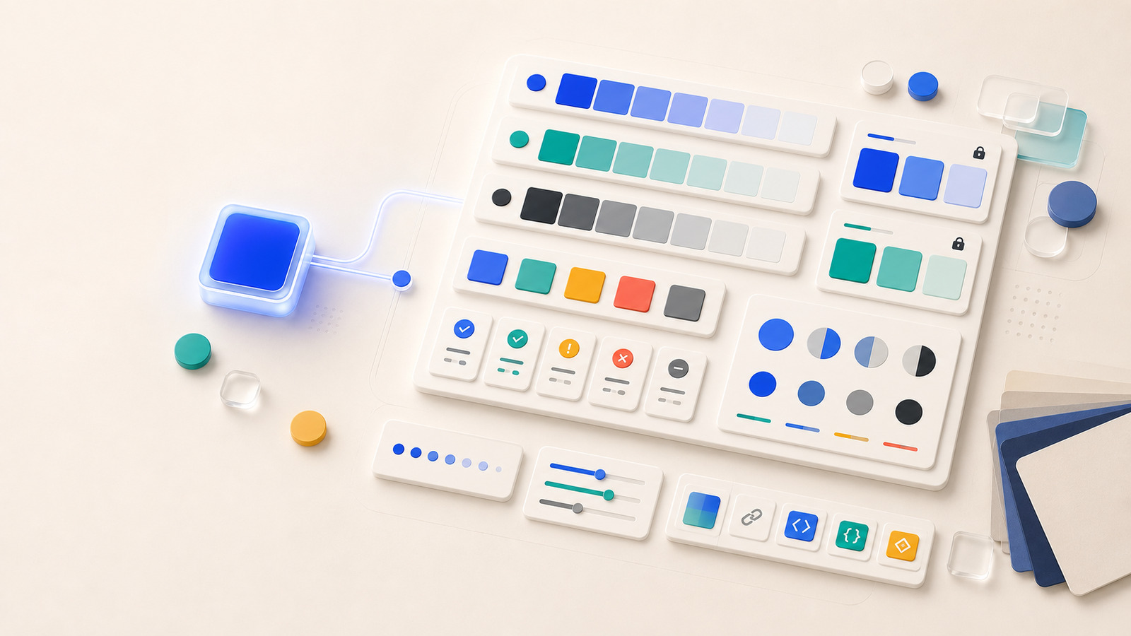
Quick answer
To build a color palette from one color, use the starting color as a seed, create lighter tints, darker shades, muted tones, and neutrals, then assign each candidate a role and test real foreground/background pairs. The useful output is not a row of related swatches; it is a palette that can support surfaces, text, actions, states, and documentation.
If you want to build a color palette from one color, do not stop at automatic harmony suggestions. One strong seed can become a useful design system only after you create supporting ranges, name the roles, and test the combinations people will actually read or use.
This tutorial uses a single blue seed, #2563EB, to show the workflow. The same process works for brand colors, campaign accents, product UI colors, and documentation palettes. The important move is to treat generated colors as candidates until they have a job.
Before You Start
- Choose one seed color in a stable format such as HEX, RGB, HSL, or OKLCH.
- Decide whether the palette is for a website, app UI, brand deck, chart, documentation page, or campaign asset.
- Write down the roles you need before generating extra colors.
- Plan to check contrast after roles are assigned; related colors are not automatically readable colors.
Step 1: Choose a Seed That Can Carry the Palette
Start with a color that represents the product or message well enough to anchor decisions. In the Hue Codex palette generator, paste the seed color, generate a first role-based palette, and look at the output as a draft: primary, secondary, accent, surface, text, border, success, warning, and danger are role suggestions that still need review.
A good seed does not need to do every job. It only needs to create a useful direction. A saturated blue may work well as a primary action, but it usually needs lighter surfaces, darker hover states, quieter borders, and a separate readable text color around it.
Step 2: Generate Ranges Before Roles
Use the tint, shade, and tone generator to create a working range from the seed. Tints can become surfaces and selected states. Shades can become hover, active, or emphasis colors. Tones and neutrals can calm the palette when the base color is too vivid for every supporting role.
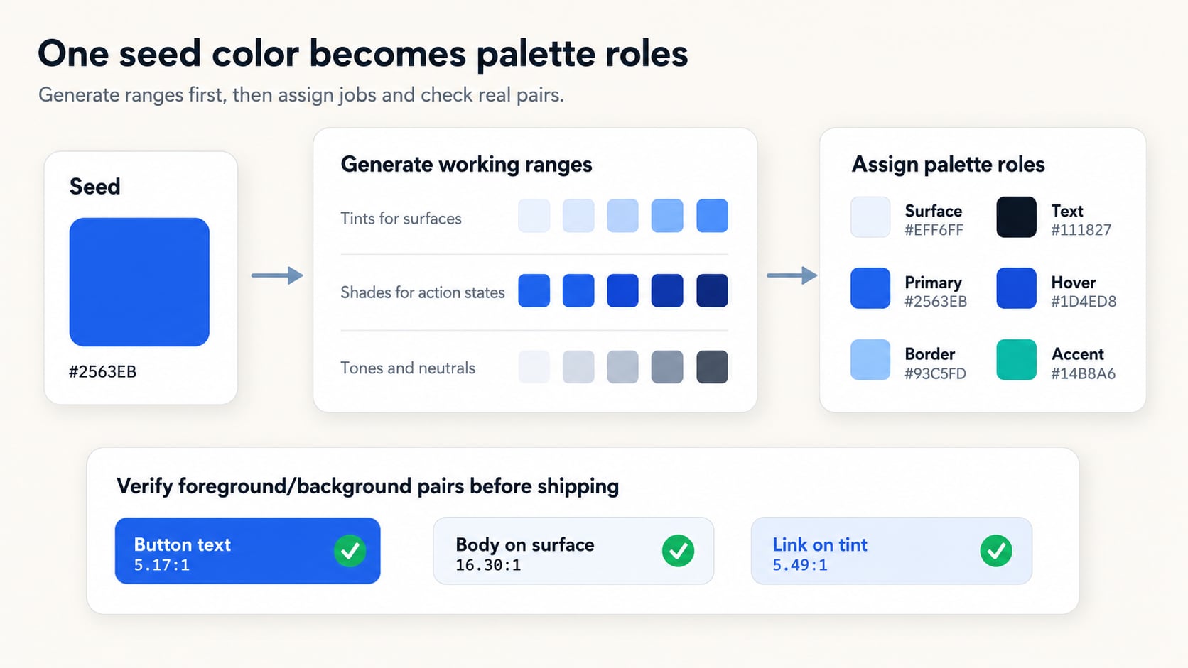
| Generated range | Useful candidates | What to check |
|---|---|---|
| Tints | Page surfaces, cards, selected rows, gentle badges | Make sure the tint is quiet enough behind text and controls. |
| Shades | Hover states, pressed states, high-emphasis buttons, dark accents | Check that label text still passes for the intended text size. |
| Tones | Borders, muted accents, disabled states, secondary UI | Avoid tones that become too low-contrast against nearby surfaces. |
| Neutrals | Body text, headings, dividers, subdued backgrounds | Keep neutrals independent enough that the palette does not become a single-color wash. |
Step 3: Assign Roles Before Export
A palette becomes easier to ship when each color has a job. Instead of exporting every interesting swatch, choose the smallest set that covers the interface or brand system. If a color cannot be named by role, keep it as exploration instead of production data.
| Role | Example value | Why it belongs |
|---|---|---|
| Primary action | #2563EB | Keeps the original seed visible in the most recognizable interactive role. |
| Hover action | #1D4ED8 | Uses a darker related shade so the state change feels connected. |
| Soft surface | #EFF6FF | Provides a light supporting background without using pure white for every surface. |
| Border or quiet accent | #93C5FD | Gives the system a related separator candidate that is not as loud as the seed. |
| Body text | #111827 | Uses a dark neutral because the seed itself is not always the best text color. |
Step 4: Check Actual Foreground and Background Pairs
WCAG 2.x contrast checks use ratios for actual foreground and background pairs. For Level AA, normal text needs at least 4.5:1 and large text needs at least 3:1. Use the Hue Codex contrast checker on the pairs you plan to ship, not just on the seed color by itself.
| Use | Foreground / background | Ratio | Result |
|---|---|---|---|
| Primary button label | #FFFFFF on #2563EB | 5.17:1 | Passes WCAG 2.x AA for normal text. |
| Body text on soft surface | #111827 on #EFF6FF | 16.30:1 | Comfortably clears the normal text threshold. |
| Link on blue tint | #1D4ED8 on #DBEAFE | 5.49:1 | Passes WCAG 2.x AA for normal text. |
A color is not accessible by itself. Only a specific foreground/background pair can pass or fail a specific contrast target.
Step 5: Use Hue Codex as a Review Loop
- Paste the seed color into the palette generator and create a role-based draft.
- Lock any role that already feels right, then regenerate or adjust the rest.
- Use tint, shade, and tone ranges to fill missing surfaces, borders, and states.
- Move important pairings into the contrast checker and record the ratio next to the role.
- Export or copy only the role values that pass review and can be explained in documentation.
Common Mistakes
- Using five related swatches as a palette without assigning roles.
- Making every supporting color a tint of the seed and ending up with weak hierarchy.
- Assuming a vivid seed color will also work as text, borders, status, and background.
- Testing contrast only on the primary button and skipping links, focus states, disabled states, and badges.
- Exporting a generated palette before removing duplicate or decorative swatches.
FAQ
Can one color really create a complete palette?
One color can create a strong starting palette, especially for UI surfaces, states, and brand accents. Most production systems still need neutrals, contrast checks, and sometimes separate semantic colors.
Should a one-color palette be monochromatic?
Not always. A monochromatic range is useful, but practical palettes often add neutrals and a small accent or status set so every role is not forced through one hue.
How many colors should I keep?
Keep the fewest colors that cover real roles. For many web or app palettes, five to nine documented role colors are more useful than a long strip of unnamed swatches.
When is the palette ready to export?
Export after the important roles are named, duplicate swatches are removed, and text, button, link, border, and status pairs have been checked in context.
Final Takeaway
The fastest useful way to build a color palette from one color is to move from seed to ranges, then from ranges to roles, then from roles to verified pairs. As a next step, run one seed through the palette generator, keep only the roles you can name, and check the three pairs most likely to carry text or interaction before exporting values.
Spot an issue or want a color topic covered?Send a correction or request a post.