Privacy choices

Hue Codex uses local settings and privacy-aware measurement.

Required storage keeps tools and your local workspace working. Analytics helps improve popular tools; stricter consent regions stay opt-in unless you allow it. Marketing and personalized ads stay off until you choose them.

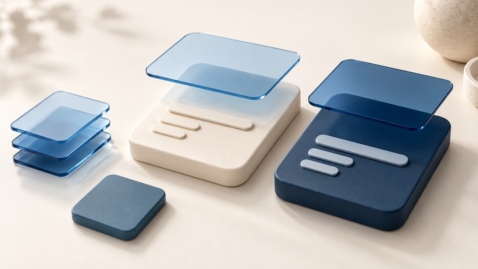
Translucent blue panels suspended above ivory and navy cards, with solid foreground bars and layered blue samples.

Hue Codex blog

Hue Codex Blog: practical color posts for designers and developers.

Browse the full Hue Codex blog archive for practical notes on color decisions, accessibility, tools, workflows, palettes, CSS, design systems, and the everyday details that make color easier to use.

13published posts
1current page
2total pages

Blog archive

Browse all Hue Codex blog posts.

Use this page to find focused color posts by date, title, and topic. For deeper background, follow the related Hue Codex guides and tools linked from each post.
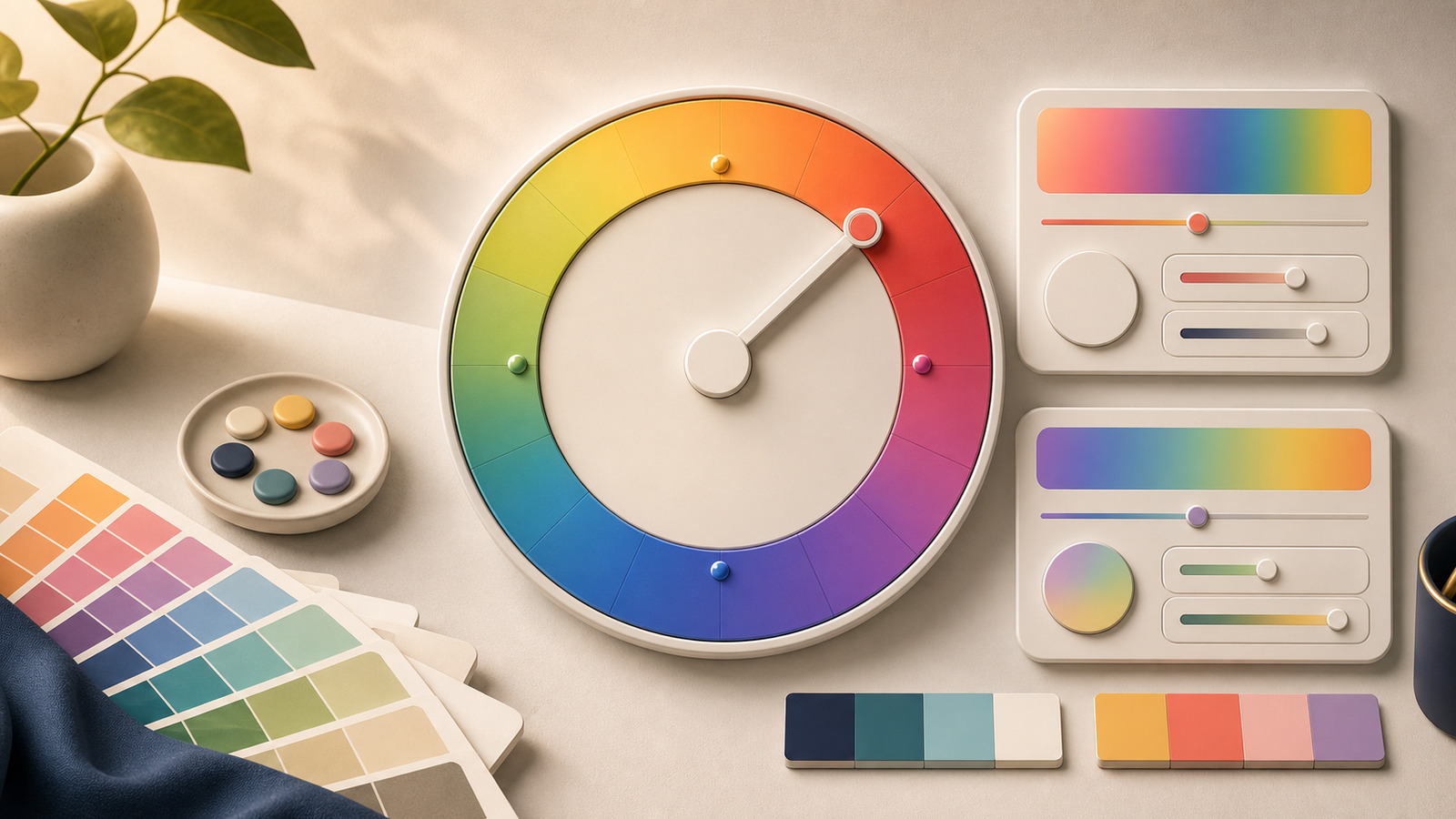
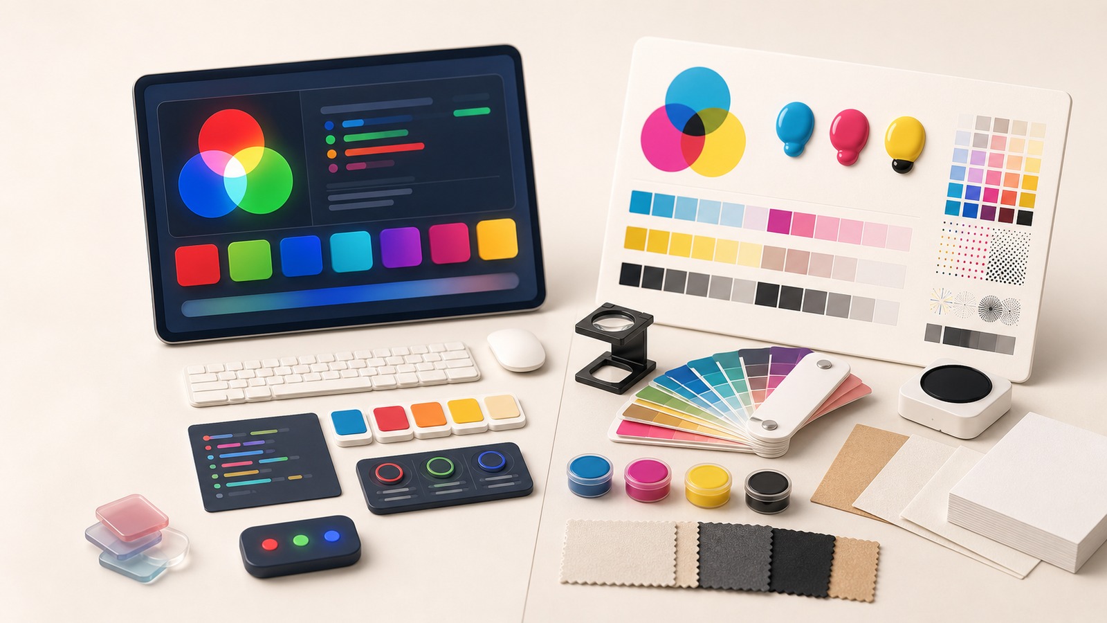
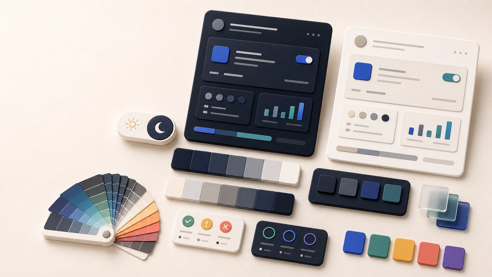
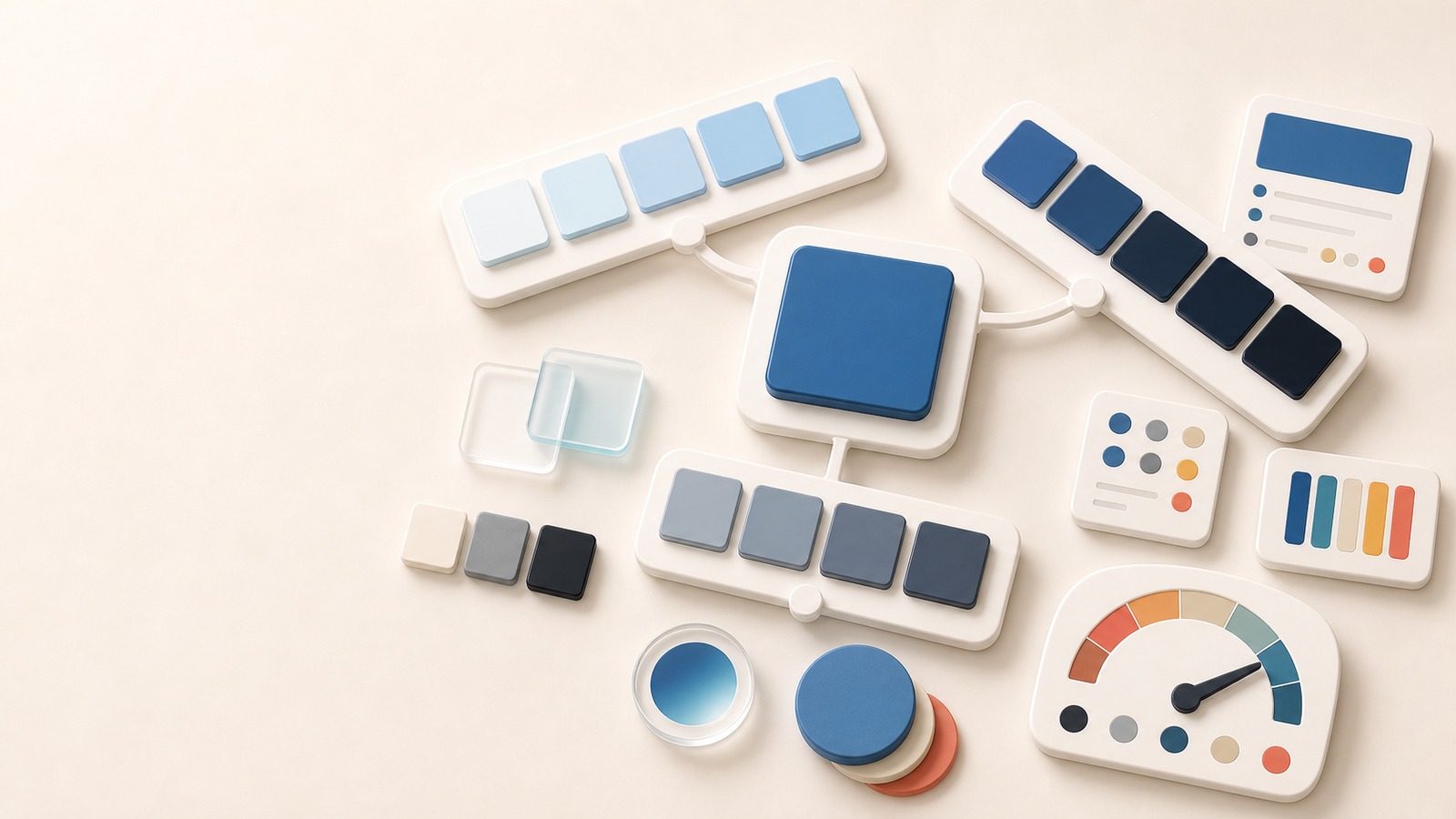
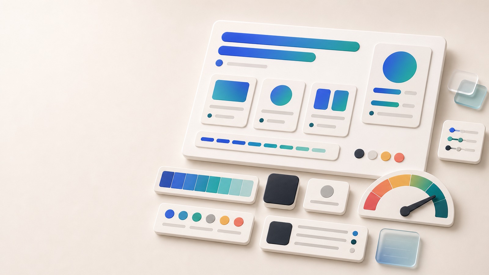
Translucent blue panels suspended above ivory and navy cards, with solid foreground bars and layered blue samples. Tutorial CSS Color Overlay: Keep Text Opaque on Tinted CardsBuild a translucent blue card without fading its text. Resolve the overlay on two backgrounds, verify the resulting colors, and keep the CSS handoff clear.Hue dial with a pointer, surrounding swatches, and color control cards for comparing hue directions. Blog post Hue Angle Meaning: How Degrees Map to ColorHue angle is the degree direction of a color inside a color model. Learn how 0, 120, 240, HSL, OKLCH, and palette roles fit together.Palette board comparing original swatches, simulated swatches, pattern chips, and accessibility review indicators. Blog post Color Blindness Simulator Palette: Review Colors Beyond ContrastA color blindness simulator palette review helps reveal hue-only risks in status colors, charts, links, and UI states before a palette ships.Screen color workspace with RGB swatches beside a print proof board with CMYK swatches, paper samples, and color fan deck. Blog post RGB vs CMYK for Web and Print: Use the Right Color ModelRGB is the working model for screens, while CMYK belongs to print production. Learn how to document both without pretending one set of numbers can serve every output.Dark and light interface panels with palette swatches, neutral ramps, accent chips, and contrast indicators for a dark mode color system. Blog post Dark Mode Color Palette: Roles, Contrast, and TokensBuild a dark mode color palette by remapping roles, testing contrast, and documenting tokens instead of simply inverting a light palette.One blue base swatch branching into pale tint, dark shade, and muted tone color ramps. Blog post Tint vs Shade vs Tone: Use the Right Color VariationTint, shade, and tone describe different ways to vary one color. Learn the difference, when to use each branch, and how to turn them into palette roles.Gradient UI cards with fallback color chips, swatches, token panels, and contrast meter elements. Tutorial Gradient Text Color CSS: Fallbacks, Contrast, and TokensCreate gradient text color CSS with a readable fallback, progressive enhancement, contrast samples, and tokenized gradient stops before shipping display text.Focused interface controls with glowing focus rings, contrast status cards, and adjacent color swatches. Tutorial Focus Ring Contrast Checker: Test Keyboard Focus ColorsUse a focus ring contrast checker workflow to test keyboard focus colors against page and component surfaces before shipping UI states.One blue seed color feeding into palette cards, role swatches, contrast checks, and export controls. Tutorial Build a Color Palette From One Color: A Practical WorkflowLearn a practical workflow for turning one seed color into tints, shades, tones, palette roles, and verified foreground/background pairs.