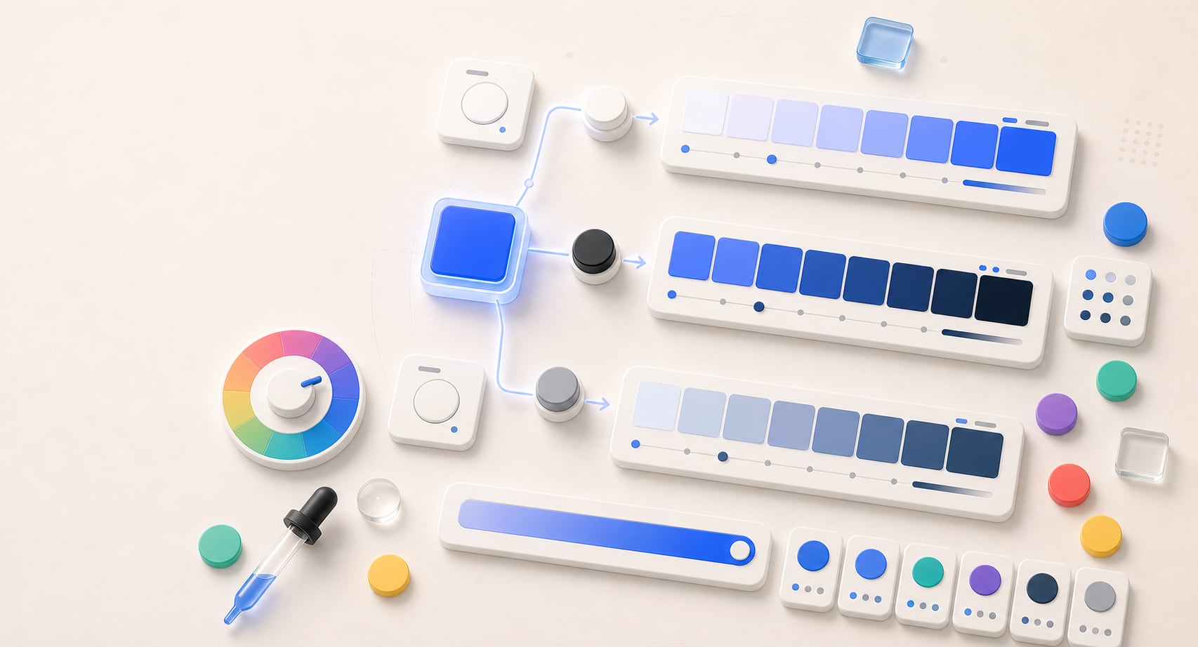
Tint, shade, tone generator
Build dependable tints, shades, and tones.
Create 5, 7, 9, or 11 step scales with perceptual, HSL, or RGB methods and export them as practical color roles and CSS tokens.
Free color utility
Tints
Inputs update live, exports are copy-ready, and the color math stays deterministic.
Quick start
Starter presets
Start with a realistic setup, then adjust any input and watch the result update.
Valid input example: #4169E1 or rgb(65 105 225)
If input is invalid: Invalid or incomplete color values are identified at the field, announced, and explained in the result area so they can be corrected without guesswork.
Choose a preset or edit the controls directly.
Color scale
Build practical color scales
Instructions
- Enter a base color or use Random to start from a new seed color.
- Choose the scale intent, number of steps, and mixing mode for the kind of system you are building.
- Review the specimen, readiness summary, per-step role suggestions, and contrast notes before assigning roles.
- Copy CSS variables, JSON, token-style JSON, role suggestions, or a handoff summary for documentation.
Methodology and guides
How this tool calculates and connects.
Review the formulas, assumptions, edge cases, validation checks, caveats, and related color guidance behind Tints.
Methodology pages
Related guides
How it fits
Build scales with different mixing models.
Generate simple RGB mixes, HSL lightness scales, or OKLCH perceptual scales for UI states and token ladders.
Scale lengths
Choose 5, 7, 9, or 11 steps depending on how much system depth you need.
Mixing modes
Compare simple mixing against HSL and OKLCH approaches.
Role-ready output
Copy CSS custom properties with consistent tint, shade, and tone naming.
Quick overview
Hue Codex Tint, Shade, and Tone Generator is a free browser-based color scale tool that creates lighter tints, darker shades, and muted tones from one base color. It supports 5, 7, 9, and 11 step scales, offers OKLCH perceptual, HSL lightness, and simple RGB mix modes, and exports the generated scales as CSS custom properties.
- Use it to create tint, shade, and tone scales for UI surfaces, states, backgrounds, badges, charts, and brand systems.
- Tint scales move a color lighter, shade scales move it darker, and tone scales mute or gray the color.
- Modes include OKLCH perceptual, HSL lightness, and simple RGB mix so you can compare different scale behavior.
- Generated CSS custom properties are ready to copy into stylesheets or adapt into role-based naming.
- Scale generation helps produce candidates, but final foreground and background pairs still need contrast checks.
What the Hue Codex tint, shade, and tone generator does
The Hue Codex tint, shade, and tone generator starts with one base color and creates three related color scales. Tints move the color lighter, shades move it darker, and tones move it toward a more muted color.
You can choose 5, 7, 9, or 11 steps, compare OKLCH perceptual, HSL lightness, and simple RGB mix modes, then copy the generated values as CSS custom properties. The output is useful for UI states, backgrounds, borders, badges, chart accents, brand ramps, and color-role drafts.
A tint is a color moved lighter, a shade is a color moved darker, and a tone is a color moved toward a muted or gray-like version. In production color systems, these related variants often become surfaces, hover states, borders, disabled states, and supporting accents.
Tint vs shade vs tone
Tint, shade, and tone are related ideas, but they solve different palette problems. A tint is useful when a color needs to become a softer surface or background. A shade is useful when a color needs depth, emphasis, or a darker state. A tone is useful when the base color is too vivid and needs to sit more quietly in a UI.
| Scale | Direction | Common use |
|---|---|---|
| Tints | Lighter variants of the base color. | Soft backgrounds, selected states, panels, tags, and subtle brand surfaces. |
| Shades | Darker variants of the base color. | Hover states, pressed states, emphasis, dark accents, and high-depth UI roles. |
| Tones | Muted variants of the base color. | Borders, quiet accents, disabled states, secondary UI, and less saturated palette support. |
Scale modes
Different mixing models can create noticeably different scales from the same base color. Hue Codex lets you compare three modes so you can choose the scale that best fits the color system you are building.
OKLCH perceptual
Adjusts lightness and chroma in OKLCH for scales that usually feel smoother and more perceptually consistent.
HSL lightness
Keeps hue familiar and adjusts HSL lightness and saturation, which can be easy to reason about in hand-authored CSS.
Simple RGB mix
Mixes toward white for tints, black for shades, and gray for tones, which is straightforward and familiar for quick exploration.
Step count
Choose 5, 7, 9, or 11 steps depending on whether you need a compact palette or a deeper token ladder.
CSS output
The export panel writes the generated scales as CSS custom properties. Tints, shades, and tones use predictable names such as --color-tints-1, --color-shades-1, and --color-tones-1 so the values can be pasted into a stylesheet and renamed for your system.
For reusable color roles, use the exported CSS as a starting point. Teams often rename the values by role, such as --color-primary-hover, --color-primary-surface, --color-border-muted, or --color-accent-disabled.
The exported numbers are useful candidates, but token names should describe how the color is used, not only how it was generated.
Best uses for generated color scales
Tint, shade, and tone scales are most useful when a single brand or interface color needs supporting variants. They help a palette feel related while still giving teams enough steps for real component states.
UI states
Create hover, active, selected, disabled, and pressed-state candidates from a base action color.
Surfaces and backgrounds
Use lighter tints for panels, empty states, page sections, and subtle brand-tinted backgrounds.
Borders and quiet accents
Use toned variants when the base color is too saturated for dividers, outlines, secondary labels, or subtle UI cues.
Brand and token systems
Build repeatable ramps that can become semantic color roles, documentation swatches, and ready-to-use CSS variables.
Contrast and production caveats
A generated scale does not automatically make a color accessible or ready to use. A tint can be too light for text, a shade can be too dark against a dark surface, and a tone can lose important distinction if it is too muted.
Before using generated values for text, icons, focus indicators, buttons, form controls, or chart labels, test the actual foreground and background combination in context.
Scale generation creates options. Contrast testing and role assignment decide which options belong in production.
Quick answers
Tints FAQ
What is the Hue Codex tint, shade, and tone generator?
The Hue Codex tint, shade, and tone generator is a free online tool that creates lighter tints, darker shades, and muted tones from one base color.
What is the difference between a tint, a shade, and a tone?
A tint is a lighter version of a color, a shade is a darker version of a color, and a tone is a more muted version of a color.
Can I generate OKLCH color scales?
Yes. The generator includes an OKLCH perceptual mode that adjusts lightness and chroma to create tint, shade, and tone scales.
How many steps can the generator create?
The generator can create 5, 7, 9, or 11 steps for each tint, shade, and tone scale.
What is HSL lightness mode?
HSL lightness mode creates tints, shades, and tones by adjusting HSL lightness and saturation while keeping the hue easy to reason about.
What is simple RGB mix mode?
Simple RGB mix mode creates tints by mixing toward white, shades by mixing toward black, and tones by mixing toward gray.
Can I export the generated scales as CSS?
Yes. Hue Codex exports generated tint, shade, and tone scales as copy-ready CSS custom properties.
Are generated tints, shades, and tones automatically accessible?
No. Generated scales still need foreground and background contrast checks before they are used for text, controls, icons, focus states, or important labels.