Color-role review
Find which palette colors can serve as text on surface, text on accent, icon on fill, or border on background.
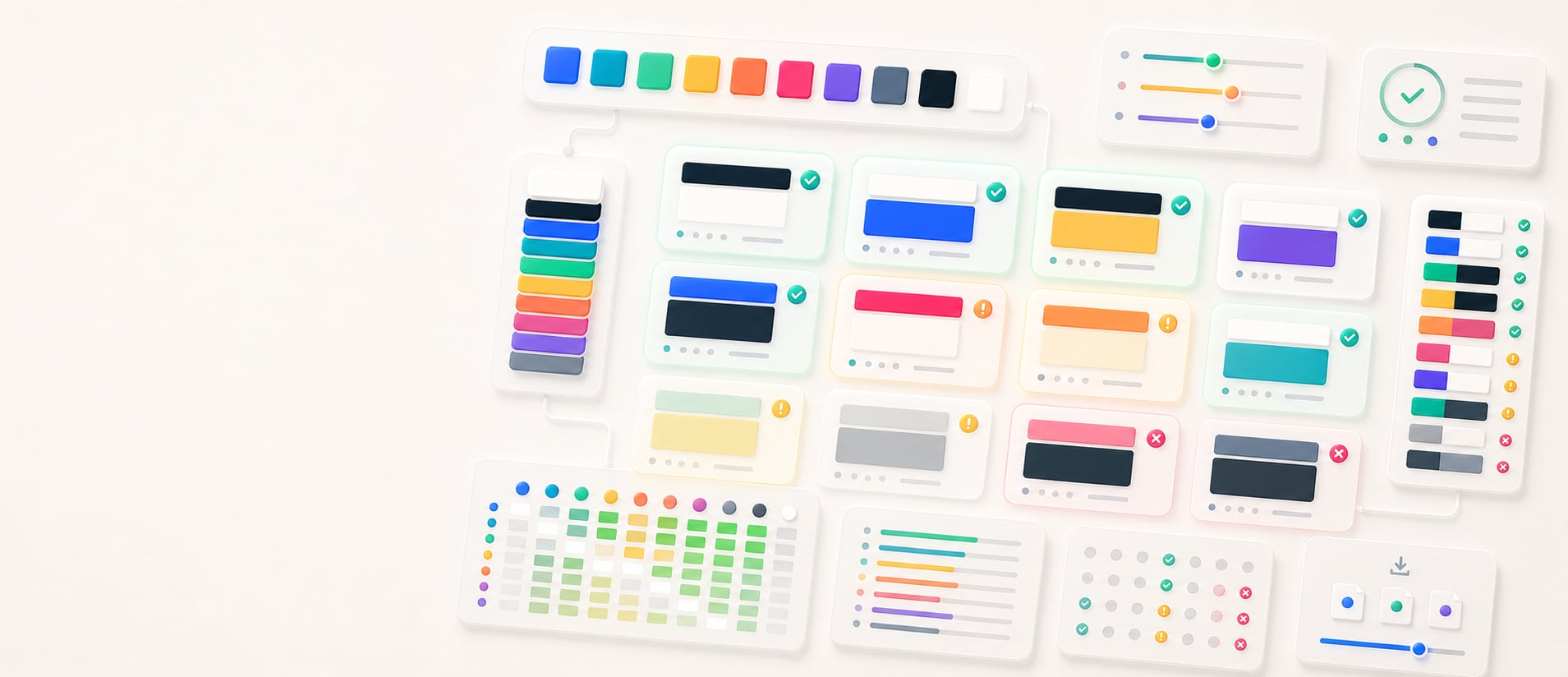
Accessible pair finder
Paste a HEX palette or load the demo colors, choose a contrast threshold, and find which foreground/background directions meet normal text AA, normal text AAA, or large-text and UI contrast targets. Hue Codex sorts passing pairs by contrast, previews each readable combination, and exports copy-ready pair notes for palette QA, color roles, and interface review.
Free color utility
Inputs update live, exports are copy-ready, and the color math stays deterministic.
Contrast matrix
How it fits
Hue Codex treats each color as part of a larger workflow: conversion, accessibility, palette roles, CSS syntax, shareable URLs, and production exports.
Color conversion follows CSS Color 4 conventions, including D50 Lab/LCH, D65 OKLab/OKLCH, and WCAG contrast thresholds.
Every result is formatted for clear reading, project notes, documentation, and assistive technology.
Palette URLs can be bookmarked and sent without an account, making color decisions easy to revisit.
Hue Codex Accessible Pair Finder is a free browser-based tool that finds readable foreground and background color pairs from a pasted HEX palette. It checks both directions for each color combination, filters by 4.5:1, 7:1, or 3:1 contrast thresholds, sorts passing pairs by contrast ratio, and exports copy-ready pair notes.
The Hue Codex accessible pair finder takes a list of HEX colors and checks every foreground/background direction against the selected contrast threshold. Matching pairs are shown as readable preview rows with the foreground text rendered on the background color.
The export panel lists every passing pair as foreground on background with its contrast ratio. This makes it easier to turn a raw palette into role candidates such as text on surface, button text on fill, badge text on background, or icon on component.
An accessible color pair is a foreground and background combination with enough contrast for the intended text, icon, or UI role.
Hue Codex lets you choose the minimum contrast ratio before calculating pairs. Higher thresholds produce fewer but stronger combinations.
| Threshold | Minimum ratio | Best use |
|---|---|---|
| Normal text AA | 4.5:1 | Body text, labels, form text, and most ordinary reading contexts. |
| Normal text AAA | 7:1 | Stricter text contrast targets, especially for long-form reading or high-confidence palette options. |
| Large text / UI | 3:1 | Large text, graphical objects, component boundaries, icons, and interface contrast checks. |
The tool parses HEX values from the palette field, removes duplicates, then compares each color against every other color in both foreground/background directions. Same-color pairs are skipped because they have no useful contrast.
Passing pairs are sorted from highest to lowest contrast. The preview list shows up to 40 passing pairs so the page remains scannable, while the export text includes all passing pairs for documentation and review.
Pair finding is most useful when you already have a palette and need to assign colors to real interface roles. It turns a group of swatches into candidate relationships.
Find which palette colors can serve as text on surface, text on accent, icon on fill, or border on background.
Quickly spot palettes where too few colors can support readable text or important UI elements.
Choose foreground/background directions for buttons, alerts, badges, cards, inputs, and navigation states.
Copy contrast-qualified pairs into accessibility notes, review comments, and design-system guidance.
A passing contrast ratio does not automatically make a complete interface accessible. Text size, font weight, state changes, icon shape, borders, focus indicators, disabled states, and surrounding colors all affect readability.
Use this tool to find candidate pairs, then check the actual component or page context. Important meaning should not rely on color alone, and non-text UI elements should be reviewed with the correct 3:1-style target for their role.
Quick answers
Hue Codex Accessible Pair Finder is a free browser-based tool that finds readable foreground and background color pairs from a pasted HEX palette.
It compares each palette color against every other color in both foreground/background directions, calculates the contrast ratio, and keeps pairs that meet the selected threshold.
The tool includes 4.5:1 for normal text AA, 7:1 for normal text AAA, and 3:1 for large text or UI contrast review.
Yes. It checks color A on color B and color B on color A as separate role candidates, then sorts passing pairs by contrast ratio.
Enter at least two HEX colors. The parser accepts pasted HEX values and removes duplicate normalized colors before testing pairs.
The preview list shows the highest-contrast passing pairs first and caps the visible list for readability. The export panel includes all passing pairs.
Yes. Each preview row has a copy control, and the export panel lists all passing foreground/background pairs with contrast ratios.
No. Passing contrast is important, but real accessibility also depends on text size, component state, surrounding colors, non-color cues, and the actual UI context.