Color harmony generator
Build useful color relationships from one seed.
Explore complementary, analogous, triadic, tetradic, split, and monochromatic relationships with a visual wheel and copy-ready palette roles.
Free color utility
Harmonies
Inputs update live, exports are copy-ready, and the color math stays deterministic.
Quick start
Starter presets
Start with a realistic setup, then adjust any input and watch the result update.
Valid input example: #4169E1 or another valid CSS color value
If input is invalid: Invalid or incomplete color values are identified at the field, announced, and explained in the result area so they can be corrected without guesswork.
Choose a preset or edit the controls directly.
Color wheel
Build useful hue relationships
Instructions
- Enter a base color or use Random to start from a new seed.
- Choose a harmony scheme for the kind of relationship you want: calm, bold, balanced, varied, or tonal.
- Use Tone to preserve the seed, balance the supporting colors, make them vivid, or soften them for UI work.
- Review the wheel, role suggestions, contrast notes, handoff signals, and caveats before using the colors.
- Copy individual colors, CSS variables, token-style JSON, or a handoff summary for palette documentation.
Methodology and guides
How this tool calculates and connects.
Review the formulas, assumptions, edge cases, validation checks, caveats, and related color guidance behind Harmonies.
Methodology pages
Related guides
How it fits
See hue relationships, not just swatches.
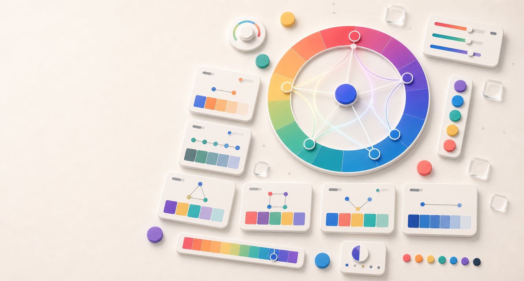
Harmony output includes a visual wheel cue so complementary, analogous, triadic, tetradic, split, and monochromatic choices are easier to reason about.
Spatial relationships
The wheel preview shows where generated colors sit around the hue circle.
Practical labels
Each generated color is labeled for quick copying and palette exploration.
Accessibility reminder
Harmony describes hue relationship; contrast still needs to be checked before using colors as text.
Quick overview
Hue Codex Color Harmonies is a free browser-based color harmony generator that creates complementary, analogous, triadic, tetradic, split complementary, and monochromatic palettes from one base color. It shows the generated colors on a hue wheel, labels each swatch, and exports copy-ready harmony values.
- Use it to turn one base color into common color wheel harmonies for palette exploration.
- The harmony schemes include complementary, analogous, triadic, tetradic, split complementary, and monochromatic.
- The hue wheel preview makes each relationship easier to understand before you copy the colors.
- Harmony helps organize hue relationships, but readable text and UI states still need contrast checks.
What the Hue Codex color harmony generator does
The Hue Codex color harmony generator starts with one base color and creates related colors by applying familiar hue relationships around the color wheel. You can type a color value, pick a color visually, generate a random base color, and switch between harmony schemes.
Each generated palette includes labeled swatches, a hue wheel preview, and copy-ready values. The tool is useful when you need supporting accents, brand exploration, UI color ideas, editorial palettes, chart color candidates, or a quick way to compare color wheel relationships.
A color harmony is a group of colors related by a repeatable color wheel pattern, such as opposite hues for complementary colors or evenly spaced hues for triadic colors.
Supported color harmony schemes
Hue Codex generates six common harmony types. The schemes are based on hue relationships, so they are best treated as starting points. Lightness, saturation, role assignment, and contrast still decide whether the palette works in a real design.
| Scheme | Relationship | Best use |
|---|---|---|
| Complementary | The base hue plus the hue opposite it on the color wheel. | High-contrast accents, calls to action, and energetic brand pairings. |
| Analogous | The base hue plus nearby hues on either side. | Calm, cohesive palettes with low hue tension. |
| Triadic | Three hues spaced around the color wheel. | Balanced palettes with distinct accent options. |
| Tetradic | Four hues spaced as two opposing pairs. | Richer palettes that need careful role assignment and restraint. |
| Split complementary | The base hue plus two hues near its complement. | Contrast with less direct tension than a strict complementary pair. |
| Monochromatic | One hue family varied through lightness and saturation. | Subtle UI scales, brand ramps, backgrounds, and tonal systems. |
Best uses for color harmonies
Color harmonies are most useful during exploration. They help you find related hue families quickly, then you can choose which colors deserve real production roles.
Brand exploration
Use complementary, split complementary, or analogous palettes to test how a base brand color could expand into secondary and accent colors.
UI accents
Use harmony output as candidate colors for badges, highlights, charts, illustrations, and state accents before assigning semantic roles.
Editorial and campaign palettes
Generate triadic or tetradic options when a layout needs more color variety than a single brand accent can provide.
Monochromatic systems
Use monochromatic output when the goal is consistency, restraint, or a focused one-hue interface palette.
A practical harmony workflow
Start with a base color that already fits the brand, mood, or product context. Generate several harmony schemes, then compare the hue relationships before deciding which colors should become primary, secondary, accent, surface, or data-visualization roles.
- Choose or enter the base color.
- Generate complementary, analogous, triadic, tetradic, split complementary, and monochromatic options.
- Pick a scheme based on the job: calm cohesion, strong contrast, balanced variety, or tonal restraint.
- Adjust or regenerate colors before assigning real palette roles.
- Check contrast before using harmony colors for text, icons, focus rings, controls, or important chart labels.
Harmony, contrast, and production caveats
A harmony scheme describes how hues relate to each other. It does not guarantee readability, accessibility, brand fit, emotional fit, or ready-to-use color roles.
For real interface work, treat harmony colors as candidates. Tune lightness and saturation, assign specific roles, check contrast, and avoid using hue alone to communicate meaning.
A beautiful hue relationship can still fail as text. Always test foreground and background pairs when harmony colors move into UI or content roles.
Quick answers
Harmonies FAQ
What is the Hue Codex color harmony generator?
The Hue Codex color harmony generator is a free online tool that creates complementary, analogous, triadic, tetradic, split complementary, and monochromatic palettes from one base color.
What is a complementary color?
A complementary color is opposite the base hue on the color wheel. Complementary pairs often feel energetic and high contrast, but they still need lightness and contrast checks before use in UI or text.
What is an analogous color palette?
An analogous palette uses hues near each other on the color wheel. Analogous colors usually feel cohesive and calm because the hue shift is smaller.
What is a triadic color palette?
A triadic palette uses three hues spaced around the color wheel. It can provide balanced variety for accents, illustration, editorial design, or brand exploration.
What is a split complementary palette?
A split complementary palette uses the base hue plus two hues near the base color's complement. It gives contrast while often feeling less direct than a strict complementary pair.
Are color harmonies automatically accessible?
No. Harmony describes hue relationships, not readability. You still need to check foreground and background contrast before using harmony colors for text, icons, controls, or important labels.
Can I copy the generated harmony values?
Yes. The tool shows labeled swatches and a copy-ready harmony value export so you can move the colors into palettes, documentation, or project notes.