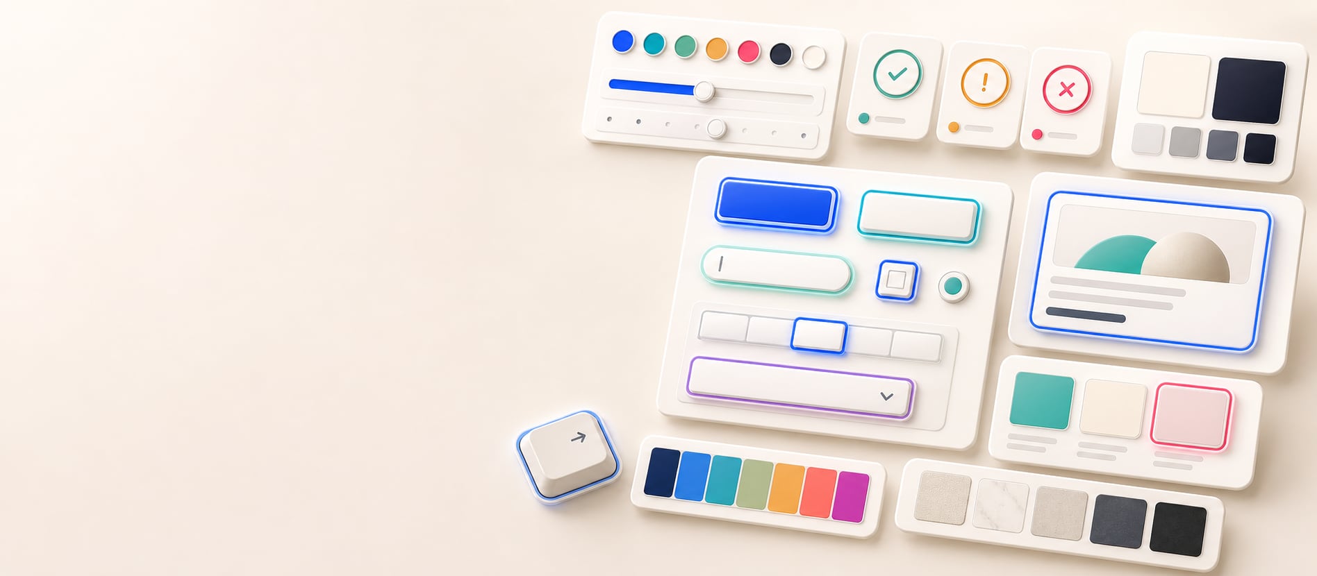
Design-system focus roles
Test a proposed focus color before applying it across components and themes.
Focus ring contrast
Enter a focus ring color, page background, and component fill to test whether the ring has 3:1 UI contrast against both adjacent colors. Hue Codex previews a focused button, reports ring-versus-page and ring-versus-component contrast, and exports a copy-ready focus ring report for keyboard accessibility review.
Free color utility
Inputs update live, exports are copy-ready, and the color math stays deterministic.
Focus state
How it fits
Hue Codex treats each color as part of a larger workflow: conversion, accessibility, palette roles, CSS syntax, shareable URLs, and production exports.
Color conversion follows CSS Color 4 conventions, including D50 Lab/LCH, D65 OKLab/OKLCH, and WCAG contrast thresholds.
Every result is formatted for clear reading, project notes, documentation, and assistive technology.
Palette URLs can be bookmarked and sent without an account, making color decisions easy to revisit.
Hue Codex Focus Ring Contrast Tool is a free browser-based tool that checks a focus ring color against both the page background and component fill. It calculates ring-versus-page and ring-versus-component contrast ratios, marks each against a 3:1 UI contrast target, previews the focused state, and exports a copy-ready focus ring report.
The Hue Codex focus ring contrast tool checks a proposed focus ring color against the two colors it commonly touches: the page background around the component and the component fill inside the outline.
The preview shows a focused button using your page, component, and ring colors. The result panel reports ring versus page contrast, ring versus component contrast, and a 3:1 UI contrast target so you can document the focus state clearly.
Focus ring contrast is the visual difference between a focus indicator and the adjacent colors around it, such as the page background and the focused component surface.
Hue Codex uses a 3:1 target for focus ring checks because focus indicators are non-text interface cues. The tool treats each adjacent color separately: a ring can pass against the page but fail against the component, or the other way around.
| Check | What it compares | Why it matters |
|---|---|---|
| Ring vs page | Focus ring color against the surrounding page background. | Shows whether the outside edge of the ring is visible around the component. |
| Ring vs component | Focus ring color against the component fill. | Shows whether the inside edge of the ring stands apart from the focused control. |
| Target | 3:1 UI contrast for both adjacent color comparisons. | Gives a practical threshold for visible non-text focus indicators. |
A focus ring is usually drawn at the boundary between a component and its surroundings. If the ring only contrasts with one side, part of the indicator can disappear, especially on filled buttons, cards, inputs, dark surfaces, or complex layouts.
That is why the tool asks for both page and component colors. The ring should remain visible at both edges when the user moves through the interface with a keyboard.
Focus ring contrast checks are most useful when designing reusable component states. A single ring color may appear on buttons, links, inputs, cards, menu items, tabs, and controls with different fills.
Test a proposed focus color before applying it across components and themes.
Check whether the ring is visible on filled controls, outlined controls, and plain text controls.
Compare the same ring color against different page and component colors before reusing it across themes.
Copy the report into keyboard navigation reviews, bug tickets, design notes, or release QA documentation.
Contrast is only one part of a usable focus indicator. Size, shape, thickness, offset, animation, persistence, and location all affect whether keyboard users can track focus reliably.
A 3:1 contrast result is a useful signal for the colors in this tool, but the final focus state should still be reviewed in the real component, at real sizes, across hover, active, disabled, selected, light-theme, dark-theme, and forced-colors contexts.
Quick answers
Hue Codex Focus Ring Contrast Tool is a free browser-based tool that checks a focus ring color against page and component colors, previews the focused state, and reports both contrast ratios.
Hue Codex checks focus ring colors against a 3:1 UI contrast target for both the page background and the component fill.
A focus ring often touches both the outside page surface and the focused component. Checking both sides helps catch rings that disappear against one adjacent color.
Ring versus page is the contrast ratio between the focus ring color and the surrounding page background color.
Ring versus component is the contrast ratio between the focus ring color and the focused component fill color.
The Suggest button chooses a preset ring color with strong contrast against the page background. The ring still needs to be checked against the component fill.
No. Passing contrast is important, but focus accessibility also depends on thickness, size, placement, persistence, and the real component context.
Yes. The tool exports the focus ring, page background, component fill, ring-versus-page contrast, and ring-versus-component contrast.