Quick answer
Accessible color combinations are foreground and background pairs that stay readable or perceivable for their actual role. Check normal text, large text, UI components, focus indicators, and status colors in context; a pair that passes for one role is not automatically accessible everywhere.
Accessible color combinations are color pairs that remain readable and understandable in the place where people actually use them. A swatch can look beautiful on its own and still fail when it becomes body text, a disabled button, a warning badge, a chart line, or a focus ring against a busy surface.
The practical goal is simple: choose foreground and background colors that have enough contrast, keep meaning clear without relying on hue alone, and still fit the brand or product tone. Accessibility does not remove creative choice. It gives color choices a test they need to pass before they ship.
Accessible Color Combinations Start as Pairs
The most common mistake is judging a color by itself. Accessibility depends on relationships. Navy text can be excellent on white and weak on black. Yellow can be vivid and still disappear under white text. A soft gray may feel elegant as a border, but it may be too faint to mark an input boundary.
Think in pairs first: text on surface, icon on button, link on paragraph background, focus ring against component edge, chart mark against plot area, warning text against warning surface. The Hue Codex color contrast basics guide explains why this pair-based thinking matters for readability.
Useful Contrast Targets
For common web work, WCAG 2.x contrast ratios are still the most familiar baseline. Normal text targets at least 4.5:1 for Level AA. Large text that meets WCAG's size and weight definition targets at least 3:1. Enhanced AAA text targets are stricter: 7:1 for normal text and 4.5:1 for large text. Meaningful non-text UI parts, such as input borders, focus indicators, and chart marks, need their own contrast checks against adjacent colors.
| Use case | Common target | Why it matters |
|---|---|---|
| Normal text | 4.5:1 for WCAG AA | Body copy and labels need enough contrast for sustained reading. |
| Large text | 3:1 for WCAG AA | Large or bold text can remain readable at a lower ratio than small text. |
| Enhanced normal text | 7:1 for WCAG AAA | Useful when a project has stricter readability goals. |
| Enhanced large text | 4.5:1 for WCAG AAA | A stricter target for prominent text. |
| Non-text UI parts | 3:1 for WCAG AA non-text contrast | Important for focus rings, input boundaries, chart marks, and meaningful controls. |
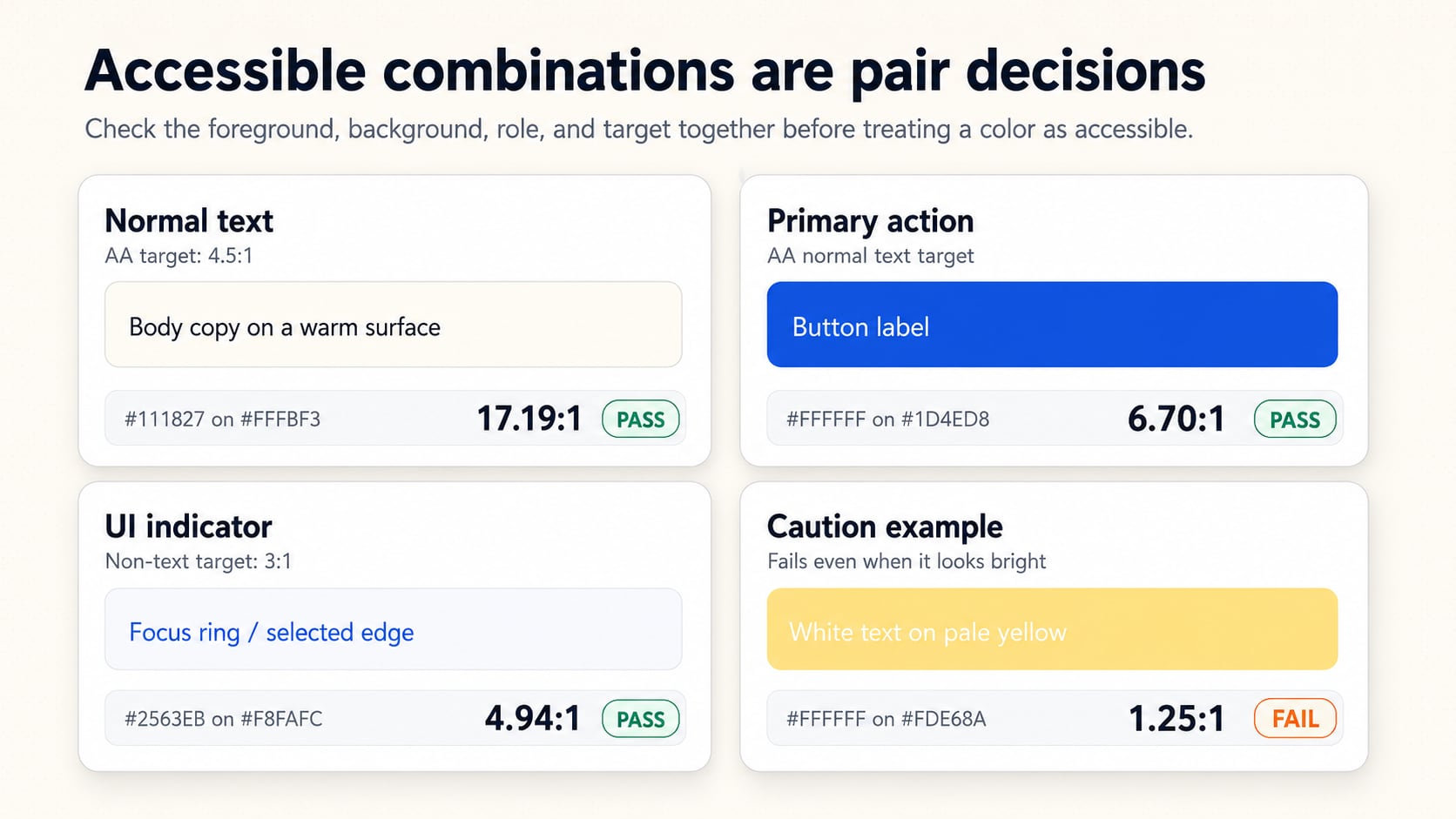
A passing ratio for one use does not make a color universally accessible. Always test the actual foreground, background, size, weight, and role.
- Body text needs strong contrast because people read it for longer periods.
- Buttons need readable labels plus visible boundaries or state changes.
- Links need enough contrast and usually a non-color cue such as an underline in dense text.
- Focus rings need contrast against both the component and the surrounding page when possible.
- Charts need labels, ordering, or direct annotation so color is not the only clue.
Choose Combinations by Role
Accessible color combinations become easier to manage when colors have jobs. Instead of asking whether a green, blue, or purple is accessible, ask what the pair needs to do. Is it body copy, a link, a selected tab, a success state, a warning surface, a chart category, or a brand accent?
Role-based thinking keeps the palette from drifting. A bright accent may work well for a small decorative chip but fail as a text background. A dark brand color may work well for primary button backgrounds but feel too heavy for large panels. A pale tint may be ideal for a status surface but need a darker companion for the text placed on top.
Reliable Accessible Color Combination Patterns
There is no single perfect palette, but a few patterns are dependable starting points. Dark ink on warm white is useful for long reading. White or near-white text on a deep brand color can work for primary actions. Dark semantic text on pale semantic surfaces often works well for alerts, as long as the text color is not just a slightly darker version of the background.
| Pattern | Example pair | Contrast | Best use | Caution |
|---|---|---|---|---|
| Dark ink on warm white | #111827 on #FFFBF3 | 17.19:1 | Long-form text and documentation surfaces | Check secondary text separately; muted grays may fail. |
| White on deep blue | #FFFFFF on #1D4ED8 | 6.70:1 | Primary button labels and active states | Hover states still need their own contrast test. |
| Dark red on pale red | #7F1D1D on #FEE2E2 | 8.20:1 | Error text on danger surfaces | Do not rely on red alone; include text or an icon. |
| Dark amber on pale yellow | #78350F on #FEF3C7 | 8.15:1 | Warning text on caution surfaces | Yellow backgrounds often fail with white text. |
| Dark green on pale green | #14532D on #DCFCE7 | 8.30:1 | Success text on confirmation surfaces | Pair with a label, check mark, or direct status text. |
| Dark underlined link on light surface | #1D4ED8 on #FFFFFF | 6.70:1 | Links inside paragraphs | Underline or otherwise distinguish links from surrounding text. |
These are patterns, not guarantees. The exact HEX, RGB, HSL, or OKLCH values still need to be checked. Slight changes in lightness can move a pair from comfortable to marginal very quickly.
Do Not Rely on Hue Alone
Accessible color combinations are not only about ratios. Color should not be the only way to communicate meaning. Red and green status dots, chart series, required fields, pass/fail badges, and selected states should also use text, icons, shapes, patterns, position, or direct labels.
This matters for people with color-vision differences, but it also helps everyone in bright light, on low-quality displays, in dark mode, or when scanning a dense interface quickly. The color accessibility guide covers these broader state, focus, and non-color cue decisions.
How to Check a Palette Quickly
Start with the combinations that carry meaning or content. Body text, primary buttons, links, form errors, warnings, focus rings, selected tabs, chart labels, and disabled states deserve more attention than decorative swatches. Test them as foreground and background pairs, then adjust lightness before changing hue.
- List the real pairings: text on surface, button label on button, icon on state color, link on page background.
- Check contrast for each pairing before deciding the palette is finished.
- If a pair fails, adjust lightness first because hue changes alone may not improve readability.
- Add a non-color cue when a color communicates status, action, selection, or chart meaning.
- Retest hover, focus, selected, disabled, and dark-mode versions separately.
For palette work, the accessible pair finder can help identify which foreground and background combinations are already readable before you spend time polishing names, tokens, or documentation.
FAQ
What makes a color combination accessible?
A color combination is accessible when the foreground and background remain readable or perceivable for the actual role. Text, icons, focus rings, chart marks, and state indicators all need to be tested in context.
Is contrast ratio the only accessibility requirement for color?
No. Contrast is important, but color should not be the only way to communicate meaning. Use labels, icons, patterns, underlines, position, or direct annotation when color carries status, action, or distinction.
Can an accessible palette still use bright brand colors?
Yes. Bright brand colors can still be part of an accessible palette, but they need the right roles. A vivid color may work as an accent or button background while failing as body text or as a background for white text.
What should I adjust first when a pair fails contrast?
Adjust lightness first. Hue changes alone often do not improve readability enough, while lightness changes directly affect contrast.
Final Takeaway
Accessible color combinations are tested relationships between colors. Start with real foreground/background pairs, check contrast for the role, avoid hue-only meaning, and tune lightness before abandoning a palette direction. As a next step, test one body text pair, one button label pair, one status message pair, and one focus indicator before treating a palette as ready.
Spot an issue or want a color topic covered?Send a correction or request a post.