
Color guide
Color contrast basics
Color contrast is the measurable difference between a foreground color and a background color. It is the reason text stays readable, controls stay visible, and interface meaning survives real screens, low vision, glare, color-vision differences, and imperfect viewing conditions.
Short answer
Color contrast compares the relative luminance of two colors placed together. Under WCAG 2.x, normal text needs at least 4.5:1 contrast for AA and 7:1 for AAA. Large text needs at least 3:1 for AA and 4.5:1 for AAA. Important non-text UI elements and graphical objects generally need 3:1 contrast against adjacent colors.
- Contrast is a property of a color pair, not a single color.
- WCAG contrast ratios range from 1:1 for no luminance difference to 21:1 for black against white.
- Hue difference does not guarantee readability. Luminance difference is what drives the WCAG 2.x contrast ratio.
- Normal body text usually targets 4.5:1 or higher for WCAG AA, while AAA raises the target to 7:1.
- Large text, UI component boundaries, focus indicators, icons, and charts need their own contrast decisions.
- Color should not be the only way to communicate status, errors, selection, required fields, or chart meaning.
Standards status
Badges mark whether this guide relies on stable standards, draft or preview specifications, primary or model sources, Hue Codex guidance, approximations, or browser-dependent behavior.
What color contrast means
Color contrast is the visible separation between two colors that appear together. In web accessibility, the most common case is text color against background color, but the same idea applies to icons, borders, focus rings, chart marks, disabled-looking controls, selected states, and any visual cue that users must perceive.
A color cannot pass or fail contrast by itself. A blue might pass as white text on a dark button, fail as body text on a pale blue surface, and become excellent as a border against white. Always evaluate the final foreground and background pair in the actual state where it appears.
Color contrast is the perceptual and measurable difference between adjacent colors, most often expressed on the web as a WCAG contrast ratio between a foreground color and a background color.
How WCAG contrast ratio works
WCAG 2.x contrast ratio is calculated from relative luminance, which estimates how bright each color appears after sRGB values are linearized. The formula compares the lighter color to the darker color: (L1 + 0.05) / (L2 + 0.05).
The result is written as a ratio from 1:1 to 21:1. A ratio of 1:1 means the colors have the same relative luminance. A ratio of 21:1 is the maximum possible contrast between black and white in the WCAG 2.x formula.
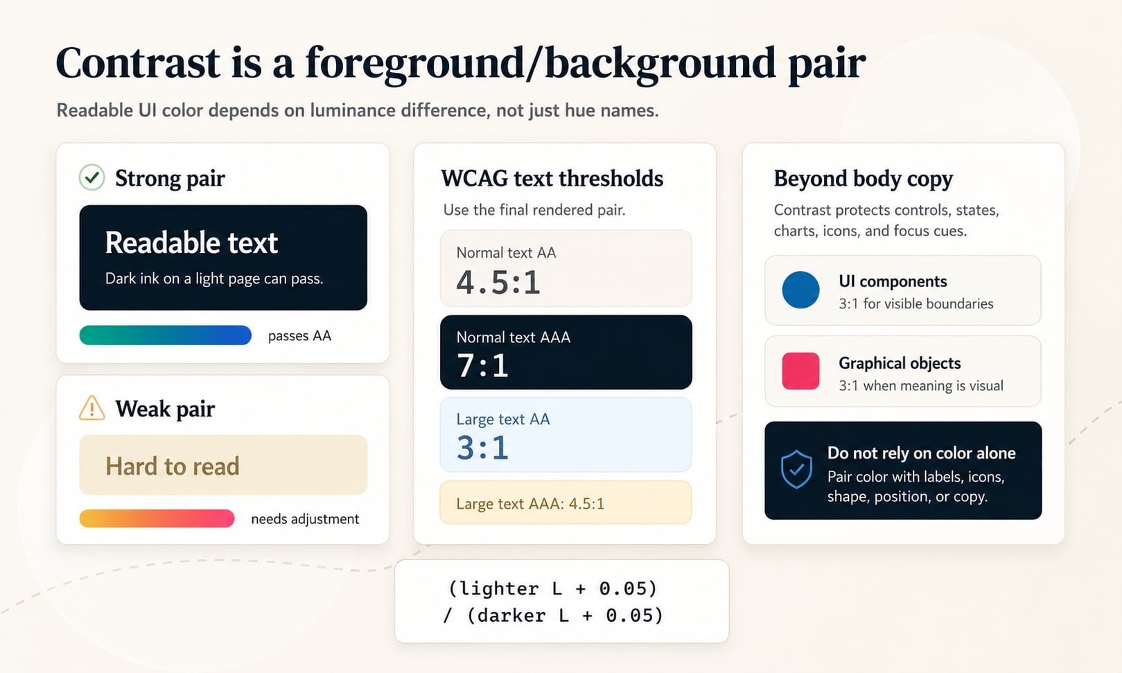
WCAG AA and AAA contrast thresholds
WCAG defines success criteria for different levels. AA is the common target for most public websites, apps, and product interfaces. AAA is stricter and is useful for high-readability experiences, but it is not always required or practical for every brand expression and UI state.
The core text thresholds come from WCAG success criteria 1.4.3 Contrast (Minimum) and 1.4.6 Contrast (Enhanced). Treat these ratios as minimums, not design ideals. A pair that barely passes on paper can still feel weak in small type, thin fonts, low-quality displays, glare, or motion.
| Content type | WCAG AA | WCAG AAA | Practical use |
|---|---|---|---|
| Normal text | 4.5:1 | 7:1 | Body copy, small labels, form text, buttons, navigation, helper text |
| Large text | 3:1 | 4.5:1 | Headings or large bold text where letterforms are easier to recognize |
| UI components | 3:1 | Not defined by the same AAA text rule | Input borders, focus indicators, selected states, control boundaries |
| Graphical objects | 3:1 | Not defined by the same AAA text rule | Meaningful icons, chart marks, status symbols, visual indicators |
WCAG also includes exceptions for cases such as inactive components, decorative content, incidental text, and logotypes. Those exceptions should not become a shortcut for weak product UI.
Normal text versus large text
Normal text needs stronger contrast because smaller letterforms are harder to distinguish. This includes body text, captions, labels, placeholder-like helper copy that remains meaningful, navigation links, button text, table content, alerts, and most form content.
Large-scale text can use a lower AA threshold because larger or bolder letterforms are easier to perceive. WCAG defines large-scale text in points, commonly understood on the web as roughly 24 CSS pixels for regular-weight text or about 18.5 CSS pixels for bold text, depending on font rendering and browser assumptions.
Use 4.5:1 for ordinary UI text
When in doubt, classify the text as normal. Small labels, badges, breadcrumbs, pills, and form hints often look larger in a design tool than they feel in a real browser.
Reserve 3:1 for genuinely large text
Headlines and large display copy may qualify, but the final size, weight, font, and context matter. Do not use the large-text rule for compact controls.
Thin fonts need extra caution
A ratio can pass mathematically while still feeling fragile if the typeface is thin, condensed, anti-aliased lightly, or rendered on a bright background.
Non-text contrast: controls, icons, charts, and focus
Accessibility is not only about paragraphs. WCAG 2.2 success criterion 1.4.11 Non-text Contrast covers visual information needed to identify UI components and meaningful graphical objects. In practical UI work, that means important borders, focus indicators, selected tabs, checkboxes, toggles, icons, chart lines, and data marks need enough separation from adjacent colors.
The common threshold for required non-text visuals is 3:1 against adjacent colors. A form field border that disappears into the page, a focus ring that blends into a button, or a chart series that cannot be separated from the plot background can create real usability problems even when the page text passes.
Input and button boundaries
If shape or border is needed to understand a control, that boundary needs visible contrast against the surrounding surface.
Focus indicators
Keyboard focus must be easy to locate. Check the focus indicator against both the component and the page background it touches.
Charts and icons
Meaningful marks need contrast against the chart background and often need labels, patterns, or direct annotation so color is not the only cue.
Do not rely on color alone
WCAG success criterion 1.4.1 Use of Color says color should not be the only visual means of conveying information, indicating an action, prompting a response, or distinguishing a visual element. This is where many otherwise attractive palettes fail.
Red versus green, blue versus purple, and pale yellow versus pale green may be obvious to one user and nearly invisible to another. Good interfaces pair color with text, icons, shape, position, line style, underlines, patterns, motion used carefully, or explicit labels.
| Pattern | Color-only risk | Accessible support |
|---|---|---|
| Form validation | Only red border means error | Add error text, aria-describedby messaging, an icon, and clear focus behavior |
| Links in body copy | Only blue text marks a link | Use underline or another non-color affordance, especially in dense copy |
| Status badges | Only green means active and red means blocked | Add readable labels such as Active, Blocked, Warning, or Draft |
| Charts | Only hue separates series | Use labels, line styles, markers, patterns, or direct annotations |
Why hue difference is not enough
A common contrast mistake is choosing colors because they are different hues. Hue helps people categorize color families, but WCAG 2.x contrast is driven by relative luminance. Yellow text and white background are different hues, yet they can be almost indistinguishable. Blue and purple may feel different on a color wheel while still being too close in luminance for small text.
Saturation is not enough either. A vivid color can fail contrast if it is too light against white or too dark against black. Lightness, luminance, font size, font weight, and the actual background all work together.
Different hue, weak contrast
Bright yellow on white, cyan on white, red on black, and violet on blue can all be hard to read despite hue separation.
Same hue, strong contrast
A dark navy foreground on a pale blue background can read very clearly because the luminance gap is large.
Palette harmony is separate
Harmonies help colors feel related. Contrast checks decide whether the chosen pair can actually be read or perceived.
How to choose accessible foreground and background pairs
Start with the role of the color pair. Body text, muted text, primary buttons, warning banners, disabled states, links, badges, and chart labels each have different constraints. Choose the semantic job first, then tune the foreground and background until the pair meets its minimum target with enough visual comfort.
The most reliable workflow is to test early, then retest after every meaningful change. A color that passed on a white artboard may fail inside a tinted card, on a gradient, over an image, or in dark mode.
- Identify the real foreground and background colors after opacity, overlays, gradients, and state layers are applied.
- Decide whether the element is normal text, large text, a UI component, a graphical object, decorative, inactive, or a logotype.
- Check the applicable ratio target: 4.5:1 for normal AA text, 7:1 for normal AAA text, 3:1 for large AA text, or 3:1 for required non-text visuals.
- Adjust lightness first when contrast fails. Hue and saturation changes can help brand fit, but luminance usually moves the ratio most directly.
- Verify hover, focus, active, selected, disabled, error, warning, success, dark mode, and high-emphasis states separately.
Common contrast mistakes
Most contrast problems are not caused by a lack of taste. They happen when a palette is tested as isolated swatches instead of real foreground/background pairs in real UI states.
Mistake: testing only brand colors
Brand palettes often include expressive colors that are not meant to be used as small text. Test role pairs, not just the raw brand swatches.
Mistake: forgetting opacity
Semi-transparent text, overlays, disabled states, shadows, and glass effects can change the effective color pair users see.
Mistake: trusting design-tool zoom
Text that looks readable at 200 percent zoom may fail at actual size in a browser. Check final CSS sizes and weights.
Mistake: ignoring backgrounds behind images
Text over photography, video, gradients, or illustration needs a stable contrast strategy such as overlays, scrims, solid panels, or constrained image crops.
Mistake: treating pass as perfect
A 4.51:1 ratio technically passes AA for normal text, but a little extra margin often creates a better real-world reading experience.
Mistake: relying on disabled exceptions
Inactive controls may be exempt in WCAG, but critical product flows still need users to understand what exists, what changed, and what to do next.
Brand colors can fail contrast
A brand color can be beautiful, memorable, and still fail as text. This is especially common with bright yellows, oranges, cyans, neons, light greens, and mid-tone saturated colors. The answer is not always to abandon the brand color; the answer is to assign it to a role it can perform.
Use lower-contrast brand colors for backgrounds, accents, decorative areas, illustrations, focus on larger areas, or supporting states. Use darker or lighter companion colors for text and icons. A mature brand system usually includes accessible text colors, surface colors, border colors, and state colors built around the core palette.
Keep the brand, change the role
A bright yellow might fail as text on white but work well as an alert background with dark text.
Create accessible companions
For every expressive brand color, define readable foreground colors and darker or lighter variants for interactive states.
Document allowed pairings
Color roles should make accessible pairs easy to choose and hard to accidentally break.
Contrast in design systems and CSS tokens
Design systems should store contrast decisions as relationships, not only as isolated color values. A color named brand-500 does not explain whether white, black, or ink text should appear on top of it. Paired color roles remove guesswork.
For production CSS, document both the color value and the approved pairings. That can mean tokens such as color.button.primary.background and color.button.primary.text, or metadata that records contrast ratios for text, border, icon, focus, and state combinations.
| Token or rule | What it protects | Contrast decision |
|---|---|---|
| color.text.default on color.surface.default | Body readability | Normal text should pass AA with comfortable margin |
| color.action.primary.text on color.action.primary.bg | Button text | Button label must pass as normal text |
| color.focus.ring against adjacent colors | Keyboard navigation | Focus indicator must remain visible around components |
| color.status.warning.text on color.status.warning.bg | Alert comprehension | Status copy must not rely on yellow alone |
How Hue Codex uses contrast
Hue Codex treats contrast as a practical decision layer on top of color picking, conversion, palette generation, and CSS output. A color format can describe a value, and a color harmony can describe a relationship, but a contrast check decides whether a pair is readable in context.
Use the Hue Codex contrast tools to test foreground and background pairs, compare AA and AAA outcomes, evaluate large text separately, and turn palette ideas into ready-to-use color roles. The goal is not only to pass a checker; it is to make color choices that remain legible, durable, and easy for teams to reuse.
Sources and further reading
This guide is written for practical UI and design-system work and cross-checked against primary WCAG 2.2 accessibility references.
Try it in Hue Codex
Use the free tools to test the idea immediately: pick a color, convert it, generate harmonies, build tints and shades, check contrast, and export practical CSS or palette data.
Quick answers
Color contrast basics FAQ
What is color contrast?
Color contrast is the visible difference between two adjacent colors. In web accessibility, it usually means the contrast ratio between foreground content, such as text or an icon, and its background.
What contrast ratio should normal text pass?
Normal text should meet at least 4.5:1 for WCAG AA. For WCAG AAA, normal text should meet at least 7:1.
What contrast ratio should large text pass?
Large text should meet at least 3:1 for WCAG AA and 4.5:1 for WCAG AAA. In practice, use the large-text threshold only for genuinely large or large bold text.
What is the maximum WCAG contrast ratio?
The WCAG 2.x contrast ratio ranges from 1:1 to 21:1. Black against white has the maximum ratio of 21:1.
Does hue affect contrast?
Hue can affect perception, but WCAG 2.x contrast ratio is based on relative luminance. Two different hues can still fail if their luminance values are too close.
Can a brand color fail contrast?
Yes. A color can be on brand and still fail as small text or a UI boundary. Use expressive brand colors in roles they can perform, and define accessible foreground/background pairings for production use.
Do icons need contrast?
Meaningful icons and graphical objects generally need at least 3:1 contrast against adjacent colors under WCAG non-text contrast guidance. Decorative icons do not carry the same requirement.
Do disabled controls need to meet contrast?
WCAG includes exceptions for inactive UI components, but disabled states should still be designed carefully so users can understand the interface and the reason an action is unavailable.
Is passing WCAG contrast enough for accessibility?
Passing contrast is important, but it is not the whole accessibility story. Interfaces also need readable typography, clear labels, keyboard focus, non-color cues, semantic markup, and usable interaction states.
Should links be identified by color alone?
Links in body copy should not rely on color alone when surrounding text could be confused with the link. Underlines or other non-color cues make links easier to recognize.
How do I fix a contrast failure?
Adjust the foreground or background lightness first, then retest the final pair. If the color is a brand requirement, keep the brand hue but create darker, lighter, or companion variants for accessible roles.