Foreground
Text, icon, border, focus ring, chart line, selected indicator, badge label, or any mark that needs to be perceived.
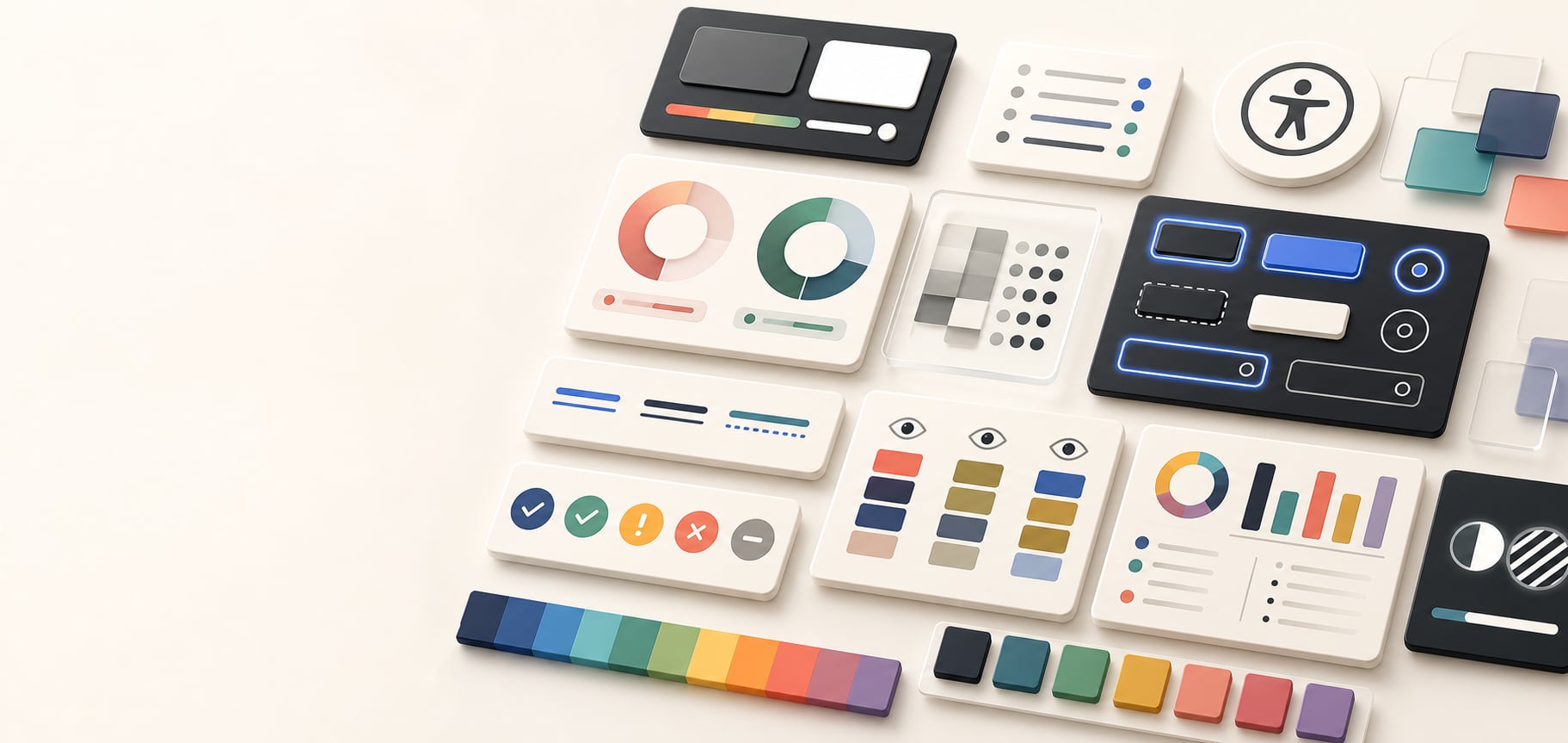
Color guide
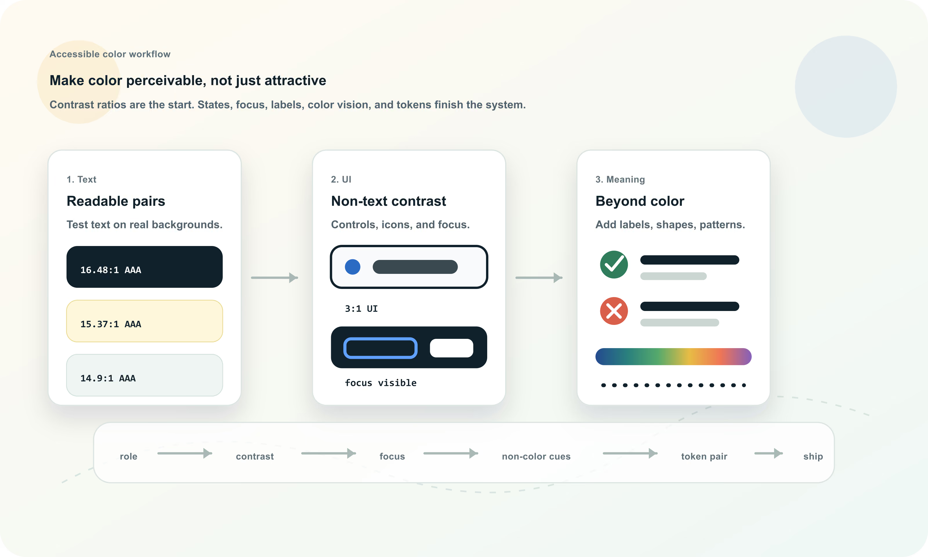
Color accessibility means making sure people can read, find, understand, and operate an interface when color is involved. It includes text contrast, non-text contrast, focus indicators, links, semantic states, charts, color-vision differences, motion and theme changes, and color tokens that make safe pairings repeatable.
Color accessibility is the practice of using color so content, controls, states, and meaning remain perceivable and understandable. Under WCAG 2.2, normal text generally needs at least 4.5:1 contrast for AA, large text needs 3:1 for AA, and meaningful non-text UI components and graphical objects generally need 3:1 contrast against adjacent colors. But accessible color also requires visible focus, non-color cues, color-vision-safe design, and tested token pairings.
Color accessibility is the practice of making color decisions that remain usable for people with low vision, color-vision differences, glare, aging eyes, low-quality displays, zoomed layouts, dark mode, bright environments, keyboard navigation, and different assistive technology workflows.
A color can be beautiful and still inaccessible. A palette can be harmonious and still unreadable. A button can have a focus outline and still be hard to find. The useful question is not only "does this color look good?" but "can users perceive, interpret, and operate this interface with confidence?"
Color accessibility is the use of contrast, non-color cues, visible states, tested pairings, and documented color roles so visual information remains perceivable and understandable for as many users as possible.
Contrast is a relationship between two colors, not a property of one color by itself. A blue may pass on white, fail on black, pass as a button background with white text, and fail as a thin border on a tinted panel. You need the final foreground and background pair that users actually see.
That final pair can be affected by opacity, alpha colors, overlays, gradients, images, theme rules, component states, disabled styling, hover layers, focus rings, browser rendering, and CSS variables. Always test the rendered state, not only the design-tool swatch.
Text, icon, border, focus ring, chart line, selected indicator, badge label, or any mark that needs to be perceived.
The immediate color or image behind that foreground, after alpha, overlays, themes, and state layers are applied.
For non-text visuals, the color touching the component or graphic can matter as much as the page background.
WCAG 2.2 uses the WCAG 2.x contrast-ratio model for text. The ratio is based on relative luminance and ranges from 1:1 for no luminance difference to 21:1 for black against white. These thresholds are minimum accessibility targets, not a guarantee that a design feels comfortable in every real-world situation.
Normal text generally needs at least 4.5:1 for WCAG AA and 7:1 for WCAG AAA. Large-scale text generally needs 3:1 for AA and 4.5:1 for AAA. Meaningful non-text visuals such as UI component boundaries and graphical objects generally need 3:1 contrast against adjacent colors.
| Visual | AA target | AAA target | Examples |
|---|---|---|---|
| Normal text | 4.5:1 | 7:1 | Body copy, form labels, navigation, button text, helper text, table content |
| Large text | 3:1 | 4.5:1 | Large headings and large bold text that meet the WCAG large-scale definition |
| UI components | 3:1 | No parallel AAA threshold in the same SC | Input borders, button boundaries, focus indicators, selected controls |
| Graphical objects | 3:1 | No parallel AAA threshold in the same SC | Meaningful icons, chart marks, status symbols, visual indicators |
WCAG includes exceptions for cases such as inactive controls, decorative visuals, incidental text, and logotypes. Those exceptions should be applied carefully, not used as a design shortcut.
Classify text conservatively. Body copy, small labels, captions, badges, breadcrumbs, buttons, navigation, form hints, table cells, and helper copy should usually be treated as normal text. These areas often look larger in design tools than they feel in a browser.
Large text can use the lower 3:1 AA threshold because larger or bolder letterforms are easier to recognize. But thin fonts, low font weight, tight letterforms, anti-aliasing, small viewport scaling, and bright environmental glare can still make a technically passing pair feel weak.
A 4.51:1 pair may pass, but a little extra margin often survives more fonts, displays, themes, and viewing conditions.
Muted copy is often real content. If users need to read it, do not make it decorative-gray by habit.
Opacity and alpha can reduce effective contrast once the color is composited over its final background.
Non-text contrast covers visual information required to identify UI components and meaningful graphical objects. In practical interface work, this includes input borders, focus indicators, selected tabs, toggle boundaries, checkbox marks, slider tracks, chart lines, icon shapes, and status symbols.
The common target for required non-text visuals is 3:1 against adjacent colors. If a boundary, mark, or symbol is necessary for understanding or operation, it needs to be perceivable. If it disappears into the surrounding surface, the UI may be technically present but functionally hard to use.
| Element | Check against | Why it matters |
|---|---|---|
| Input border | Page or form surface | Users need to locate fields and understand editable areas |
| Focus ring | Component and surrounding background | Keyboard users need to see where focus is |
| Selected state | Adjacent tabs, cards, or rows | Users need to know what is active |
| Icon | Button or page background | Meaningful icons need to be perceivable |
| Chart mark | Plot background and nearby series | Data marks need separation plus labels or patterns |
| Control boundary | Neighboring surface | Buttons, switches, sliders, and checkboxes need recognizable affordances |
Keyboard focus is one of the most important places where color accessibility becomes interaction accessibility. A site can have a focus style in CSS and still be hard to use if that style is too faint, hidden behind overflow, removed on custom controls, or only visible on some backgrounds.
WCAG 2.2 includes focus-related success criteria such as Focus Visible and Focus Appearance. In practical design, the focus indicator should be easy to find, visually distinct from hover and selected states, and tested wherever components appear: light surfaces, dark surfaces, images, tinted panels, and dense toolbars.
A focus outline may touch the component fill and the page background. It should remain visible against both.
Soft glows can look polished but may fail in high-density UI or against similar backgrounds. Use a solid outline, offset, dual ring, or strong shape change when needed.
Mouse hover and keyboard focus are different states. Users should not have to infer focus from a subtle color shift.
Links embedded in body copy should be identifiable. A color-only link style can be fragile because color perception varies and because link blue may not be sufficiently distinct from surrounding text for every user. Underlines remain the most recognizable non-color cue for inline links.
Navigation menus, buttons, and card links can use layout and shape as additional affordances, but ordinary paragraph links should usually keep an underline or another strong cue. Link focus and hover states also need visible contrast.
Use underlines or another persistent non-color cue when links appear inside paragraphs or dense text.
If visited state matters, make sure it does not become too low contrast or too similar to disabled text.
Interactive link states should be perceivable without depending only on a slight hue shift.
WCAG 2.2 Use of Color requires that color not be the only visual means of conveying information, indicating an action, prompting a response, or distinguishing a visual element. This is a broader requirement than contrast ratio.
Error states, required fields, success messages, selected rows, active filters, profitable versus losing values, chart categories, and availability signals should combine color with labels, icons, underlines, patterns, position, shape, or text. The goal is meaning that survives when hue perception changes.
| Case | Color-only risk | Accessible support |
|---|---|---|
| Form error | Only a red border indicates the problem | Add error text, icon, aria-describedby messaging, and focus management |
| Required field | Only red label means required | Add required text, symbol explanation, or programmatic required state |
| Status badge | Only green means active and red means blocked | Add readable status labels and consistent icons |
| Chart series | Only hue separates categories | Use direct labels, markers, patterns, line styles, or annotations |
| Financial data | Only green means gain and red means loss | Add signs, arrows, labels, or position so meaning is not hue-dependent |
Color-vision differences affect how people distinguish certain hue relationships. Red and green are the best-known risk pair, but blue/purple, green/brown, pink/gray, and low-saturation neighboring colors can also collapse depending on the palette and viewer.
Simulation tools are useful for finding likely problems, but they are not a complete substitute for robust design. The durable strategy is to add lightness separation, labels, icons, patterns, direct annotation, spacing, and consistent ordering so meaning is not carried by hue alone.
Colors that differ in lightness are easier to separate when hue perception changes.
Labels reduce the need to match colors to legends, especially in charts and status-heavy interfaces.
Different markers, line styles, fills, or icons can preserve categories when colors become similar.
Small dots, thin lines, and subtle borders are especially vulnerable when they carry meaning alone.
Success, warning, danger, information, selected, disabled, active, hover, focus, and loading states all need color decisions. Each state should have a clear role, adequate contrast, and a non-color cue when the state communicates meaning.
A common mistake is using one red, one green, and one yellow everywhere. The background, border, icon, and text for each semantic state may need separate values. A warning surface can be pale amber while its text is dark brown; a danger icon can be red while the text remains readable ink; a selected row can use color plus a left border, checkmark, or label.
| State | Needs | Accessible color move |
|---|---|---|
| Success | Meaning beyond green | Add success text, check icon, or confirmation language |
| Warning | Readable amber/yellow treatment | Use dark text on pale amber or a darker warning border |
| Danger | Urgency without red-only meaning | Use text, icon, and strong contrast for the error message |
| Selected | Clear active item | Use color plus shape, border, checkmark, or position |
| Disabled | Clarity without hiding the control | Use explicit disabled behavior, text, and enough visible structure |
| Focus | Keyboard location | Use a strong outline or dual-color ring that survives backgrounds |
Accessible color systems should be tested in light mode, dark mode, forced-color or high-contrast environments where relevant, zoomed layouts, and user preference contexts. Dark mode is not simply inverted light mode. Saturated accents can glow, subtle borders can vanish, and disabled states can become illegible.
User settings can also alter color behavior. Some users increase contrast, use forced colors, zoom text, use custom style sheets, or browse in bright environments. A resilient system uses semantic roles, sufficient contrast margins, visible outlines, and content cues that do not disappear when color treatment changes.
Check text, surfaces, borders, focus, and states separately in each supported theme.
Do not encode meaning only in custom colors that may be overridden by user or operating-system settings.
Leaving margin above minimum ratios helps colors survive rendering differences, anti-aliasing, and theme adjustments.
Text over images, gradients, videos, and translucent surfaces is one of the easiest places to lose accessibility. The background changes across the image or viewport, so a contrast check against one sampled pixel may not represent the whole experience.
Use stable contrast strategies: solid panels, scrims, overlays, constrained crops, text-safe image regions, stronger type, and minimum contrast checks across the full responsive range. Glass effects and low-opacity cards can be elegant, but they need actual contrast testing over the real background art.
A translucent panel may need a stronger fill, blur, border, or shadow to preserve text contrast.
A hero image that works on desktop can fail on mobile if text moves over a brighter region.
If users must read it, do not place it over an unpredictable background without a controlled treatment.
Chart accessibility needs more than a colorblind-friendly palette. Users should be able to identify series, understand values, and follow comparisons without relying on color matching alone. Direct labels, legends near marks, line styles, point markers, patterns, ordering, and sufficient contrast all help.
The more categories a chart has, the harder color alone has to work. Use color to support structure, not to carry the entire structure. If a chart is critical, test it in grayscale, with color-vision simulation, and with labels visible.
| Chart element | Risk | Better support |
|---|---|---|
| Series colors | Similar hues collapse | Use lightness differences, direct labels, markers, or line styles |
| Legends | Users must match tiny swatches | Place labels near the data where possible |
| Heatmaps | Color scale may hide values | Use readable labels, scale explanation, and perceptually ordered ramps |
| Status charts | Red/green carries all meaning | Use signs, icons, labels, and ordering |
Design systems should store accessible color decisions as relationships. A color named blue-500 does not explain whether white, black, or dark navy text belongs on top of it. Semantic color roles and paired roles make accessible choices repeatable.
A mature color system documents allowed pairings, minimum contrast targets, theme variants, focus treatments, semantic state rules, chart guidance, and disallowed combinations. This helps teams choose safe colors without rediscovering the same checks every time.
| Token or rule | Protects | Accessibility decision |
|---|---|---|
| color.text.default on color.surface.default | Body readability | Normal text passes AA with practical margin |
| color.action.primary.text on color.action.primary.bg | Button labels | Foreground belongs to the background token |
| color.focus.ring against component and page | Keyboard navigation | Focus remains visible around every component |
| color.status.warning.text on color.status.warning.bg | Alert comprehension | Warning is readable and not yellow-only |
| color.chart.series.1 plus marker style | Data understanding | Series remains identifiable beyond hue |
Accessible color work is easiest when it becomes a checklist tied to real UI roles. Instead of asking whether the palette is accessible in the abstract, test the actual combinations people will encounter.
This workflow works for websites, apps, dashboards, brand systems, charts, dark mode, and CSS tokens. It keeps the creative palette intact while making sure color choices survive real use.
Most color accessibility failures are workflow failures. A team chooses colors as attractive swatches, then applies them to text, states, and components without checking the actual contexts where users need them.
Buttons, forms, focus rings, charts, icons, links, badges, and selected states also need attention.
A pair barely above the threshold may still feel weak in thin type, glare, dark mode, or small UI.
A red border without text or programmatic messaging may not tell users what happened or how to fix it.
Removing outlines or making focus nearly invisible blocks keyboard users from operating the interface confidently.
Alpha, opacity, glass effects, and overlays change the final color pair.
The palette may look accessible until it is placed on real cards, gradients, images, and component states.
Hue Codex treats accessibility as part of the color workflow, not a final checkbox. You can pick and convert colors, compare models, generate palettes, test WCAG contrast, find readable foregrounds, inspect color-vision simulations, and turn approved pairings into CSS-ready values.
The goal is not only to pass a tool. The goal is a color system people can read, scan, operate, understand, and maintain. Good color accessibility turns subjective palette decisions into tested, reusable, explainable choices.
This guide is written from practical design-system usage and cross-checked against current W3C WCAG 2.2 and WAI guidance.
Use the free tools to test the idea immediately: pick a color, convert it, generate harmonies, build tints and shades, check contrast, and export practical CSS or palette data.
Quick answers
Color accessibility is the practice of using contrast, non-color cues, visible states, labels, and tested color pairings so people can read, perceive, and understand visual information regardless of vision differences, device conditions, or input method.
No. Contrast is central, but accessible color also includes visible focus indicators, non-text contrast, link affordance, semantic states, color-vision differences, non-color cues, chart readability, and color-role documentation.
Under WCAG 2.2, normal text generally needs at least 4.5:1 contrast for AA and 7:1 for AAA.
Large-scale text generally needs at least 3:1 contrast for AA and 4.5:1 for AAA. Use this threshold only for genuinely large or large bold text.
Non-text contrast is the contrast needed for meaningful graphical objects and UI components such as icons, focus indicators, input borders, selected states, chart marks, and control boundaries. The common WCAG target is 3:1 against adjacent colors.
No. Color should not be the only cue for information, state, action, or response. Add text, icons, shape, position, patterns, or programmatic messaging.
No. Red and green can be used, but they should not be the only way to communicate meaning. Add labels, icons, shapes, signs, or position so the meaning survives color-vision differences.
Yes. Focus indicators must be visible. Check them against both the component and the surrounding background, especially on tinted surfaces, dark mode, and image backgrounds.
Inline links in body copy should usually use underlines or another persistent non-color cue. Navigation links and card links can use layout and shape, but they still need visible focus and hover states.
WCAG has exceptions for inactive components, but disabled states should still be designed with care so users understand what exists, what is unavailable, and why.
Use contrast, direct labels, line styles, markers, patterns, ordering, and annotations. Do not rely only on hue differences or a separate legend of tiny swatches.
Yes. A brand color can be memorable and still fail as text, a border, or a UI state. Use it in roles it can perform and define accessible companion colors for text and states.
Design systems should store approved foreground/background pairings, semantic role tokens, focus treatments, state rules, chart guidance, and disallowed combinations rather than only isolated swatches.
Start with body text, headings, links, buttons, form fields, focus indicators, error states, semantic badges, icons, charts, and any text or control placed over images, gradients, or translucent panels.