
Quick answer
A dark mode color palette is a set of role-based colors tuned for dark surfaces: background, surface, text, muted text, borders, accents, states, and alerts. Do not simply invert a light palette; remap each role and test the actual foreground and background pairs.
A dark mode color palette is not a light palette with the brightness turned down. It needs its own surface ladder, foreground colors, borders, states, and accents that still feel related to the brand while remaining readable on dark backgrounds.
The practical goal is simple: name the jobs first, then choose the colors. A dark background, elevated surface, muted label, primary action, focus state, warning, and success color each need a role, a contrast check, and a short note about where they should be used.
Why Dark Mode Needs Role Mapping
A simple inversion can make familiar colors look harsh, muddy, or visually disconnected. The bright blue that works as a button on white may need to become a softer blue on a dark canvas. A border that was subtle on white may disappear against charcoal. A muted gray label that felt quiet in light mode may become unreadable in dark mode.
Role mapping keeps the system explainable. Instead of asking whether one swatch is pretty, ask whether it can do a specific job on a specific surface.
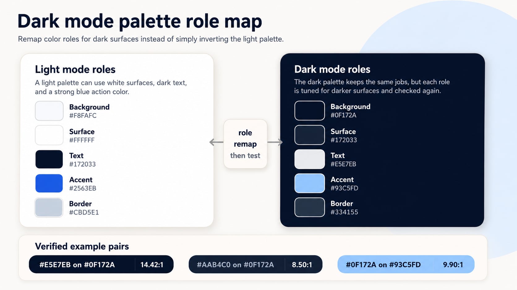
Start With the Core Roles
The Hue Codex dark mode color guide goes deeper into surfaces, elevation, contrast, shadows, and token handoff. For a first pass, keep the role set small enough to review instead of generating a giant swatch wall.
| Role | What it does | Review question |
|---|---|---|
| Background | The deepest app or page canvas. | Is it dark enough to feel calm without swallowing all contrast? |
| Surface | Cards, panels, menus, and grouped content. | Can users tell it apart from the background without a heavy outline? |
| Text | Primary reading color for headings and body copy. | Does it pass the intended contrast target on every surface it appears on? |
| Muted text | Secondary labels, helper text, and metadata. | Is it quiet but still readable for its size and importance? |
| Accent | Primary action, selected state, links, or brand emphasis. | Does it stand out on dark surfaces without glowing or vibrating? |
| Border | Separates surfaces, controls, and states. | Can it be perceived against both adjacent colors? |
Verified Example Pairs
The pairs below use WCAG 2.x contrast math. Normal text needs at least 4.5:1 for AA, while large text needs at least 3:1. These examples are not a universal palette; they are a starting set that shows how to document foreground, background, role, and ratio together.
| Foreground | Background | Role | Contrast ratio | Use note |
|---|---|---|---|---|
| #E5E7EB | #0F172A | Primary text on page background | 14.42:1 | Strong enough for normal body text under WCAG 2.x AA. |
| #AAB4C0 | #0F172A | Muted text on page background | 8.50:1 | Readable for secondary labels, though context and size still matter. |
| #60A5FA | #0F172A | Accent link or emphasis text | 7.02:1 | Passes for text, but hover and visited states need their own checks. |
| #0F172A | #93C5FD | Text on primary action button | 9.90:1 | Dark text on a lighter accent is often calmer than glowing blue text. |
| #E5E7EB | #172033 | Text on raised surface | 13.14:1 | Check the card border or shadow separately if elevation matters. |
Build the Token Pattern
A dark mode color palette becomes easier to maintain when each color is stored by role. The CSS below is a starting pattern, not a finished theme. It uses plain custom properties and a prefers-color-scheme media query so the role names stay stable while the values change.
:root {
  color-scheme: light;
  --color-bg: #F8FAFC;
  --color-surface: #FFFFFF;
  --color-text: #172033;
  --color-text-muted: #52616B;
  --color-border: #CBD5E1;
  --color-accent: #2563EB;
}

@media (prefers-color-scheme: dark) {
  :root {
    color-scheme: dark;
    --color-bg: #0F172A;
    --color-surface: #172033;
    --color-text: #E5E7EB;
    --color-text-muted: #AAB4C0;
    --color-border: #334155;
    --color-accent: #93C5FD;
  }
}

body {
  background: var(--color-bg);
  color: var(--color-text);
}

.card {
  background: var(--color-surface);
  border: 1px solid var(--color-border);
}
Hue Codex Workflow
- List the roles your dark mode actually needs: background, surface, text, muted text, border, accent, focus, and alerts.
- Start from a restrained neutral ladder, then add one or two accent families instead of recoloring every component.
- Use the palette generator to explore related swatches, but keep only colors that can be named by role.
- Check every important foreground and background pair in the contrast checker before promoting it to a token.
- Document exceptions such as charts, illustrations, disabled controls, code blocks, and brand-only decorative areas.
If you are starting from one brand color, the palette generator can help you explore related candidates before you assign final dark-mode roles.
Common Mistakes
- Inverting the light palette and treating the result as finished.
- Using pure black backgrounds everywhere, then relying on high-chroma accents to create hierarchy.
- Testing text only on the main background while ignoring cards, modals, inputs, and hover states.
- Keeping the same accent color from light mode even when it blooms or vibrates on dark surfaces.
- Naming tokens by color value instead of role, which makes future palette changes harder to explain.
- Approving disabled, warning, success, and focus colors without checking their specific adjacent colors.
FAQ
Should a dark mode color palette use pure black?
Pure black can work in some contexts, but many interfaces use a very dark neutral instead because it gives surfaces, borders, and shadows more room to separate.
Can I reuse my light mode brand color in dark mode?
Sometimes, but it should be tested on the real dark surfaces. Many bright brand colors need a softer or lighter dark-mode variant for text, buttons, and selected states.
How many colors should a dark mode palette have?
Start with enough roles to cover real UI decisions: background, surface, text, muted text, border, accent, state colors, and focus. Add more only when a component needs a distinct job.
Does passing contrast mean the palette is finished?
No. Contrast is required for readable pairs, but the palette still needs hierarchy, brand fit, state distinction, and component review.
Final Takeaway
A strong dark mode color palette is built from roles, not inverted swatches. Start with surfaces and text, add accents only where they have a job, test the exact pairs, and then freeze the approved values as tokens. As a next step, take one light-mode palette and remap only six roles first: background, surface, text, muted text, border, and accent.
Spot an issue or want a color topic covered?Send a correction or request a post.