Page background
The deepest stable surface. Near-black is often easier to work with than absolute black because it leaves room for shadows, borders, and hierarchy.
Color guide
Dark mode is not a light palette with the values inverted. A strong dark theme uses deliberate surfaces, readable foregrounds, restrained chroma, visible borders, accessible focus states, tuned semantic colors, and CSS that respects user preferences.
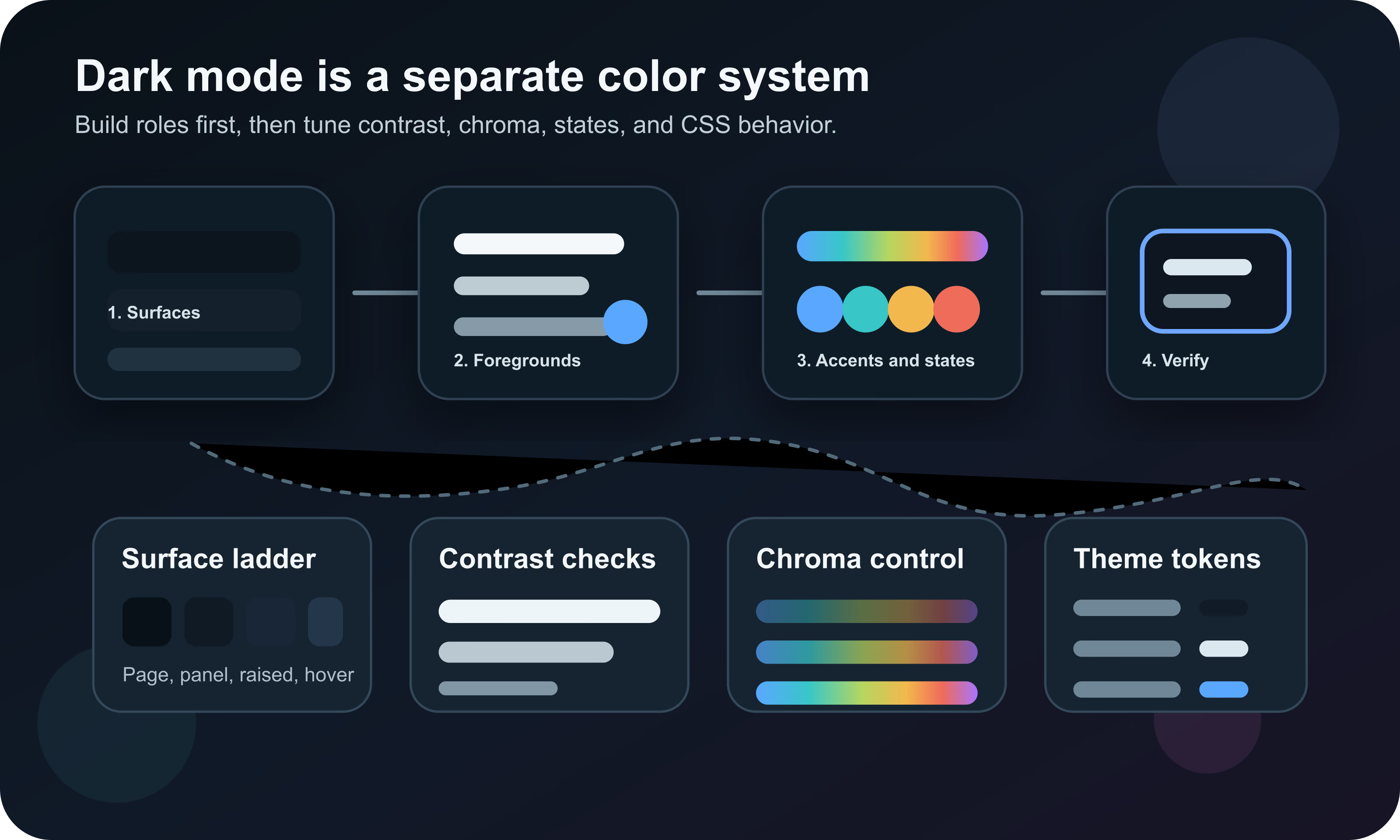
Build dark mode as its own color system. Start with a near-black surface ladder, then define readable foregrounds, muted text, borders, focus rings, action colors, semantic states, chart colors, and theme roles. Check every real foreground and background pair in dark mode, reduce chroma for large areas, avoid color-only meaning, and document reusable color roles where appropriate.
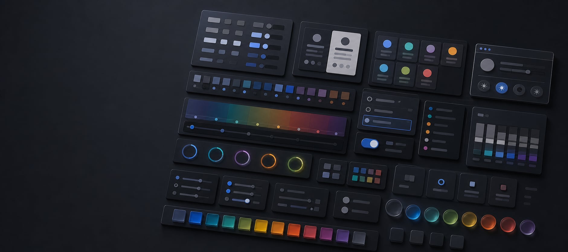
Dark mode color design is the practice of building a complete interface palette for dark backgrounds. It includes page backgrounds, surfaces, raised panels, text, muted text, borders, dividers, icons, focus indicators, links, buttons, form controls, semantic states, charts, shadows, images, and theme tokens.
A dark theme is successful when it feels comfortable in low-light conditions, preserves hierarchy, remains readable, supports the brand, respects user preferences, and stays accessible. It should feel like the same product in a different lighting condition, not a separate product with a decorative black skin.
A dark mode color system is a set of role-based colors, contrast rules, and semantic states designed specifically for dark user interface contexts.
Automatic inversion can produce a first draft, but it rarely produces a polished dark theme. A light interface often relies on subtle gray borders, dark shadows, pale backgrounds, high-chroma accents, and brand colors chosen for white surfaces. When those values are flipped, hierarchy and meaning can collapse.
Inversion also affects images, logos, charts, disabled states, shadows, focus rings, code blocks, maps, illustrations, and semantic colors. A red error value that works on white may become too loud on charcoal. A pale blue focus ring may disappear on a tinted dark panel. A brand yellow may fail as button text or glow against a near-black background.
| Light-mode assumption | Dark-mode problem | Better move |
|---|---|---|
| White page, gray card | Cards may vanish if all surfaces become similar dark grays | Create a surface ladder with clear role steps |
| Black text | Pure white replacement can glare in long reading contexts | Use near-white primary text and tuned muted text |
| Soft gray border | Border may disappear on dark panels | Use visible border tokens checked against adjacent surfaces |
| Bright brand accent | Accent may glow or dominate dense UI | Reduce chroma or use the vivid value only for small roles |
| Drop shadow elevation | Shadow can be invisible on dark backgrounds | Use surface lightness, borders, and subtle glow instead |
| Red, green, yellow states | States can become harsh or ambiguous | Tune semantic palettes separately for dark mode |
The surface ladder is the foundation of dark mode. It defines the difference between the page background, base panels, raised cards, controls, hover states, selected states, overlays, modals, and tooltips. Without it, a dark interface becomes a flat field of nearly identical rectangles.
A common approach is to use near-black for the page, then slightly lighter or cooler surfaces for panels and raised elements. The steps should be visible enough to support scanning, but subtle enough that the interface still feels calm. In dense software, the surface ladder often matters more than the accent color.
The deepest stable surface. Near-black is often easier to work with than absolute black because it leaves room for shadows, borders, and hierarchy.
The default card, panel, input, or sidebar surface. It should separate from the page without creating a high-contrast patchwork.
A slightly lighter or clearer surface used for menus, popovers, modals, active panels, and elements that sit above the page.
Hover, pressed, selected, and active states need their own values so controls do not rely only on a border or shadow.
Exact values depend on brand, product density, display quality, and desired mood, but the role structure is consistent. Name surfaces by use rather than by literal color so they can adapt across light, dark, high contrast, and future themes.
| Role | Purpose | What to check |
|---|---|---|
| surface-page | Main page or app background | Comfort, glare, and enough contrast for panels |
| surface-base | Cards, panels, sidebars, and input wells | Separation from page background |
| surface-raised | Menus, dialogs, popovers, and active sheets | Visible elevation without heavy shadows |
| surface-hover | Hover states for controls and rows | Clear enough for mouse users without flicker |
| surface-selected | Selected tabs, rows, pills, and nav items | Meaning is clear with text or icon cues |
| surface-overlay | Scrims, drawers, modals, and temporary layers | Background relationship and readable foregrounds |
| border-subtle | Low-emphasis dividers and control edges | Visible against both neighboring surfaces |
| border-strong | High-emphasis component boundaries | Non-text contrast and clear affordance |
Readable text is the most important dark-mode color decision. WCAG contrast thresholds still apply, but a dense interface can technically pass while feeling harsh if every paragraph uses pure white on pure black. Many mature dark themes use near-white primary text, softer secondary text, and carefully tested muted text.
Avoid making muted text so quiet that it becomes decorative. Labels, metadata, helper text, placeholders, disabled text, captions, breadcrumbs, tab labels, timestamps, and chart labels all need to be readable enough for their job.
| Role | Use | Dark-mode guidance |
|---|---|---|
| text-primary | Body copy, headings, primary labels | Near-white, not necessarily pure white |
| text-secondary | Supporting labels and descriptions | Softer than primary but still comfortably readable |
| text-muted | Metadata, timestamps, inactive labels | Use sparingly and test against every surface |
| text-disabled | Unavailable controls | Must communicate disabled state without vanishing |
| text-on-accent | Text on buttons, chips, alerts, and badges | Check against each accent and state color |
| icon-primary | Functional icons | Treat icons as foregrounds, not decoration |
Contrast is not optional in dark mode. Text, icons, buttons, input boundaries, focus indicators, chart marks, and status components need enough contrast against the surface where they actually appear. Do not check a token only against the page background if it will be used on cards, tinted panels, gradients, or images.
Dark themes also need real-state testing. The normal state might pass, while hover, active, disabled, selected, loading, error, warning, and focus states fail. This is common when teams lower contrast to make the interface feel softer.
A color that feels balanced on white can feel electric on a dark surface. This is why dark mode often needs lower chroma for large fills, softer tints for backgrounds, and separate accent values for text, borders, and filled controls.
Use vivid colors intentionally. A saturated blue focus ring, red danger button, or green success dot can be useful because it attracts attention. The problem starts when large panels, backgrounds, charts, and decorative blocks use the same vivid color for too much area.
Reduce chroma and keep lightness controlled. Large saturated regions can feel noisy and fatiguing on dark backgrounds.
Small interactive accents can carry more saturation because they need to be found quickly.
Use separate dark-mode ramps for error, warning, success, and info so each state remains legible and distinct.
Reduce saturation where the chart is dense. Preserve distinguishability with labels, markers, and ordering.
Simple hex edits and HSL lightness changes can create uneven steps in dark palettes. A color ramp may look balanced in code but jump visually from one step to the next. Perceptual color spaces such as Lab, LCH, OKLab, and OKLCH can make dark-mode ramps more predictable because they are designed around how color differences are perceived.
You do not need every production token to be authored by hand in OKLCH, but it is useful for palette creation. Build candidate ramps with more even perceived lightness and chroma, then test the actual rendered colors in browsers and design tools.
| Model | Useful for | Caution |
|---|---|---|
| HEX and RGB | Final CSS values and exact handoff | Hard to adjust perceptually by eye |
| HSL | Simple hue, saturation, and lightness thinking | Lightness steps may not look visually even |
| Lab and LCH | Perceptual color adjustments and ramps | Needs gamut checking for output colors |
| OKLab and OKLCH | More predictable modern ramps and theme tokens | Still needs browser and contrast testing |
Success, warning, error, danger, info, selected, new, promoted, disabled, and destructive colors often fail when reused from light mode. Dark mode changes the perceived brightness and urgency of those colors, so each semantic family needs its own foreground, background, border, icon, and filled-control values.
This is especially important for errors and warnings. A pale red error background may vanish on a dark card, while a saturated red panel may feel alarming in a context that only needs mild correction. Tune severity through role and scale, not hue alone.
| State | Roles needed | Check |
|---|---|---|
| Success | Text, icon, border, soft background, filled background | Distinguishable from brand green and chart green |
| Warning | Text, icon, border, soft background, filled background | Readable without relying only on yellow |
| Error | Text, icon, border, soft background, filled background | Clear but not painfully saturated |
| Info | Text, icon, border, soft background, filled background | Distinct from primary action color |
| Selected | Background, text, icon, border, focus relationship | Visible in lists, tabs, tables, and nav |
| Disabled | Foreground, background, border, cursor and label cues | Unavailable but still understandable |
Dark mode often exposes weak focus styling. A focus ring that is visible on white may disappear on charcoal, tinted cards, image backgrounds, or saturated buttons. Keyboard users need a clear focus indicator on every interactive element.
Use a focus token that has strong contrast against the component and the surrounding surface. If one ring color cannot work everywhere, use a layered focus style: an inner ring, an outer ring, offset, outline, or shadow that adapts by component role.
Light themes often use shadows for elevation. Dark themes can use shadows too, but a black shadow on a near-black background may be invisible. The more reliable dark-mode elevation toolkit is surface lightness, border contrast, subtle glow, spacing, and layer order.
Borders deserve explicit tokens. A border that is perfect on surface-base may disappear on surface-raised or become too loud on surface-page. High-density dashboards, tables, code editors, forms, and settings screens need particularly careful divider tuning.
Use for low-emphasis separators, table rows, and card outlines. They should support structure without drawing too much attention.
Use for inputs, focus-adjacent controls, selected states, and important layout boundaries.
Use slightly lighter surfaces for popovers, menus, dialogs, and active sheets when shadows are not enough.
A soft color glow can help focus or active states, but it should not replace a clear boundary.
Forms are where dark mode often breaks. Inputs, selects, textareas, checkboxes, radio buttons, sliders, toggles, validation messages, placeholders, autofill states, and disabled states all need real dark-mode values.
CSS color-scheme can also affect native form controls, scrollbars, and built-in UI colors. If a page supports dark mode, declare the intended color schemes so the browser can render supported native controls appropriately. Then still test the actual controls in target browsers.
| Form part | What can fail | Better practice |
|---|---|---|
| Input background | Too close to page or card surface | Use a defined input surface token |
| Input border | Invisible when inactive or too loud when active | Separate default, hover, focus, and error borders |
| Placeholder text | Too faint to read or too strong to distinguish from input text | Give placeholder a readable but clearly secondary token |
| Validation | Error color only appears in border | Add text, icon, and field-level message |
| Autofill | Browser color clashes with dark theme | Test real browser autofill behavior |
| Scrollbar and controls | Native UI stays light or low contrast | Use color-scheme and browser testing |
Dark mode is not only CSS colors. Images, logos, icons, screenshots, illustrations, maps, and product photography may need separate assets or treatment. A logo built for white backgrounds may need a reversed version. A screenshot with a white UI can create a bright block inside an otherwise comfortable dark page.
Do not dim every image automatically. Dimming can reduce clarity, distort brand colors, and make people look unnatural. Instead, decide by asset type: transparent logos, UI screenshots, editorial images, decorative illustrations, and data visuals each need different rules.
Charts need special attention because dark mode changes how gridlines, labels, legends, data marks, and categorical colors are perceived. A palette that is distinguishable on white can become muddy on charcoal, while a high-saturation chart can feel noisy in a dark dashboard.
Use lighter labels, quieter gridlines, sufficient mark contrast, and direct labeling where possible. Sequential scales, diverging scales, and categorical palettes should be tuned for the actual chart background rather than copied from the light theme.
Keep gridlines visible enough to read the chart but quiet enough that they do not compete with the data.
Axis labels, legends, and tooltips need their own foreground and surface tokens.
Make categories distinguishable in dark mode and under color-vision simulations.
Risk, loss, error, and warning colors should include labels or symbols, not only hue.
Modern CSS gives teams several ways to implement dark mode. The prefers-color-scheme media feature can respond to the user preference. The color-scheme property tells the browser which schemes an element supports, which can affect built-in rendering such as controls and scrollbars. CSS custom properties can hold theme tokens. light-dark() can choose between two colors when the used color scheme is known.
The most maintainable approach is usually token-first. Define semantic tokens such as --color-surface-page, --color-text-primary, --color-border-subtle, --color-action-primary, and --color-status-danger. Then assign different values for light and dark contexts. Components should consume tokens, not hard-code one-off dark values.
| Feature | What it does | Dark-mode use |
|---|---|---|
| prefers-color-scheme | Detects whether the user has expressed a light or dark preference | Apply dark token values when the user prefers dark |
| color-scheme | Indicates supported color schemes for browser-rendered UI | Help form controls and scrollbars match the theme |
| CSS custom properties | Store reusable theme values | Map component roles to light and dark values |
| light-dark() | Selects between light and dark color values in a color-scheme context | Useful for paired values without duplicating every declaration |
| forced-colors | Detects forced color mode | Avoid fighting user-selected high-contrast colors |
Dark mode should usually respect the system preference by default, but many products also need an explicit theme setting. A user may prefer dark mode at night, light mode in bright environments, or a specific theme for accessibility reasons. A good theme system can support system, light, dark, and sometimes high-contrast modes.
If the product includes a manual setting, make the choice persistent and easy to change. Avoid theme switches that flash through the wrong theme on page load. This is often solved by setting an early class or data attribute before the main CSS renders.
Dark mode accessibility is broader than a contrast number. People use dark themes for comfort, migraine sensitivity, low-light reading, battery preference, visual focus, and personal taste. Others find dark themes harder to read, especially with thin type, astigmatism, bright accents, or low-quality displays.
This means dark mode should be optional when possible and tested across real content densities. Long-form reading, dense tables, code editors, dashboards, forms, map views, and marketing pages each create different accessibility risks.
| Risk | Where it appears | Mitigation |
|---|---|---|
| Glare or halation | Pure white text on pure black, thin type, high-brightness screens | Use near-white text and comfortable font weight |
| Lost structure | Subtle borders, table rows, cards, nested panels | Create visible surface and border tokens |
| Color-only meaning | Alerts, charts, required fields, links, status dots | Add text, icons, patterns, labels, or shape |
| Invisible focus | Buttons, menus, form controls, dark tinted panels | Use high-contrast focus rings with geometry |
| Over-saturated accents | Charts, buttons, badges, notifications, gradients | Reduce chroma for large areas and tune semantic ramps |
| Forced colors conflict | Custom controls, SVG icons, pseudo-elements | Test forced-colors and avoid hard-coded overrides |
A reliable workflow starts with roles, not colors. If the team starts by choosing a charcoal background and a blue accent, the system will quickly run into missing states. Instead, list the UI roles, assign candidate values, test them in real components, and adjust in context.
Tokens keep dark mode maintainable. Avoid naming tokens after their current appearance, such as dark-gray-2, when the token actually means a card surface or muted text. Role names make it possible to change values without rewriting components.
| Token group | Example roles | Why it matters |
|---|---|---|
| Surface | surface-page, surface-base, surface-raised, surface-overlay | Keeps hierarchy separate from brand color |
| Foreground | text-primary, text-secondary, text-muted, text-disabled | Prevents unreadable muted and disabled states |
| Border | border-subtle, border-strong, border-focus | Makes structure and affordance testable |
| Action | action-primary, action-hover, action-active, action-disabled | Keeps buttons and links consistent |
| Semantic | status-success, status-warning, status-danger, status-info | Gives states tuned values for dark backgrounds |
| Data | chart-series, chart-grid, chart-label, chart-highlight | Avoids copying light-mode chart colors blindly |
| Overlay | scrim, modal-surface, tooltip-surface, popover-border | Controls temporary layers and depth |
Most dark-mode problems come from treating it as a finish layer instead of a system. A site can look impressive in a static mockup and still fail in forms, data tables, charts, focus states, or long reading contexts.
Hue Codex can help turn dark-mode decisions into real values. Use the picker and converter to inspect exact colors, the tint and shade tools to explore ramps, the contrast checker to test foreground and background pairs, the color blindness simulator to check distinguishability, and the CSS tools to export ready-to-use values.
The most useful workflow is iterative: choose candidate tokens, test them in a real component, adjust lightness and chroma, retest contrast, then document the values as role-based tokens. Dark mode gets good by testing the actual interface, not by admiring isolated swatches.
Use color conversion, tint and shade, harmonies, and palette generation to create surface, accent, and semantic ramps.
Use contrast and accessible pair tools to check text, icons, focus, borders, controls, and state colors.
Use CSS and token tools to document the final theme values for design and engineering.
This guide is written from practical UI design-system work and cross-checked against W3C CSS and WCAG references for color schemes, user preferences, CSS color, contrast, and color-only meaning.
Use the free tools to test the idea immediately: pick a color, convert it, generate harmonies, build tints and shades, check contrast, and export practical CSS or palette data.
Quick answers
There is no universal best value. Many interfaces work better with near-black or deep charcoal instead of absolute black because it leaves room for surface hierarchy, borders, shadows, and comfortable text.
Sometimes, especially for OLED-focused media experiences, but many apps and websites are more comfortable with near-black surfaces. Test the actual reading and UI density before choosing.
Use inversion only as a rough exploration. A production dark theme needs separate surfaces, text, borders, focus, semantic states, images, charts, and tokens.
Yes. Text, icons, controls, focus indicators, and other important visual elements still need to meet the relevant contrast requirements against their actual backgrounds.
Very high contrast can feel harsh in dense reading contexts, especially with thin type or bright displays. Near-white text on near-black surfaces often feels more comfortable while still supporting readability.
Dark surrounding surfaces make saturated colors feel more intense. Large bright fills can glow or dominate the interface, so dark themes often use lower chroma for large areas and reserve vivid color for small accents.
Yes. Error, warning, success, info, selected, disabled, and focus colors should be tuned separately for dark backgrounds and tested in real components.
Most interfaces need at least page, base, raised, hover, selected, input, overlay, and border roles. Dense apps may need more specific table, chart, sidebar, and code-editor roles.
color-scheme tells the browser which color schemes an element supports. It can affect browser-rendered UI such as form controls and scrollbars.
prefers-color-scheme is a media feature that lets CSS respond to the user preference for light or dark color schemes.
Often yes, but products with long sessions should also consider a manual setting for system, light, and dark. Users may need different themes in different environments.
Sometimes. Logos, screenshots, illustrations, charts, and maps may need reversed versions, borders, alternate screenshots, or separate palettes to work on dark backgrounds.
Yes. OKLCH can help create more perceptually even ramps, especially for surface, accent, and semantic color scales. Final values still need gamut and contrast testing.
Name tokens by role, such as surface-page, text-primary, border-subtle, action-primary, and status-danger. Role names are easier to maintain than names tied to one visible color.