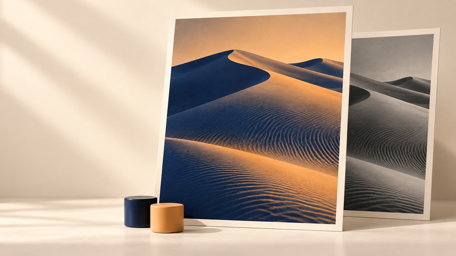
Quick answer
A duotone generator maps darker image pixels toward a shadow color and lighter pixels toward a highlight color, with intermediate tones between them. In Hue Codex, record those colors plus Intensity, Midtones, and Contrast to make the treatment repeatable. Export the PNG for the rendered image; the CSS export is an approximation.
A campaign needs its landscape photos to feel related, even though one image is warm and bright and another is cool and overcast. A two-color treatment can give them a shared visual direction. The difficult part is preserving the subject while making the next image follow the same recipe.
This duotone generator workflow produces two deliverables: a rendered image and a small record of its settings. Start with the Hue Codex demo to compare results, then repeat the process with your own image. The example uses opaque navy and apricot endpoints so the effect is easy to inspect.
1. Establish a baseline in the duotone generator
Open the Hue Codex Duotone Generator and use Restore demo for the landscape shown below, or choose a JPG, PNG, WebP, or AVIF file under Image file. Local files are decoded and processed in the browser. For your first pass, choose an image with a recognizable subject and some detail in both its darker and lighter areas.
Set Shadow color to #172B4D and Highlight color to #F6BD80, then choose Balanced image under Treatment. Confirm the controls against this baseline before making adjustments. The colors are a worked example, not a required brand palette.
| Setting | Value | Purpose |
|---|---|---|
| Shadow color | #172B4D | Maps the darkest tones toward navy. |
| Highlight color | #F6BD80 | Maps the lightest tones toward apricot. |
| Intensity | 100% | Uses the full mapped treatment. |
| Midtones | 0 | Keeps the midpoint adjustment neutral. |
| Contrast | 100% | Keeps the tone range at its baseline. |
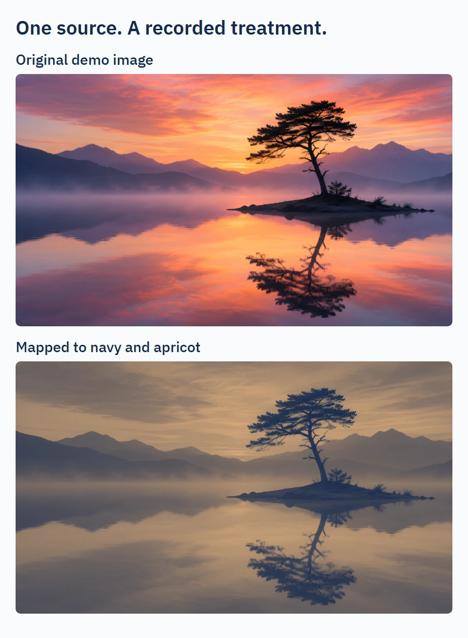
Notice what survives the change: the tree silhouette, distant mountain layers, and reflection. The result contains many intermediate colors along the selected ramp. A digital duotone effect is not a conversion into exactly two flat pixel colors.
2. Change one tone control at a time
Keep the two endpoint colors fixed while tuning the image. Begin with Midtones when the subject feels too dark or too light: a negative value moves middle tones toward the shadow color, while a positive value moves them toward the highlight. Compare each adjustment with the baseline before touching another control.
Here is a controlled example using a test image with opaque black, #808080 gray, and white patches. Intensity stays at 100% and Contrast at 100%. Only Midtones changes. These are verified pixel results from the Hue Codex tool, not colors estimated from the landscape screenshot.
| Midtones | Mapped gray | Effect on this patch |
|---|---|---|
| −20 | #5B575C | Moves toward the navy shadow. |
| 0 | #877467 | Uses the unshifted ramp position. |
| +20 | #B39171 | Moves toward the apricot highlight. |
In all three tests, black still maps to #172B4D and white to #F6BD80. The midtone adjustment has no effect at those two endpoints. This gives you a useful diagnostic: if the middle is wrong but the endpoints are right, try Midtones before choosing a new pair of colors.
Contrast changes how far tones spread around the midpoint. Increasing it can strengthen separation, but may flatten near-black or near-white detail into the ends of the ramp. Lowering it compresses the range. Intensity has a different job: reducing it blends the processed result back toward the original image, so original colors can return.
Hue Codex calculates this mapping from encoded canvas RGB channels. It is not a perceptual color-space interpolation or the full relative-luminance calculation used for text contrast. The Image Sampling and Processing Methodology documents the equations and browser-dependent limits if you need to reproduce the processing.
3. Judge the treatment at the final crop
A good full-image preview can hide a weak mobile crop. Inspect the part of the image that will actually appear in the banner, card, or social graphic. Cropping can remove the brightest area or enlarge a dark region, changing the visual balance even though the treatment settings are identical.
- Compare small defining details, such as branches, edges, fabric, or lettering in the source. Keep the detail the image needs to communicate.
- Inspect a dark area and a light area. If texture disappears after increasing Contrast, step the control back and compare again.
- Check the image at its intended display size as well as enlarged. A texture that survives at full resolution may no longer read in a small card.
The result viewer supports keyboard inspection: focus it and hold S for split comparison or O for the original view. Plus and minus change the detail magnification. Use these views to compare the same region rather than relying on your memory of the source.
If the finished layout places text over the image, review the text against the actual image behind it at each crop. The tool’s overlay-text suggestion checks the two endpoints; it does not certify every pixel, text position, or responsive layout. Keep that layout review separate from approving the visual treatment.
4. Export the image and the recipe together
Choose Download PNG for the rendered image. The demo used here downloads as huecodex-duotone.png at 1800 × 1040 pixels, while its on-page canvas preview is 900 × 520. The export renders from the original source dimensions, so use that file instead of a screenshot of the preview.
| Output | What it gives you | What to keep beside it |
|---|---|---|
| Download PNG | The rendered treatment at source image dimensions. | Source file, intended crop, and placement. |
| JSON data or Markdown report | Endpoint colors and the selected treatment settings. | The original image and any crop decisions. |
| CSS approximation | A starting point for a live browser effect. | A separate visual review; it is not an exact PNG replacement. |
Select JSON data under Export to record the source name and dimensions, colors, intensity, midtone bias, and contrast. Keep that output beside the downloaded image. The settings record does not contain the source image pixels, and its source dimensions do not describe your final website crop.
Give the handoff a short note naming the intended placement and what was reviewed. For example: “Landscape card; centered crop keeps the tree; checked at desktop and mobile card sizes.” For a second image, retain the baseline recipe first, then record any image-specific adjustment as an exception instead of silently changing the shared settings.
Questions about duotone exports
Why does the image contain more than two visible colors?
The two selected colors are endpoints. Intermediate source tones map to intermediate colors between them. Reducing Intensity can also reintroduce colors from the original image.
Why does the same recipe look different on another photo?
The photos contain different distributions of dark, middle, and light tones. A repeatable recipe preserves the processing choices; it does not make different source images have identical tonal balance.
Is the PNG a two-ink file for a print shop?
No. This workflow exports a rendered digital image. A print duotone uses ink-specific preparation and curves; arrange the required separation and proofing workflow with the printer.
Save one reusable treatment
Finish one image, save its PNG and settings, and apply the same baseline to a second source. Compare the subject detail and intended crops before adjusting anything. You will have a usable treatment recipe plus a record of where it needs exceptions, ready for the next image in the set.
Spot an issue or want a color topic covered?Send a correction or request a post.