Quick answer
A focus ring contrast checker tests whether a keyboard focus indicator stands out from adjacent colors. In Hue Codex, check the ring color against both the page background and the component fill, using the 3:1 UI/non-text target as a contrast baseline; still review size, offset, clipping, and every focusable state manually.
A focus ring contrast checker helps answer a narrow but important question: can people see where keyboard focus is right now? That answer depends on the ring color, the page surface around the component, the component fill inside the ring, and whether the indicator remains visible in the real UI.
This tutorial shows a practical Hue Codex workflow for testing a focus ring color before it becomes a design-system token or CSS rule. The goal is not to declare full WCAG conformance from one number. The goal is to catch weak focus colors early, document the adjacent-color checks, and leave the remaining focus appearance review visible.
What the Checker Tests
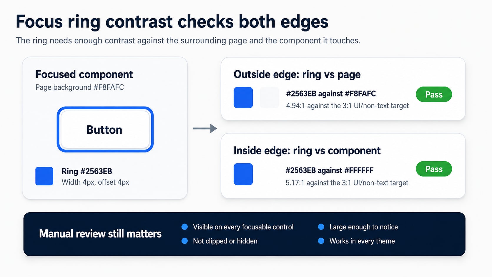
A focus indicator often touches two colors at once: the page or panel outside the control, and the control surface inside the outline. A ring can pass against one edge and fail against the other. That is why Hue Codex checks ring versus page and ring versus component separately.
| Check | What it compares | Why it matters |
|---|---|---|
| Ring versus page | Focus ring color against the surrounding page, card, or panel background. | The outside edge helps the user locate the focused component in the layout. |
| Ring versus component | Focus ring color against the component fill or inner surface. | The inside edge keeps the ring visible when the component itself is light, dark, branded, or tinted. |
| Weakest edge | The lower of the two contrast ratios. | The weakest edge usually decides whether the ring needs a color, offset, or geometry adjustment. |
Step 1: Capture the Real Focus Colors
Before opening a focus ring contrast checker, identify the exact colors the ring touches. Use production tokens, inspected CSS values, or agreed design-system values. Avoid testing a ring against a white placeholder if the component actually sits on a tinted card, dark toolbar, gradient, or image-backed surface.
- Ring color: the outline, box-shadow, border, underline, or custom focus indicator color.
- Page background: the surface outside the component or around the visible indicator.
- Component fill: the button, input, menu item, link treatment, or card action surface inside the indicator.
- Geometry: ring width, outline offset, shape, radius, and whether the ring is drawn inside or outside the component.
Step 2: Test the Ring Against Both Edges
Open the Hue Codex focus ring contrast tool, enter the ring, page, and component colors, then choose a preview component that resembles the real UI state. The tool reports ring-versus-page and ring-versus-component ratios against a 3:1 UI/non-text target, previews the focused state, and can export a copy-ready handoff.
| Pair | Ratio | Review result |
|---|---|---|
| #2563EB ring against #F8FAFC page | 4.94:1 | Passes the 3:1 UI/non-text target for the outside edge. |
| #2563EB ring against #FFFFFF component | 5.17:1 | Passes the 3:1 UI/non-text target for the inside edge. |
| #93C5FD ring against #FFFFFF component | 1.80:1 | Fails the 3:1 UI/non-text target and should not be used as the only visible focus cue. |
Step 3: Do the Manual Focus Appearance Review
Contrast is necessary, but it is not the whole focus-state review. WCAG 2.2 Focus Appearance includes separate ideas around focus-indicator area and the visual change from unfocused to focused states. Hue Codex documents this limit in its WCAG contrast methodology: the Focus Ring Contrast tool checks adjacent-color contrast, not the full size, area, obstruction, or state-change requirement.
| Review item | Question to answer |
|---|---|
| Size and shape | Is the indicator large enough to notice around the component or subcomponent? |
| Offset and clipping | Does overflow, border radius, container clipping, or nearby content hide part of the ring? |
| Theme coverage | Does the same token work in light mode, dark mode, selected states, disabled-looking contexts, and branded surfaces? |
| Keyboard coverage | Does every keyboard-focusable control show a visible focus indicator when reached with keyboard navigation? |
Step 4: Use a CSS Pattern You Can Audit
This CSS is a starting pattern, not a universal drop-in. It keeps the focus token visible, uses an offset so the ring can be compared against both adjacent colors, and relies on :focus-visible for keyboard-oriented focus styling. Test the real components after applying it.
:where(a, button, input, select, textarea, [tabindex]):focus-visible {
  outline: 4px solid var(--focus-ring-color, #2563EB);
  outline-offset: 4px;
}

:where(a, button, input, select, textarea, [tabindex]) {
  --focus-ring-color: #2563EB;
}
Step 5: Document the Handoff
A useful focus-ring handoff records more than a passing color. Include the ring token, tested adjacent colors, ratios, ring width, offset, focus style, and any manual caveats. This gives designers, developers, QA reviewers, and accessibility reviewers the same evidence instead of a vague note that the color is accessible.
- Record the ring color and the component state where it is used.
- Record ring-versus-page and ring-versus-component contrast ratios.
- Note the ring width, offset, and whether it is outline, border, box-shadow, underline, or another indicator.
- List the component types tested, such as buttons, inputs, links, cards, tabs, and menu items.
- Keep a manual-review note for size, clipping, obstruction, and theme coverage.
For a broader review of focus indicators, links, states, and non-color cues, pair this workflow with the Hue Codex color accessibility guide.
Common Mistakes
- Testing the focus ring only against the page background and ignoring the component fill.
- Using a pale brand tint as the only focus indicator on white or near-white surfaces.
- Removing browser focus outlines before a replacement has been implemented and tested.
- Letting overflow hidden, card clipping, or tight spacing cut off the indicator.
- Checking a single button while leaving links, custom controls, tabs, menus, and form fields untested.
FAQ
What does a focus ring contrast checker measure?
It measures the contrast between the focus indicator color and adjacent colors, usually the page background and the component fill.
Is a 3:1 focus ring enough for full WCAG 2.2 Focus Appearance?
No. The 3:1 adjacent-color check is only part of the review. Focus Appearance also involves indicator area and the visual change between focused and unfocused states.
Should the ring be outside or inside the component?
Either can work if it is visible, not clipped, and distinguishable from adjacent colors. An outside ring with offset is often easier to review because the page and component edges are clearer.
Can brand colors be used for focus rings?
Yes, but test them in context. A brand color that passes on white may fail on a tinted card, dark toolbar, or component fill.
Final Takeaway
A focus ring contrast checker is most useful when it is part of a real keyboard-accessibility review. Test the ring against both adjacent colors, document the ratios, then confirm the indicator is large, visible, unclipped, and present across every focusable component. As a next step, choose one focus-ring token, test it on a light component and a dark component, and update the token only after both edges and the manual review pass.
Spot an issue or want a color topic covered?Send a correction or request a post.