
Quick answer
Gradient text color CSS usually uses a readable fallback color first, then applies a gradient background clipped to the text inside an @supports rule. Use it for display text, test every visible stop and midpoint against the real background, and keep a solid fallback for unsupported or high-contrast situations.
Gradient text can make a display heading feel more polished, but it is easy to ship a beautiful effect that is fragile, unreadable, or invisible in older rendering contexts. The safer pattern is to treat gradient text as progressive enhancement: start with a readable solid color, add the clipped gradient only when the browser supports the technique, then check the visible gradient samples against the real background.
This tutorial builds a gradient text color CSS pattern for a short marketing or product heading on a white interface surface. The example uses #1D4ED8 to #0F766E because the start, midpoint, and end all pass WCAG 2.x AA contrast for normal text against #FFFFFF. Use the same workflow with your own brand colors before promoting the style into a design system token.
What the CSS Technique Actually Does
CSS does not have a single font-color gradient property. The common technique paints a gradient as the element background, clips that background to the text glyphs, and makes the text fill transparent so the background shows through. That means the effect depends on both text rendering and background clipping, so a fallback color matters.
| Layer | Job | Review risk |
|---|---|---|
| Fallback color | Keeps the heading readable before the enhancement applies. | If this color fails contrast, the fallback is not a real fallback. |
| Gradient background | Defines the visual color movement used by the clipped text. | A pale stop can make part of the word unreadable on light surfaces. |
| background-clip: text | Limits the painted background to the text shape. | Support and rendering details are why the enhancement belongs in @supports. |
| Transparent text fill | Reveals the clipped gradient through the text glyphs. | If clipping does not apply, transparent text can disappear. |
| Contrast samples | Checks each meaningful gradient color against the actual surface. | The weakest sample decides whether the effect is safe for real text. |
Step 1: Choose a Solid Fallback First
Start with the color people will see if the gradient enhancement is not applied. For this example, #1D4ED8 on #FFFFFF has a 6.70:1 contrast ratio, so it clears the WCAG 2.x AA threshold for normal text. Check your fallback in the Hue Codex contrast checker before writing the gradient CSS, because a fallback that fails contrast only hides the problem until the enhancement is unavailable.
Step 2: Build Stops, Then Sample the Middle
Use the Hue Codex gradient generator to choose the gradient direction, stop colors, midpoint behavior, and fallback CSS. Then adapt the values for text instead of treating the generated background as finished. Overlay text on a gradient background and gradient-filled text on a plain background are different contrast problems, so test the text colors against the page surface after you choose the stops.
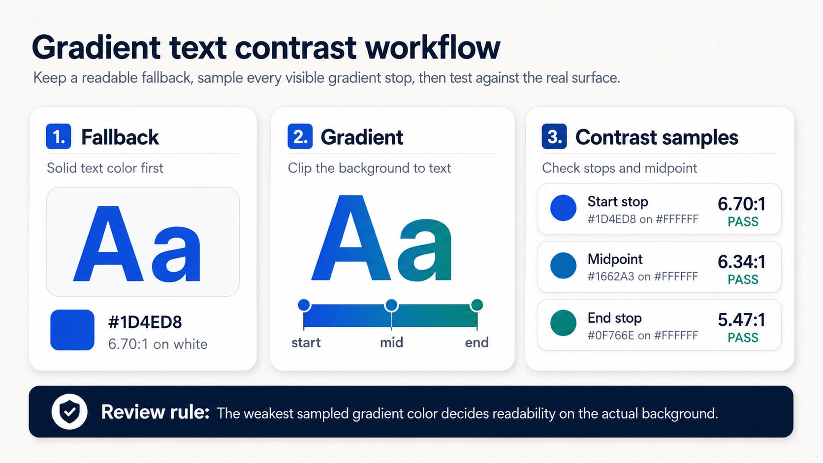
| Sample | Foreground / background | Ratio | Use decision |
|---|---|---|---|
| Fallback and start stop | #1D4ED8 on #FFFFFF | 6.70:1 | Passes WCAG 2.x AA for normal text. |
| sRGB midpoint sample | #1662A3 on #FFFFFF | 6.34:1 | Passes WCAG 2.x AA for normal text. |
| End stop | #0F766E on #FFFFFF | 5.47:1 | Passes WCAG 2.x AA for normal text. |
| Pale blue caution sample | #93C5FD on #FFFFFF | 1.80:1 | Fails normal text and large text contrast; keep it decorative or darken it. |
Step 3: Write CSS With Progressive Enhancement
The CSS below is a starting pattern for a display heading. The normal color declaration comes first. The gradient layer is guarded by @supports so unsupported environments keep the solid color instead of ending up with transparent text. The prefixed text-fill declaration is included because common gradient text examples still need it for practical browser rendering.
.gradient-text {
  color: var(--gradient-text-fallback, #1D4ED8);
}

@supports ((background-clip: text) or (-webkit-background-clip: text)) {
  .gradient-text {
    --gradient-text-start: #1D4ED8;
    --gradient-text-end: #0F766E;

    background-image: linear-gradient(
      90deg,
      var(--gradient-text-start),
      var(--gradient-text-end)
    );
    background-clip: text;
    -webkit-background-clip: text;
    color: transparent;
    -webkit-text-fill-color: transparent;
  }
}
Step 4: Tokenize the Decision
Once the effect passes review, document the fallback, gradient stops, sampled midpoint, and surface together. If your team is choosing between HEX, HSL, OKLCH, or another notation, the CSS color formats guide can help separate authoring convenience from production fallback behavior.
| Token | Value | Why it is stored |
|---|---|---|
| --gradient-text-fallback | #1D4ED8 | Readable solid color before the enhancement applies. |
| --gradient-text-start | #1D4ED8 | First visible gradient stop and fallback match. |
| --gradient-text-mid-sample | #1662A3 | Contrast review sample for the middle of the effect. |
| --gradient-text-end | #0F766E | Final visible gradient stop. |
| --gradient-text-surface | #FFFFFF | The background used for the documented contrast ratios. |
Step 5: Verify the Real UI
Gradient text should not be approved from a code snippet alone. Review the final type size, font weight, background, dark mode, wrapping behavior, zoom, and any image or patterned surface behind the text. If the heading can wrap across lines, sample colors from each line because the gradient positions may shift across the text box.
- Use gradient text for short display copy, not body copy, form labels, error messages, or essential instructions.
- Test each stop and a midpoint sample against the actual page background, not a default white canvas unless the surface is truly white.
- Keep the solid fallback color readable and visually acceptable on its own.
- Check hover, responsive wrapping, dark mode, and high-contrast user settings in the real interface.
- Document whether the gradient is decorative branding or carries meaning that must remain perceivable without color.
Common Mistakes
- Starting with transparent text before a working fallback color is in place.
- Checking only the darkest gradient stop and ignoring a pale endpoint or midpoint.
- Assuming a gradient that works on white also works on tinted, image-backed, or dark surfaces.
- Using gradient text for long paragraphs where the color movement interrupts scanning and readability.
- Copying a decorative gradient from a hero background and using it as text without testing every visible sample.
FAQ
Can CSS apply a gradient directly to color?
Not as a simple color property. The common pattern uses a gradient background, clips that background to the text, and makes the text fill transparent.
Is gradient text accessible?
It can be readable when every visible gradient sample has enough contrast against the real background. It is not automatically accessible, and it should usually be limited to short display text.
What contrast ratio should gradient text meet?
For WCAG 2.x AA, normal text needs at least 4.5:1 and large text needs at least 3:1 against the background. Check the actual stop colors and important midpoint samples.
Should the fallback match the first gradient stop?
It often should, because that keeps the fallback visually related to the enhanced version. It still needs its own contrast check against the page surface.
Final Takeaway
A good gradient text color CSS pattern is less about the visual trick and more about the review loop around it: solid fallback first, clipped gradient second, contrast samples third, and real UI verification last. As a next step, choose one short heading, test the fallback and gradient samples against its actual background, and only then promote the style into shared tokens.
Spot an issue or want a color topic covered?Send a correction or request a post.