Quick answer
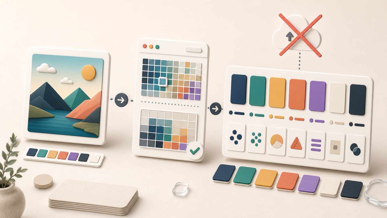
An image palette extractor no upload workflow analyzes a local image in your browser instead of sending the file to a server. Hue Codex reads browser-side pixels, groups nearby colors into swatches, and helps you turn those swatches into palette roles before export.
An image palette extractor no upload workflow is useful when you want colors from a photo, screenshot, logo, illustration, or moodboard without handing that file to a remote service. The goal is not just to list pretty HEX values. The goal is to turn local image pixels into a small palette you can review, name, test, and use.
This tutorial shows a practical Hue Codex workflow: choose a local image, extract representative swatches in the browser, pick the right swatch count and focus mode, then translate the result into palette roles for design and development handoff.
What No Upload Means
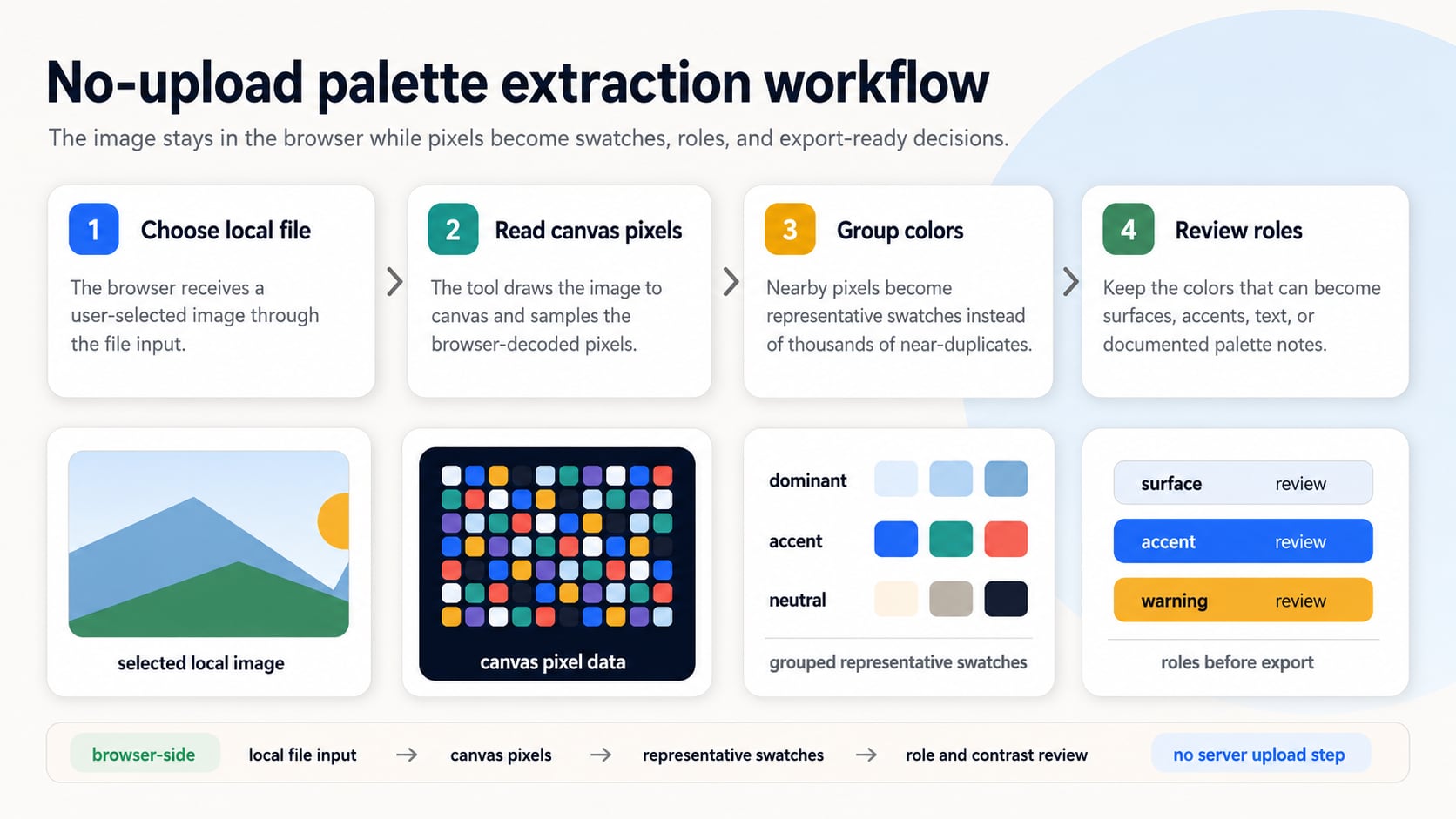
In this context, no upload means the selected image is processed by the browser-side tool rather than sent to a server for palette extraction. Browser file inputs let a web application work with a file the user chooses, and canvas pixel APIs can read image data after the image is drawn into a canvas.
That does not make every image automatically safe to use. You still need permission to process the source image, and you should avoid dropping sensitive client, legal, medical, or private material into any tool unless your workflow allows it. No-upload palette extraction reduces unnecessary file sharing, but it does not replace your own privacy and licensing judgment.
Before You Start
- Use a source image you are allowed to process.
- Decide whether you need moodboard colors, brand exploration, UI-role candidates, or exact source samples.
- Crop the image mentally before extraction: a busy background can dominate the palette.
- Plan to test contrast later; extracted swatches are candidates, not finished production colors.
Step 1: Choose the Right Source Image
Start with the image that actually represents the color direction you want. A product photo can reveal brand-adjacent neutrals and accents. A screenshot can help match an interface. A moodboard can suggest atmosphere. A logo can provide source colors, but it may need manual sampling if the file includes shadows, compression, gradients, or anti-aliased edges.
| Source image | Best use | Watch for |
|---|---|---|
| Product photo | Brand mood, campaign colors, supporting neutrals | Lighting and shadows can overrepresent dark or warm tones. |
| Website screenshot | Matching page colors or extracting an existing UI direction | Text antialiasing and screenshots can add many near-duplicate colors. |
| Logo file | Official brand source colors or accent candidates | Gradients and transparent edges may need manual eyedropper sampling. |
| Moodboard image | Early creative direction and atmosphere | Large backgrounds can drown out small but important accents. |
Step 2: Extract the Palette in Hue Codex
Open the Hue Codex image palette extractor, choose a local image, then generate a first palette before changing settings. The extractor reads browser-side pixels, groups nearby colors, skips mostly transparent pixels, and returns representative swatches with coverage, contrast hints, role suggestions, and copy-ready outputs.
- Choose the image from your device or start with the default image to understand the controls.
- Pick a swatch count: 5 for a clean summary, 7 for balanced exploration, 9 or 12 for richer source material.
- Choose a focus mode based on the task: dominant, balanced, vivid, or UI-role extraction.
- Sort the palette by coverage, lightness, hue, or best text contrast depending on how you want to review it.
- Copy the result as HEX, CSS variables, JSON, markdown, or token-style data when the candidate palette is ready to document.
Step 3: Pick Settings for the Job
The right settings depend on what you are trying to extract. A campaign moodboard usually needs a compact, expressive palette. A UI palette draft needs neutrals, action colors, and enough contrast separation. A brand review may need a more careful pass with manual samples after the automated extraction.
| Goal | Suggested settings | Why |
|---|---|---|
| Moodboard palette | 5 or 7 swatches, balanced focus, sort by hue | Keeps the palette readable while preserving the image's overall feel. |
| Vivid campaign accents | 7 or 9 swatches, vivid focus, sort by coverage | Pulls stronger color moments without losing dominant context. |
| UI-role candidates | 9 or 12 swatches, UI-role focus, sort by best text contrast | Helps separate possible surfaces, accents, and readable foregrounds. |
| Logo color review | Detailed quality, fewer swatches, then manual eyedropper samples | Avoids treating edge pixels and compression artifacts as official colors. |
Step 4: Turn Swatches Into Palette Roles
Extracted colors are not a palette system yet. Assign jobs before you export final values. A color can be a surface, text color, accent, status color, chart series, illustration color, or brand cue. If a swatch cannot hold a useful role, remove it or keep it only as reference.
The palette anatomy guide is useful here because it separates a palette into roles instead of treating every swatch as equally important.
| Candidate role | Question to ask | Keep or adjust |
|---|---|---|
| Surface | Is it calm enough behind content? | Lighten, mute, or reserve for decorative areas if it competes with text. |
| Text or icon | Does it contrast against the real background? | Check the actual foreground/background pair before naming it. |
| Primary action | Does it stand out without breaking the brand tone? | Test hover, active, focus, and disabled states separately. |
| Status color | Does the meaning stay clear without hue alone? | Pair with text, icons, labels, or patterns when needed. |
Step 5: Use Manual Sampling When Precision Matters
Automated extraction summarizes an image. It is not the same as choosing an exact source pixel. If you need the color from a logo mark, product label, chart line, or specific UI element, use the image eyedropper after the palette extraction. Pin exact or averaged samples, compare them to the generated palette, and keep the value that best matches the real decision.
Review Checklist
- Remove duplicate swatches that only differ by tiny lightness or compression changes.
- Keep at least one usable neutral if the palette needs UI surfaces or text.
- Test any text, icon, button, or status color as a foreground/background pair.
- Document where the palette came from, especially if it supports a brand or campaign decision.
- Export only the values you can explain as roles, not every interesting color in the source image.
FAQ
What is an image palette extractor no upload workflow?
It is a palette extraction workflow where the selected image is processed locally in the browser instead of being sent to a server for analysis.
Are extracted palettes ready for production?
No. Extracted swatches are starting points. You still need to assign roles, check contrast, remove duplicates, and verify the colors in the real layout.
When should I use an eyedropper instead of automatic extraction?
Use an eyedropper when you need a precise source pixel or a small averaged sample from a specific logo, product, screenshot, or UI element.
How many colors should I extract from an image?
Use 5 swatches for a concise direction, 7 for balanced exploration, and 9 or 12 when the image has several useful accents, neutrals, shadows, or highlights.
Final Takeaway
An image palette extractor no upload workflow is strongest when it turns a local image into a decision aid, not a finished palette by itself. Extract the browser-side swatches, choose roles, verify contrast, and export only the colors that can carry a clear job. As a next step, run one image through the extractor, keep no more than seven candidate swatches, and name each one by its intended role before using it.
Spot an issue or want a color topic covered?Send a correction or request a post.