Primary
The main brand or action color. It often appears in primary buttons, active states, key links, logo systems, and high-priority highlights.
Color guide
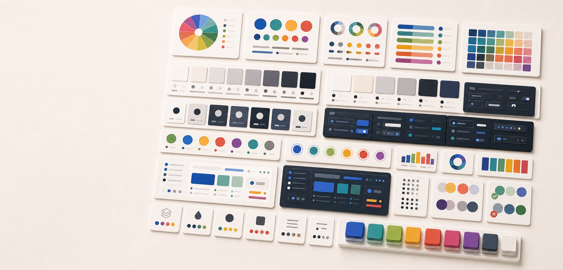
A useful palette is not just a row of attractive swatches. It is a system of named roles that explains what each color does, where it can be used, which foregrounds and backgrounds are allowed, and how the palette adapts across themes, states, charts, and production handoff.
Palette anatomy is the structure of a practical color system. A complete palette usually includes brand roles, neutral roles, surface roles, text roles, border roles, action roles, semantic roles, focus roles, chart roles, overlay roles, theme variants, and documented color roles. The palette is not finished until the important foreground and background pairings are tested for contrast, color-only meaning, dark mode, and real component use.
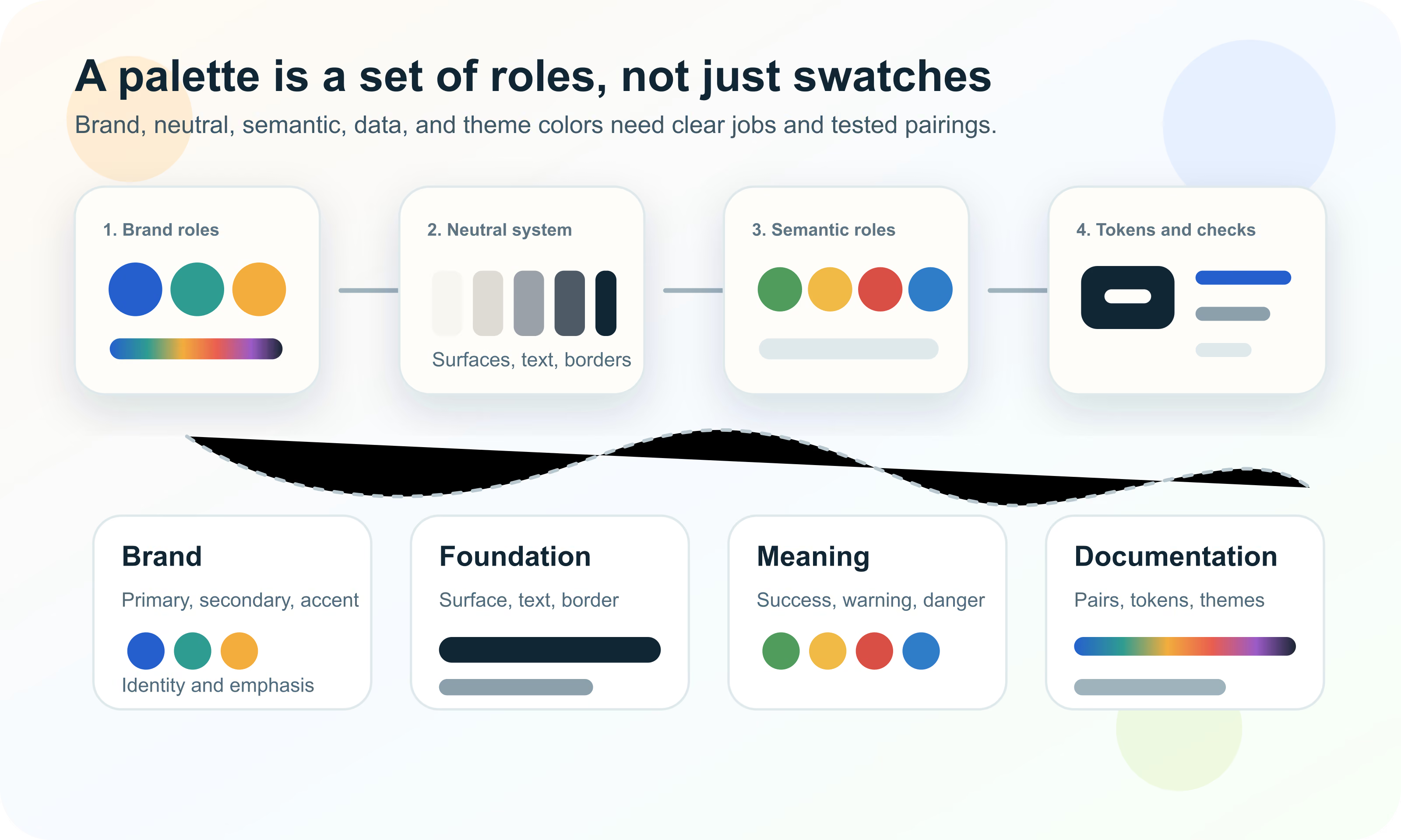
Palette anatomy is the internal structure of a color palette. It defines the roles that colors play in a brand, website, app, dashboard, design system, or content product. A palette with anatomy has purpose: one color may be for primary actions, another for success states, another for page backgrounds, another for muted text, and another for chart series.
Without anatomy, a palette is just a collection of swatches. That can work for a moodboard, but it breaks down in production. Teams need to know which colors are safe for text, which are decorative, which are reserved for state meaning, which appear in charts, and which combinations are disallowed.
Palette anatomy is the role-based structure of a color system, including brand, neutral, surface, text, border, action, semantic, chart, theme, and token roles.
The simplest way to evaluate a palette is to ask what every color is responsible for. A primary color might carry brand recognition and main actions. A neutral scale might carry backgrounds, borders, text, dividers, disabled controls, and hover states. A semantic red might communicate danger, but only when supported by text or icons.
This job-based thinking prevents color drift. If the same blue is used for brand identity, links, selected tabs, chart series, focus rings, and info messages, the interface can become ambiguous. Role separation lets teams reuse colors safely or create aliases when the same underlying value has different responsibilities.
| Role group | What it controls | Common examples |
|---|---|---|
| Brand | Identity and visual recognition | Primary, secondary, accent, campaign colors |
| Foundation | Interface structure and readability | Background, surface, text, border, divider |
| Action | Interactive commands and navigation | Button, link, selected, hover, active |
| Semantic | Meaningful states | Success, warning, danger, info, disabled |
| Focus | Keyboard and interaction visibility | Focus ring, active outline, selection boundary |
| Data | Charts, maps, graphs, and analytics | Series, sequential, diverging, highlight, grid |
| Theme | Light mode, dark mode, high contrast, brand variants | Theme aliases and mode-specific values |
| Documentation | Handoff and governance | Tokens, approved pairs, disallowed pairs, usage notes |
Brand colors create recognition. The primary color is usually the most identifiable color in the system. Secondary colors support the brand without competing with the primary. Accent colors are used for emphasis, highlights, illustrations, promotions, badges, or moments that need extra attention.
Brand colors should not automatically become UI colors. A logo blue might be excellent for identity and too low contrast for text. A vivid orange might be perfect for a campaign and too aggressive as a repeated button color. Brand roles need usage rules.
The main brand or action color. It often appears in primary buttons, active states, key links, logo systems, and high-priority highlights.
A supporting color used for secondary actions, illustrations, sections, tabs, product lines, or alternate brand moments.
A high-emphasis color reserved for callouts, badges, charts, marketing moments, or specific UI emphasis.
Temporary or seasonal colors that can extend the palette without replacing the core identity system.
In most interfaces, neutral colors carry more load than brand colors. Page backgrounds, cards, panels, form fields, labels, captions, borders, dividers, disabled states, hover states, skeleton loaders, and overlays are often neutral. If the neutral system is weak, the whole palette feels unstable.
A good neutral scale is not merely a grayscale ramp. It should be tuned for the product mood, background color, typography, density, light mode, dark mode, and accessibility. Warm neutrals can feel editorial or human. Cool neutrals can feel technical or operational. Pure neutral grays can feel restrained and adaptable.
| Neutral role | Use | What to test |
|---|---|---|
| background | Page or app canvas | Contrast with surface and text roles |
| surface | Cards, panels, inputs, sidebars, menus | Separation from background |
| surface-raised | Dialogs, popovers, active panels | Elevation and shadow visibility |
| text-primary | Main readable text | WCAG contrast and long-reading comfort |
| text-secondary | Supporting copy, labels, metadata | Readable but clearly lower emphasis |
| border-subtle | Dividers, table rows, low-emphasis structure | Visible without visual noise |
| border-strong | Inputs, controls, selected items | Affordance and non-text contrast |
| disabled | Unavailable text and controls | Recognizable without disappearing |
Surface colors define where things live. A palette needs page backgrounds, cards, panels, input fields, menus, overlays, tooltips, and modals. These roles are especially important in dense apps and dashboards where structure must be scanned repeatedly.
In light mode, surface separation often comes from shadows and subtle gray differences. In dark mode, shadows may be less visible, so surface lightness, borders, and subtle contrast become more important. A palette that ignores surfaces will feel unfinished even if the brand colors are strong.
Text colors are not decoration. A palette needs foreground roles for headings, body text, supporting copy, muted labels, placeholder text, disabled text, links, icons, inverse text, and text on accent colors. Each of these roles must be tested against real backgrounds.
The common mistake is choosing one dark text color and one light text color, then hoping they work everywhere. Real interfaces have tinted surfaces, dark cards, image overlays, disabled states, buttons, badges, alerts, and charts. Foreground roles should be approved in context.
| Role | Use | Risk |
|---|---|---|
| text-primary | Headings, body text, critical labels | Low contrast harms readability |
| text-secondary | Descriptions, metadata, lower-emphasis labels | Can become too faint on tinted surfaces |
| text-muted | Timestamps, helper copy, captions | Often over-muted and inaccessible |
| text-disabled | Unavailable controls | Should signal disabled without vanishing |
| text-link | Inline and navigation links | Color-only links need underline or another cue where relevant |
| text-on-primary | Button and badge text on primary color | Must be checked for every action state |
| text-on-danger | Text on destructive or error backgrounds | Risk communication must stay readable |
| icon-primary | Functional icons and controls | Icons often need non-text contrast checks |
Action colors tell users what can be clicked, tapped, selected, opened, submitted, or changed. Primary actions, secondary actions, ghost buttons, links, tabs, selected rows, toggles, sliders, and menus all need color roles.
Each action role needs states: default, hover, focus, active, pressed, selected, loading, disabled, and sometimes destructive. A palette that defines only the default button color will break once interaction begins.
The strongest command color, usually used for the main button or active route.
A quieter command color for alternate actions that should not compete with the primary action.
The color used for inline links and navigation links, supported by underline, weight, or other affordance where needed.
The role for selected tabs, checked options, active filters, highlighted rows, or chosen chips.
Semantic colors communicate meaning: success, warning, danger, error, info, selected, new, changed, missing, disabled, or pending. They should be defined separately from brand colors. A brand green and a success green may share a hue family, but their jobs are different.
Semantic color must not be the only cue. Error states need text, icons, field-level messages, focus behavior, and recovery guidance. A red and green chart needs labels or signs. Warning colors need enough contrast and clear language.
| Role | Needed variants | Support cue |
|---|---|---|
| success | Text, icon, border, soft background, filled background | Label, check icon, completion copy |
| warning | Text, icon, border, soft background, filled background | Warning icon, threshold label, explanation |
| danger or error | Text, icon, border, soft background, filled background | Error message, field focus, recovery copy |
| info | Text, icon, border, soft background, filled background | Info icon, callout label, supporting text |
| disabled | Foreground, background, border, cursor, opacity rule | Disabled attribute, explanatory copy where useful |
| selected | Surface, border, text, icon, focus relationship | Checkmark, active label, aria state where relevant |
Focus colors deserve their own role. Keyboard users need to see which control is active. A focus ring that is too subtle, clipped, or low contrast makes the interface harder to operate.
The focus color should be tested against page backgrounds, surfaces, buttons, inputs, destructive controls, image overlays, dark mode, and high-density UI. If one color cannot work everywhere, use a layered focus style with inner and outer rings or theme-specific focus tokens.
Chart colors should not be stolen casually from the brand palette. Data visualization has its own needs: categorical separation, sequential order, diverging scales, highlight colors, gridlines, axis labels, tooltip surfaces, and color-vision resilience.
A brand palette can inspire chart colors, but chart roles need their own system. If the primary brand blue is also a selected state, an info state, and chart-series-1, the dashboard may become confusing. Separate data roles make meaning easier to preserve.
Distinct colors for unordered groups, supported by labels and color-vision checks.
A low-to-high ramp with mostly monotonic lightness for ordered data.
Two color arms around a meaningful midpoint such as zero, target, or average.
A strong color used to direct attention while the surrounding context stays quiet.
A production palette often needs more than one theme. Light mode and dark mode should share intent, but they usually need different values for surfaces, text, borders, accents, focus, and semantic states.
Theme aliases solve this. A component should use a role like color.surface.page or color.text.primary. The light theme and dark theme can assign different values to that role while the component stays stable.
| Token layer | Example | Purpose |
|---|---|---|
| Primitive | blue-600, gray-900, red-500 | Raw palette values or generated ramps |
| Semantic alias | color.action.primary, color.text.primary | Role-based values used by components |
| Component token | button.primary.background, input.border.focus | Component-specific mapping when needed |
| Theme value | light.color.surface.page, dark.color.surface.page | Mode-specific value for the same role |
| State token | button.primary.hover, link.visited, field.error.border | Interaction and status behavior |
A palette is not accessible because it contains accessible colors individually. Accessibility depends on foreground and background pairings in context. The same blue might be fine as a large decorative block, fail as small text, pass as a focus ring on one surface, and fail on another.
Document approved pairs. Which text color can sit on primary? Which warning text can sit on warning background? Which link color works on white, off-white, gray, dark, and image backgrounds? Which icon color works on selected rows? These decisions should be explicit.
| Pairing | Why it matters | Example check |
|---|---|---|
| Text on page background | Core readability | body text on page surface |
| Text on card surface | Common UI content | labels and paragraphs on cards |
| Button text on action color | Primary interaction | text-on-primary on primary button |
| Semantic text on semantic background | Status comprehension | error text on error surface |
| Icon on control surface | Non-text visibility | search icon in input field |
| Focus ring on component and page | Keyboard operation | focus ring around input or button |
| Chart mark on plot surface | Data readability | line, point, bar, or map color on chart background |
| Muted text on tinted surface | Secondary information | helper text inside form fields |
Color names describe appearance. Role names describe use. A token named blue-600 can be useful as a primitive, but a component should usually consume action-primary, text-link, surface-raised, or status-danger. Role names are more stable when the visible color changes.
This matters during rebrands, dark mode work, accessibility fixes, seasonal campaigns, and product expansion. If every component uses blue-600 directly, changing the brand color becomes risky. If components use role aliases, the system can adapt with fewer surprises.
Primitive names such as blue-600, neutral-050, or green-700 describe raw values in a scale.
Semantic aliases such as color.action.primary describe what the value does.
Component tokens such as button.primary.background help when a component has special state behavior.
Many palettes need scales: neutral-050 through neutral-950, blue-100 through blue-900, or status-danger-soft through status-danger-strong. Scales make hover states, backgrounds, borders, and text variants easier to create consistently.
Scales should be visually reviewed. HSL lightness steps can be uneven across hue families. OKLCH, OKLab, Lab, or LCH can help create more perceptual ramps, but final values still need contrast checks, gamut checks, and component review.
| Scale type | Typical roles | Check |
|---|---|---|
| Neutral scale | Backgrounds, surfaces, text, borders, disabled states | Readable text and visible structure |
| Brand scale | Buttons, links, hover, active, tinted backgrounds | Brand consistency and contrast |
| Semantic scale | State text, soft alerts, borders, filled alerts | Meaning and non-color cues |
| Chart scale | Sequential, diverging, and categorical marks | Order, distinguishability, labels |
| Overlay scale | Scrims, shadows, focus glows, alpha layers | Composited result on real backgrounds |
Opacity can be useful, but it can also hide problems. A color with alpha changes depending on what sits behind it. A disabled text color at 40 percent opacity might pass on white, fail on gray, and look different on tinted cards.
Use alpha deliberately for overlays, scrims, state layers, shadows, and focus glows. For text and critical UI, explicit opaque colors are often easier to test and document than opacity rules that depend on context.
Brand palettes often start with identity: logo colors, campaign colors, emotional tone, and category expectations. Production palettes extend that identity into usable roles: text, surfaces, states, charts, accessibility, print, dark mode, and digital tokens.
A strong brand guide should explain which colors are core identity, which are UI roles, which are flexible accents, and which require special approval. This prevents a logo color from being misused as body text, a warning color, or a chart category.
The colors that make the brand recognizable and should be protected across contexts.
The supporting roles that make websites, apps, documents, decks, and campaigns usable.
The documentation for contrast, print, dark mode, imagery, accessibility, and disallowed uses.
UI palettes need density and predictability. A product interface may have hundreds of color uses: sidebars, tabs, tables, filters, charts, forms, alerts, modals, tooltips, menus, empty states, skeletons, code blocks, and onboarding screens.
The palette should make common decisions easy. People should not have to ask which gray to use for every divider or which green to use for every success state. The anatomy should point them to the right role.
| Area | Roles to define | Why it matters |
|---|---|---|
| Layout | page, surface, raised, overlay, scrim | Separates structure and layers |
| Typography | primary, secondary, muted, disabled, inverse | Controls readability and hierarchy |
| Controls | action, hover, active, selected, disabled | Keeps interaction consistent |
| Forms | input surface, border, placeholder, focus, error | Prevents fragile form styling |
| Status | success, warning, danger, info, pending | Communicates state consistently |
| Navigation | link, visited, current, hover, focus | Keeps wayfinding visible |
| Data | series, grid, axis, label, highlight | Supports dashboards and analytics |
Palette documentation should be practical enough for a designer, marketer, analyst, vendor, and teammate to use without guessing. It should show more than a swatch row. It should show roles, pairings, examples, anti-examples, and production notes.
The most useful documentation answers two questions: what is this color for, and what should it never be used for? Disallowed combinations are especially helpful because they prevent attractive but broken color pairings from spreading.
Most palette mistakes come from stopping at visual taste. A palette can be beautiful and still fail when it becomes a button, alert, chart, dark-mode surface, print spec, or accessible text pairing.
The best workflow starts broad, then becomes precise. Start with the brand direction and color families, then map real product roles, test pairings, generate tokens, and document usage rules.
Hue Codex can help turn palette anatomy into usable values. Use the picker and converter to capture source colors, the tint and shade tools to build ramps, the palette generator to explore supporting colors, the contrast checker to verify pairings, and the CSS tools to export ready-to-use values.
The key is to use tools around roles. Do not only ask for a nicer blue. Ask whether the blue is brand primary, link, focus, chart series, or info state. Each answer changes the checks and documentation required.
Use color tools to create neutral, brand, semantic, and chart candidates from a small set of approved source colors.
Use contrast and accessible pair tools to test text, icons, focus, controls, and state colors against real surfaces.
Use CSS and format tools to document role-based values for design and engineering handoff.
This guide is written from practical design-system color work and cross-checked against CSS color, accessibility, and color role references.
Use the free tools to test the idea immediately: pick a color, convert it, generate harmonies, build tints and shades, check contrast, and export practical CSS or palette data.
Quick answers
Palette anatomy is the role-based structure of a color palette. It defines what each color does, such as primary action, surface, text, border, success, warning, focus, chart series, or theme token.
A palette should have enough colors to cover real roles, not an arbitrary number. Many systems need brand colors, neutral scales, text colors, surface colors, semantic states, focus colors, chart colors, and theme variants.
A primary color is the main brand or action color. It often appears in identity, primary buttons, active navigation, key links, and high-priority emphasis.
A secondary color supports the main palette in a broad way. An accent color is usually more attention-grabbing and reserved for emphasis, highlights, badges, illustrations, or special moments.
Neutral colors carry backgrounds, surfaces, text, borders, dividers, disabled states, hover states, and layout structure. Most interfaces use neutrals more often than brand colors.
Semantic colors communicate meaning, such as success, warning, danger, info, selected, disabled, or focus. They should be paired with labels, icons, or other cues rather than relying on hue alone.
Surface colors are UI backgrounds for pages, cards, panels, inputs, menus, overlays, dialogs, and raised layers.
Color roles are named color decisions, such as text-primary or action-primary. They let teams reuse color choices across design tools, CSS, apps, and documentation.
Use both layers. Primitive tokens can describe raw values such as blue-600. Semantic role tokens should describe usage, such as color.link or color.surface.page.
An accessible palette includes tested foreground and background pairings, visible focus indicators, non-color cues, readable states, and chart colors that remain understandable for different users and contexts.
Yes, but document each role separately. The same underlying blue might be brand primary and link color, but those roles have different contrast, state, and usage requirements.
They can be inspired by the brand palette, but charts need their own roles for category separation, ordered scales, highlights, gridlines, and accessibility.
Dark mode usually needs separate values for surfaces, text, borders, actions, semantic states, focus rings, and charts while preserving the same role names.
Include roles, values, approved pairings, disallowed combinations, light and dark theme values, accessibility notes, chart rules, print guidance when needed, and CSS or role-based exports.