Quick answer
A link color contrast checker should compare links with both their background and nearby body text. For normal-sized text at WCAG 2.2 AA, test at least 4.5:1 against the background; when inline links are distinguished only by color and lightness, the W3C G183 technique uses at least 3:1 against surrounding text. A persistent underline provides a separate recognition cue, but does not replace readable text contrast.
“Read the release notes first” is a simple instruction. If the words “release notes” are a link, readers need to recognize them as an action and still read them comfortably. A strong contrast score against the page background answers only the second question.
This workflow uses the Hue Codex link color contrast checker to review one paragraph treatment, including default, visited, hover, and active colors. You will leave with measured pairs, a deliberate underline choice, and a record of what still needs checking in the actual page. Begin with a real paragraph and its text and background values, or use the example below.
1. Enter the paragraph in the link color contrast checker
Open the Link Color Checker and set Context to Inline body link. Choose AA normal text (4.5:1) under Target. Enter #333333 for Body text and #FFFFFF for Background, then keep Underline links as a non-color cue checked. All colors in this example are opaque, so there is no transparency layer to resolve.
Use the following four state colors. The table shows their measured contrast against the same white background, not against each other. These values are a reproducible example for this surface, rather than a ready-made palette for every theme.
| Control | Color | Contrast against white |
|---|---|---|
| Link | #005A9C | 7.14:1 |
| Visited | #6F2C91 | 8.59:1 |
| Hover | #003F6B | 10.92:1 |
| Active | #8B1E3F | 8.92:1 |
The #333333 body text measures 12.63:1 against white. Record it too: changing paragraph text later can affect link recognition even if the link color stays fixed. For a real page, collect the declared colors from the element and its rendered background instead of estimating them from anti-aliased screenshot edges.
2. Read the background and body-text comparisons separately
The default blue measures 7.14:1 against white, comfortably above the selected text target. Against the nearby #333333 text it measures only 1.77:1. These results can both be correct because the checker is answering two different questions.
| Comparison | Measured result | What it tells you |
|---|---|---|
| #005A9C link / #FFFFFF background | 7.14:1 | Meets the selected normal-text contrast threshold. |
| #005A9C link / #333333 body text | 1.77:1 | Below the 3:1 distinction used by G183 for inline links without another cue. |
| Persistent underline | Present | Adds a recognizable shape to the link text. |
Clear the underline checkbox briefly. Hue Codex reports Cue missing for this example, while the link/background ratio remains 7.14:1. Restore the checkmark and the cue becomes Underline present. You changed how readers can identify the link without changing its foreground or background color.
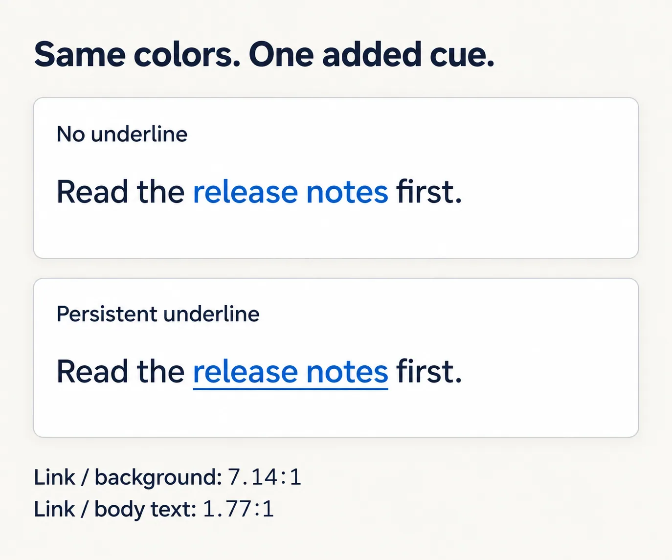
W3C technique G183 describes a 3:1 link-to-surrounding-text distinction when inline links rely on color and lightness. Technique G182 describes additional visual cues, including underlines. For this paragraph, retaining the underline is the direct design choice: it avoids depending on the blue-gray difference to identify the action.
An underline solves a different problem from faint text. As a second check, temporarily enter #E5B93C for Link while leaving the underline enabled. Its contrast against white is only 1.85:1, so the normal-text check fails even though the cue remains present. Restore #005A9C before continuing. Use Color Contrast Basics if you need to review which text threshold applies to your placement.
3. Review every state without treating every signal as a standard
Check the visited, hover, and active rows against the background individually. A default link that passes does not establish that a lighter visited treatment or a different hover color will pass. In this example all four state/background pairs meet the selected normal-text target.
Hue Codex also compares state colors with one another. Its 8 dE state-separation band is a product review heuristic, not a WCAG success criterion. A warning there asks you to inspect the treatment; it is not the same finding as failing text contrast. Keep the numeric readability results and the reason for any state warning separate in your notes.
The preview helps compare the supplied colors, but it is not a complete interaction test of your website. Check the finished paragraph with the actual selectors, typography, and layout. In particular, keep the persistent underline distinct from a keyboard-focus indicator: an underline on every link does not show which one currently has focus.
- Use Tab and Shift+Tab to reach the link and move away. Confirm that the focused link is clearly indicated and remains readable.
- Move the pointer onto the link and press it. Check the hover and active appearances against the same background.
- Follow the link and return to inspect the intended visited appearance. Keep the underline present where the paragraph design relies on it.
- Repeat the review in narrow layouts, other supported themes, and forced-colors settings. A saved white-background result does not describe a dark surface.
Browsers restrict visited-link styling for privacy, and getComputedStyle() returns the unvisited color even when the visible link is visited. Review the declared visited color and the actual browser appearance; do not interpret that scripted reading as proof that the visited rule was ignored.
4. Save a review record that names the placement
Choose Markdown under Export to collect the six colors, context, target, underline setting, and measured results. Keep the output with the component notes. It records the settings you tested; it does not inspect every link on a site or observe the CSS cascade in another page.
Add a short placement note such as “Release-note paragraph on white, normal-sized text, persistent underline.” Then record the browser states you actually reviewed and any follow-up work. If the paragraph moves onto a tinted card, update Background and repeat the comparisons instead of reusing the old result.
Questions about inline link checks
Does an underlined link still need 3:1 against nearby text?
The G183 3:1 distinction is the technique for inline links without another visual cue. A persistent underline supplies a separate cue. The link text still needs sufficient contrast against its background, and the finished interaction needs its own review.
Does 3:1 against body text replace 4.5:1 against the background?
No. They compare different pairs for different purposes. For the normal-sized text in this example, the background check remains 4.5:1 at WCAG 2.2 AA. A large-text setting must match the actual text size and weight.
Does a passing result certify the whole link or page?
No. The report screens the supplied colors and selected cues. It does not establish link purpose, semantics, keyboard operation, focus visibility, or the behavior of the final page. Keep those checks in the implementation review.
Review one paragraph in its real setting
Take the saved treatment to one real content paragraph. Confirm that readers can spot the link before interacting, read every state, and locate keyboard focus. Save the tested colors and the placement together so the next editor can tell when a background or style change requires another check.
Spot an issue or want a color topic covered?Send a correction or request a post.