
Quick answer
Tint vs shade vs tone comes down to the neutral being added: a tint moves a color toward white, a shade moves it toward black, and a tone moves it toward gray. In interface palettes, tints often become surfaces, shades often become foregrounds or emphasis, and tones often become quieter supporting accents.
Tint, shade, and tone are small words that prevent a lot of palette confusion. They all describe variations of a base color, but they are not interchangeable. A tint is not just any light color, a shade is not every alternate swatch, and a tone is not the same thing as opacity.
The useful question is not only what each word means. It is where each branch belongs in a real palette. A tint can make a brand color quiet enough for a surface. A shade can carry text or hover emphasis. A tone can keep the hue recognizable while making it easier to combine with neutrals, charts, photography, and dense UI.
The Difference in One Table
| Term | Traditional mix | Typical result | Best first use |
|---|---|---|---|
| Tint | Base color plus white | Lighter, softer, usually less visually heavy | Surfaces, selected rows, gentle badges, quiet callouts |
| Shade | Base color plus black | Darker, heavier, usually stronger in hierarchy | Text, emphasis, hover states, active states, dark accents |
| Tone | Base color plus gray | Muted, calmer, usually lower intensity | Subtle borders, secondary chips, muted charts, editorial accents |
In casual conversation, people often say shade to mean any version of a color. In precise palette work, the three terms point in different directions. The tint branch answers how light a color can get, the shade branch answers how much depth it can carry, and the tone branch answers how restrained it can become without losing its hue identity.
A Practical Role Map
The same base color can produce many useful candidates, but a scale becomes production-ready only after each color has a job. In the example below, #336699 branches into a simple sRGB tint, shade, and tone family. Hue Codex uses this kind of deterministic example in its methodology so the mix direction stays explainable.
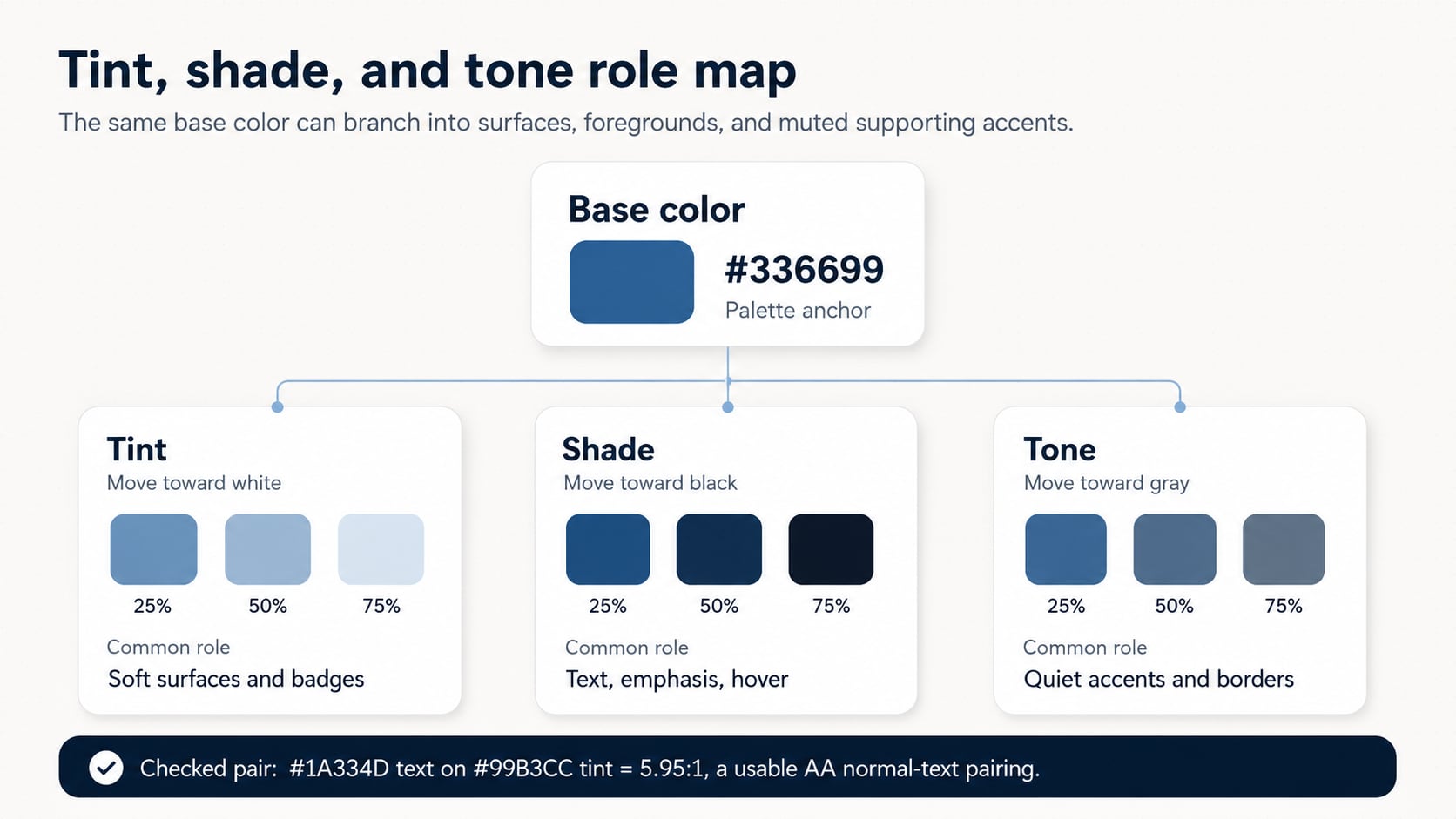
| Branch | Example value | Role idea | Review note |
|---|---|---|---|
| Base | #336699 | Brand anchor or primary accent | #FFFFFF on #336699 is 6.00:1, which passes WCAG 2.x AA for normal text. |
| Tint | #99B3CC | Soft surface or badge background | Pair with a dark foreground; #1A334D on #99B3CC is 5.95:1. |
| Shade | #1A334D | Text, hover, active, or strong emphasis | Works well on the tint in this example, but still needs context checks. |
| Tone | #53718F | Muted accent, quiet border, or secondary chart color | #FFFFFF on #53718F is 5.09:1, but thin borders and small marks need separate review. |
Use the Right Branch for the Job
Tints are often the safest place to put a strong brand hue into a large area. They work well for panels, selected surfaces, empty states, and gentle alerts because they keep the hue visible without flooding the layout. The trap is using a tint as text. Pale colors can look colorful and still have weak contrast on light backgrounds.
Shades usually carry the opposite job. A shade can make a color strong enough for readable text on a pale tint, provide a hover or active state, or give a palette the depth it needs for hierarchy. The trap is overusing shades until the interface feels heavy, muddy, or too close to black.
Tones are the branch people reach for when the hue is right but the color is too loud. A tone keeps the color family present while reducing intensity. That makes it useful for editorial layouts, calm product surfaces, secondary chips, quieter data series, and neutral-friendly brand systems.
How Hue Codex Helps
Use the Hue Codex tint, shade, and tone generator when you want to compare branches from one base color. Start with the seed, choose a scale length, compare OKLCH, HSL, and simple RGB modes, then keep only the variants that can be assigned to real palette roles.
For a fuller reference on traditional definitions, digital color spaces, and more examples, use the Hue Codex tint vs shade vs tone guide. After you choose candidates, move the important foreground and background pairs into the contrast checker before naming them as production tokens.
CSS Token Pattern
CSS color-mix() can express tint-like, shade-like, and tone-like variants directly. The safer production pattern is to keep resolved fallback values first, then use color-mix() inside a feature query when you want the browser to derive the branch. The code below is a starting pattern using sRGB examples so the fallback values and mix direction are easy to audit.
:root {
  --brand-base: #336699;
  --brand-tint-surface: #99B3CC;
  --brand-shade-text: #1A334D;
  --brand-tone-accent: #53718F;
}

@supports (color: color-mix(in srgb, black, white)) {
  :root {
    --brand-tint-surface: color-mix(in srgb, var(--brand-base) 50%, white 50%);
    --brand-shade-text: color-mix(in srgb, var(--brand-base) 50%, black 50%);
    --brand-tone-accent: color-mix(in srgb, var(--brand-base) 59%, #808080 41%);
  }
}

.example-callout {
  background: var(--brand-tint-surface);
  color: var(--brand-shade-text);
  border-color: var(--brand-tone-accent);
}
Review Checklist
- Name the base color before generating variants.
- Decide whether you need a surface tint, a foreground shade, a muted tone, or all three.
- Compare the generated branch across the same role, not as a decorative swatch strip.
- Check text and icon pairs against the actual background they will use.
- Avoid naming final tokens only by tint, shade, or tone; production names should describe roles such as surface, text, border, hover, and accent.
FAQ
What is the difference between tint, shade, and tone?
A tint moves a color toward white, a shade moves it toward black, and a tone moves it toward gray.
Is every lighter color a tint?
Not always. A lighter color may look tint-like, but in precise color work a tint means the color moved toward white. Digital tools can also change lightness in other ways.
Is tone the same as opacity?
No. A tone is a stable muted color. Opacity depends on the background behind it, so the visible result can change from one surface to another.
Are tints good for accessible backgrounds?
Often, but not automatically. A tint may work well as a background when paired with a dark enough foreground. Always check the final pair.
Final Takeaway
Tint vs shade vs tone is more than vocabulary. It is a way to turn one color into a useful family without losing control of roles. Use tints for gentle surfaces, shades for readable emphasis, and tones for quieter supporting accents. As a next step, generate the three branches from one base color, keep only the colors with clear jobs, and verify the pairs that will carry text, icons, borders, or state meaning.
Spot an issue or want a color topic covered?Send a correction or request a post.