Color guide
Tint vs shade vs tone
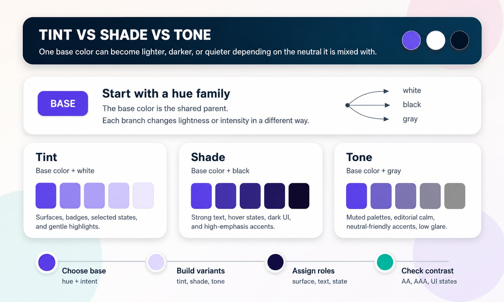
Tint, shade, and tone are three precise ways to describe how one hue becomes a useful family of colors. A tint moves a color toward white, a shade moves it toward black, and a tone moves it toward gray. In design systems, those differences shape surfaces, text, borders, states, charts, illustrations, and brand palettes.
Short answer
A tint is a color mixed with white, making it lighter. A shade is a color mixed with black, making it darker. A tone is a color mixed with gray, making it more muted. In digital design, those traditional ideas map to practical color-scale work, but the exact result depends on the color space, mixing method, and accessibility requirements.
- Tint means the base color is moved toward white; tints are usually lighter, softer, and better for surfaces than for small text.
- Shade means the base color is moved toward black; shades are usually darker, heavier, and useful for text, emphasis, hover states, and dark-mode surfaces.
- Tone means the base color is moved toward gray; tones lower intensity and often make a palette calmer, more neutral, and easier to combine.
- A tint, shade, or tone is not automatically accessible. Always test the final foreground/background contrast pair.
- HSL lightness changes, CSS color-mix(), RGB interpolation, OKLAB, and OKLCH can all create different results from the same starting color.
- Production palettes work best when tints, shades, and tones are assigned to roles such as surface, text, border, focus, hover, selected, success, warning, and danger.
Standards status
Badges mark whether this guide relies on stable standards, draft or preview specifications, primary or model sources, Hue Codex guidance, approximations, or browser-dependent behavior.
Tint, shade, and tone definitions
Tint, shade, and tone are color-variation terms. They describe what happens when a base hue or base color is mixed with a neutral. The neutral changes the usable color without choosing a completely new hue family.
In plain language, a tint is lighter, a shade is darker, and a tone is more muted. That sounds simple, but the distinction matters in real design work because each variation solves a different problem. A pale tint may be perfect for an alert background, a deep shade may be needed for readable text, and a muted tone may calm a saturated brand color enough for repeated UI use.
Tint, shade, and tone describe three neutral-mixing paths from a base color: toward white, toward black, and toward gray.
Tint
A tint is created by mixing a color with white. Tints increase lightness and often feel softer, cleaner, or more delicate.
Shade
A shade is created by mixing a color with black. Shades decrease lightness and often feel deeper, stronger, or more grounded.
Tone
A tone is created by mixing a color with gray. Tones reduce intensity and often feel calmer, dustier, or more neutral.
Quick comparison
The quickest way to remember the difference is by the neutral being added. White makes a tint, black makes a shade, and gray makes a tone. In practice, each one changes how the color behaves in a palette.
| Term | Traditional mix | Visual result | Common UI use |
|---|---|---|---|
| Tint | Color + white | Lighter and usually softer | Backgrounds, subtle badges, selected surfaces, gentle highlights |
| Shade | Color + black | Darker and usually heavier | Readable text, hover states, strong accents, dark surfaces |
| Tone | Color + gray | Muted and lower intensity | Quiet palettes, editorial surfaces, disabled-like states, neutral-friendly accents |
| Base color | Original chosen color | Reference point | Brand seed, action color, chart family, palette anchor |
In casual speech, people often say "shade" to mean any version of a color. In precise color work, tint, shade, and tone mean different things.
Tint means base color plus white
A tint is the lighter branch of a color family. If the base color is blue, its tints include pale blue, powder blue, ice blue, and other white-mixed versions. If the base color is red, tints can move toward pink, blush, rose, or pastel coral depending on the starting color and mixing method.
Tints are useful because they let a strong color appear in large areas without overwhelming the interface. A saturated brand purple may be too intense as a full card background, but a pale purple tint can carry brand identity while leaving room for readable dark text.
Best for large quiet areas
Use tints for surfaces, empty states, alert backgrounds, subtle callouts, selected rows, chart fills, and low-emphasis badges.
Not automatically readable
A tint can be too pale for white text and too low contrast for light borders. Pair tints with dark foreground colors and test the exact pair.
Often called pastel
Many pastel colors are tints because they are light, softened versions of a more saturated hue family.
Shade means base color plus black
A shade is the darker branch of a color family. If the base color is green, its shades can include forest green, deep teal-green, or near-black green. If the base color is orange, its shades may become burnt orange, brown-orange, or a dark amber.
Shades are useful when a palette needs weight, hierarchy, readability, or interaction depth. A shade can become button hover color, active state, text on a pale tint, dark-mode surface, strong border, or compact accent that needs to feel decisive.
Best for emphasis
Use shades for text colors, active states, pressed states, hover states, dark backgrounds, emphasis marks, and strong data-series values.
Can feel heavy
Very dark shades create authority and contrast, but too many dark colors can make a palette feel dense or visually harsh.
May shift character
Adding black can make warm hues look muddy and cool hues feel more formal. In digital systems, OKLCH or hand tuning can preserve intent better than simple black mixing.
Tone means base color plus gray
A tone is the muted branch of a color family. Instead of only moving lighter or darker, tone reduces color intensity by mixing the base with gray. A vivid violet may become lavender-gray. A bright teal may become sea-glass, slate-teal, or a muted blue-green.
Tones are especially useful when a color is attractive but too loud for repeated interface use. They keep a hue direction visible while making the color easier to combine with neutrals, type, photography, charts, and dense UI layouts.
Best for calm systems
Use tones for muted themes, editorial products, background accents, secondary chips, quiet charts, and neutral-friendly brand expressions.
Good for reducing saturation
Tone is often the practical answer when a brand color is correct in hue but too intense in chroma or saturation.
Can lose distinctness
Muted tones can become too similar to neighboring neutrals. Keep enough contrast and category separation for real use.
How the three branches relate
Tints, shades, and tones are easiest to understand when they branch from the same parent color. The tint branch moves toward white, the shade branch moves toward black, and the tone branch moves toward gray. Together, they create a useful family for monochromatic palettes and design-system scales.
A mature palette rarely uses only one branch. A production interface might use a tint for the alert background, a shade for the alert text, and a toned version for a border or icon. The terms are descriptive; the final role is a design decision.
Tint, shade, tone vs hue, lightness, saturation, and chroma
Tint, shade, and tone are mixing terms. Hue, lightness, saturation, and chroma are color dimensions. The terms overlap in daily design work, but they are not interchangeable.
This distinction matters because a digital color tool can change lightness without literally mixing white or black. It can reduce saturation without literally mixing gray. The visible result may resemble a tint, shade, or tone, but the math behind it can be different.
| Concept | What it describes | Typical design question |
|---|---|---|
| Hue | The color family or direction, such as red, yellow, green, blue, or violet | Which color family are we using? |
| Tint | A lighter white-mixed version of a color | Can this brand color become a soft background? |
| Shade | A darker black-mixed version of a color | Can this color become readable text or a stronger state? |
| Tone | A gray-mixed, muted version of a color | Can this vivid color become calmer without changing family? |
| Lightness | How light or dark a color appears | Does this foreground have enough luminance contrast? |
| Saturation or chroma | How vivid or colorful a color is | Is this accent too intense or too gray? |
The digital color mixing caveat
Traditional tint, shade, and tone language comes from physical and artistic color mixing. Digital color is different because displays use light, CSS works with color spaces, and design tools may use HSL, RGB, LAB, OKLAB, LCH, OKLCH, or custom interpolation.
That means two tools can start with the same color and produce different tints, shades, or tones. An HSL lightness adjustment is not the same as mixing with white in OKLAB. Mixing in sRGB can look different from mixing in OKLCH. None of those approaches is automatically wrong, but they should be chosen deliberately.
| Method | What it does | Best use |
|---|---|---|
| HSL lightness | Changes the lightness channel while hue and saturation may stay numerically stable | Quick CSS-friendly edits and simple color pickers |
| HSL saturation | Reduces or increases saturation around a hue | Fast muted variants, but not always perceptually even |
| color-mix(in srgb, ...) | Mixes colors in sRGB unless another color space is chosen | Matching existing browser or design-tool behavior |
| color-mix(in oklab, ...) | Mixes in a more perceptual rectangular color space | Smoother UI scales and more even transitions |
| OKLCH lightness and chroma | Adjusts perceptual lightness and colorfulness more directly | Color roles, accessible scales, and modern palette systems |
In modern CSS, color-mix() can express tint-like, shade-like, and tone-like ideas directly, but browser support, fallback needs, and chosen color space still matter for production.
How to build a useful tint, shade, and tone scale
A color scale should not be a random strip of lighter and darker swatches. It should answer real interface questions. Which color is the pale surface? Which one is readable text? Which one is the hover color? Which one is quiet enough for repeated backgrounds? Which one is vivid enough for a small accent?
The most reliable workflow starts with a base color, creates candidate branches, assigns roles, checks contrast, and then hand-tunes the exact stops. The final result may be mathematically generated, hand adjusted, or both.
- Choose a base color from brand, product category, semantic state, image, campaign mood, or existing palette.
- Create several tint candidates by moving toward white for soft surfaces and low-emphasis backgrounds.
- Create several shade candidates by moving toward black for text, hover, active, and high-emphasis roles.
- Create several tone candidates by moving toward gray or reducing chroma for muted accents and neutral-friendly variants.
- Assign each useful color to a role before naming it as a token.
- Test every text, icon, border, focus, and UI-state pair for contrast against the real adjacent color.
- Remove unused swatches. A smaller scale with clear jobs is better than a large scale nobody understands.
Role examples for UI and brand systems
The same base color can produce many roles when its tints, shades, and tones are treated as a system. The exact names will vary by product, but the pattern is consistent: lighter variants often become surfaces, darker variants often become foregrounds, and muted variants often become supporting accents.
| Variant | Possible token role | Contrast reminder |
|---|---|---|
| Very pale tint | color.info.surface, color.brand.subtle, color.selection.bg | Use dark text; white text will usually fail |
| Medium tint | color.badge.bg, color.chart.fill, color.callout.bg | Check label and icon contrast separately |
| Deep shade | color.text.brand, color.action.hover, color.link.visited | May pass on pale surfaces but fail on dark surfaces |
| Near-black shade | color.surface.inverse, color.text.strong, color.overlay | Needs careful foreground choices in dark mode |
| Muted tone | color.accent.muted, color.border.brand, color.chart.secondary | Muted colors can become too close to gray backgrounds |
| Gray-heavy tone | color.neutral.brand, color.disabled.support, color.sidebar.accent | Avoid using muted tone alone to communicate state |
Accessibility and contrast
Tint, shade, and tone decisions are not separate from accessibility. A beautiful scale can still fail if the final foreground and background colors are too close in relative luminance, if a border disappears, or if color is the only cue for meaning.
The practical rule is simple: generate color families however you like, then test the actual pairs that users see. Text on a tint, text on a shade, icons on a tone, focus rings around buttons, and chart marks on backgrounds all deserve their own checks.
Tints usually need dark foregrounds
Pale tints can make excellent surfaces, but they rarely work with white text. Pair them with dark shades or neutral ink colors.
Shades can fail on dark surfaces
A shade that works as text on a tint may disappear on a dark card, dark mode background, or image overlay.
Tones can erase category differences
Muted colors can become hard to distinguish from each other. Charts, badges, and status systems need labels, shapes, or direct text cues.
Color should not carry meaning alone
Error, success, warning, selected, required, and chart states need words, icons, patterns, underlines, or layout cues in addition to color.
CSS examples for tint, shade, and tone
CSS can express tint-like, shade-like, and tone-like variants with color-mix(). The exact result depends on the chosen interpolation color space. OKLAB is often a good practical choice for smoother UI scales, while sRGB may be needed when matching older tools or existing assets.
For production, keep the final approved values in semantic tokens when possible. Generated formulas are useful during exploration, but stable tokens make accessibility reviews, design handoff, and QA easier.
| Goal | Example | Use |
|---|---|---|
| Tint | color-mix(in oklab, var(--base) 20%, white) | Pale surface or subtle badge background |
| Shade | color-mix(in oklab, var(--base) 72%, black) | Deep text, hover, active, or strong border |
| Tone | color-mix(in oklab, var(--base) 55%, gray) | Muted accent or secondary chart color |
| Transparent surface | color-mix(in srgb, var(--base) 18%, transparent) | Overlay or wash, not a true white-mixed tint |
A semi-transparent overlay can look tint-like on a white page, but it changes when the background changes. Treat opacity as a different tool from a stable tint token.
Common mistakes
Most tint, shade, and tone mistakes happen when color variations are generated as decoration instead of assigned to real jobs. A scale is only useful when people know where each color belongs and which pairings are approved.
Mistake: using tint as readable text
Tints are usually too light for small text. Use them as backgrounds and choose a darker shade or neutral for the foreground.
Mistake: darkening everything with black
Simple black mixing can make colors muddy. Try OKLCH or OKLAB adjustments when a shade needs to keep a cleaner hue identity.
Mistake: confusing tone with opacity
A muted tone is a stable color. An opacity layer depends on whatever sits behind it and may change across contexts.
Mistake: keeping every generated stop
A ten-step scale is not automatically better than a five-step scale. Keep the stops that serve real roles.
Mistake: assuming one scale works in light and dark mode
Dark mode often needs different surface, border, focus, and foreground decisions even when the hue family stays the same.
Mistake: naming tokens by appearance only
A token named purple-100 is less helpful than color.info.surface or color.brand.subtle when teams need to use color consistently.
How Hue Codex uses tint, shade, and tone
Hue Codex treats tint, shade, and tone as practical palette-building tools. The goal is not simply to make a lighter row, a darker row, and a muted row. The goal is to turn one color idea into usable roles for real interface decisions.
Use Hue Codex to pick or convert a base color, generate tint and shade candidates, inspect related color formats, test WCAG contrast pairs, and export palette data. The best scale is the one that survives real UI use: readable text, visible controls, durable states, clear semantics, and enough visual character to still feel intentional.
Sources and further reading
This guide is written from practical design-system usage and cross-checked against primary CSS color and accessibility references.
Try it in Hue Codex
Use the free tools to test the idea immediately: pick a color, convert it, generate harmonies, build tints and shades, check contrast, and export practical CSS or palette data.
Quick answers
Tint vs shade vs tone FAQ
What is the difference between tint, shade, and tone?
A tint is a color mixed with white, a shade is a color mixed with black, and a tone is a color mixed with gray. Tints are lighter, shades are darker, and tones are more muted.
What is a tint in color theory?
A tint is a lighter version of a color created by mixing the color with white. In UI design, tints are often used for subtle backgrounds, badges, callouts, and selected surfaces.
What is a shade in color theory?
A shade is a darker version of a color created by mixing the color with black. In UI design, shades are often used for text, hover states, strong accents, dark surfaces, and emphasis.
What is a tone in color theory?
A tone is a muted version of a color created by mixing the color with gray. Tones reduce intensity and are useful for quieter palettes, neutral-friendly accents, editorial layouts, and subdued chart colors.
Is pink a tint or a tone?
Pink is often a tint of red because it is commonly understood as red mixed with white. Some pinks are also toned or slightly shifted in hue, depending on the exact color.
Is navy a shade of blue?
Navy is commonly treated as a shade of blue because it is a dark blue family color. In precise digital color work, the exact hue, lightness, and chroma should still be measured rather than assumed.
Is gray a tone?
Gray itself is neutral and usually has no meaningful hue. A tone is a chromatic color mixed with gray, such as a muted blue-gray or dusty rose.
Are tints always accessible backgrounds?
No. Tints can be good backgrounds, but they still need readable foreground colors. Pale tints often require dark text, and every final foreground/background pair should be contrast checked.
Can I create tints and shades by changing HSL lightness?
Yes for quick digital work, but HSL lightness changes are not identical to traditional white or black mixing. They can be useful, but OKLAB, OKLCH, color-mix(), and hand tuning may produce better UI scales.
What is the difference between tone and saturation?
Tone is a traditional mixing term for a color mixed with gray. Saturation is a color-model channel that describes vividness in systems such as HSL and HSV. Lowering saturation can create a tone-like result, but the terms are not identical.
What is the difference between tone and shade?
A shade is darker because black is added. A tone is more muted because gray is added. A color can be both darker and muted, but the terms describe different changes.
How many tints and shades should a design system have?
Use as many as the product needs for real roles. Many systems use a small set of pale surfaces, mid accents, deep foregrounds, hover states, and muted support colors rather than keeping every generated stop.
Should color roles be named tint, shade, and tone?
Usually not as final role names. Tint, shade, and tone are useful during palette creation, but production tokens are clearer when named by role, such as color.warning.surface, color.link.text, or color.brand.hover.