Quick answer
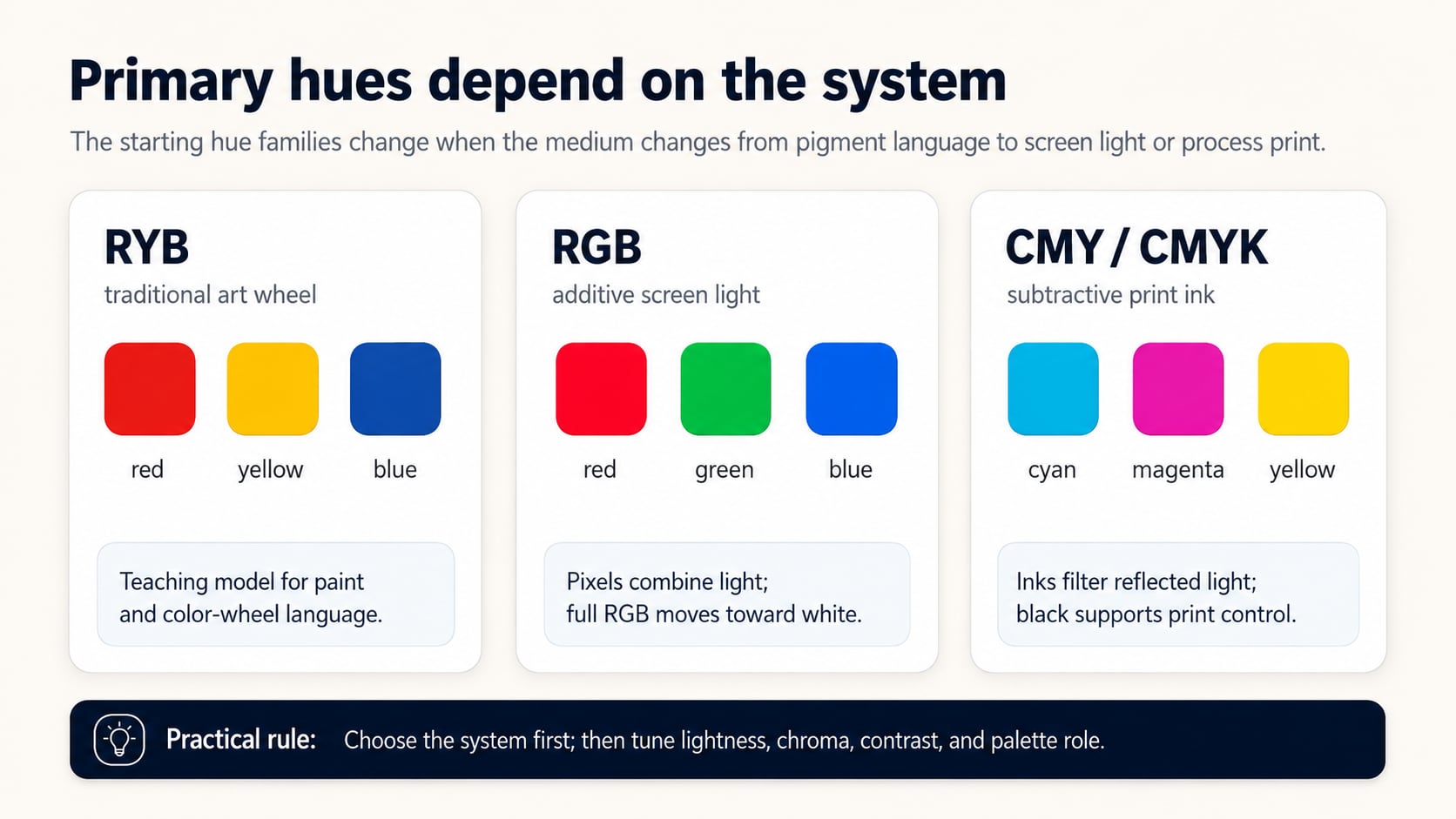
Primary hues are the starting hue families used by a color system. RYB uses red, yellow, and blue; RGB uses red, green, and blue light; CMY/CMYK uses cyan, magenta, and yellow, with black added for production print.
What are the primary hues? Primary hues are the starting color families a color system uses to create, mix, or organize other colors. Most people search for this as "primary colors", but Hue Codex uses "primary hues" when talking about the hue families before lightness, chroma, contrast, and role are chosen. The exact set depends on the medium: traditional art education often starts with red, yellow, and blue; screens use red, green, and blue light; process printing uses cyan, magenta, and yellow inks, usually with black in CMYK production.
That difference matters because a primary hue is not a universal law or a finished palette choice. It is a useful starting point inside a specific system. Designers, developers, illustrators, and brand teams still need to tune lightness, saturation, chroma, contrast, and role before a hue becomes a usable color.
Primary Hues Depend on the Color System
A primary hue is primary inside a system. If the system is a classroom color wheel, the answer may be red, yellow, and blue. If the system is a browser display, the answer is red, green, and blue because pixels create color with additive light. If the system is process print, the answer starts with cyan, magenta, and yellow because inks filter reflected light in a subtractive process, with black added in CMYK production.
| System | Primary hues | Medium | Practical note |
|---|---|---|---|
| RYB | Red, yellow, blue | Art education, painting language, traditional color wheels | Useful as a teaching and communication model, especially for familiar color-wheel relationships. |
| RGB | Red, green, blue | Screens, browser color, digital displays | Additive light model used by pixels and digital color values. |
| CMY / CMYK | Cyan, magenta, yellow, plus black in production | Process print | CMY describes the subtractive ink primaries; CMYK adds black for production print control. |
If you want the foundation first, the Hue Codex guide to what hue means explains hue as the color family or angle behind color names. The broader color theory guide then shows how hue sits beside lightness, chroma, contrast, and palette roles.
The Traditional Primary Hues: Red, Yellow, and Blue
In many art classrooms, primary hues are taught as red, yellow, and blue. This RYB model is useful for discussing paint, illustration, and familiar color wheel relationships. It gives beginners a simple way to think about mixing secondary hues such as orange, green, and violet.
RYB is also useful as design language. When someone says a palette uses primary colors, they often mean the familiar visual force of red, yellow, and blue: bold, direct, and easy to recognize. That does not mean every red, yellow, and blue will work together. A dark red, neon yellow, and muted blue may share the same broad hue families while feeling completely different from a bright classroom-style primary palette.
Use RYB as a practical art and communication model, not as the model browsers use to calculate screen color.
The Screen Primary Hues: Red, Green, and Blue
Screens work with additive light. Red, green, and blue light combine to create the colors you see on phones, monitors, and televisions. In sRGB and web color workflows, RGB channels are the underlying numeric structure behind familiar HEX values, rgb() notation, and many color conversions.
This is why green is a screen primary even though it may not appear in the traditional RYB list. Add red and green light on a display and you move toward yellow. Add red, green, and blue light at full intensity and you approach white. Remove light and you approach black. That behavior is different from mixing physical paint, where pigments absorb and scatter light.
The Print Primary Hues: Cyan, Magenta, and Yellow
Process printing starts with cyan, magenta, and yellow because inks behave subtractively. Each ink absorbs part of the light that hits the paper and reflects the rest back to the viewer. In production workflows, black ink is added for depth, text sharpness, cost control, and cleaner neutrals, which is why the common print model is CMYK.
For web and product teams, the important lesson is not to copy CMY values into CSS blindly. The lesson is to stay medium-aware. A color that looks strong in a browser may shift in print, and a print-oriented color decision may need a separate screen-safe equivalent.
Primary Hues Are Not Finished Palette Colors
The phrase primary hues can make color sound simpler than it is. Hue names the color family, but a finished color also needs other dimensions. A red can be crimson, coral, brick, rose, tomato, burgundy, or near-neutral brown-red. A blue can be royal, navy, sky, powder, indigo, or gray-blue. They may share a broad hue direction while behaving differently in a layout.
- Lightness decides whether the hue is pale enough for a background or dark enough for text.
- Saturation and chroma decide whether the hue feels vivid, muted, loud, or restrained.
- Contrast decides whether a foreground and background pair can be read or perceived.
- Role decides whether a color is decorative, semantic, interactive, structural, or brand-defining.
This is especially important for accessibility. A yellow hue can be vivid and still fail as white text on a button. A blue hue can look trustworthy and still be too low-contrast against a dark background. Primary hues start the conversation; contrast and context decide whether the result is usable.
How Designers Should Use Primary Hues
Use primary hues as anchors, not as automatic answers. First, decide which color system matches the task. A lesson about painting can use RYB language. A CSS palette should respect RGB-based screen output. A print handoff should include CMYK awareness and proofing. Then translate the chosen hue family into actual values that match the audience, medium, and role.
- Name the medium: screen, print, paint, brand documentation, or cross-channel campaign.
- Choose the hue family that fits the message or system requirement.
- Adjust lightness, saturation, and chroma before judging the color.
- Assign a role, such as primary action, accent, warning, surface, text, or chart series.
- Check the actual foreground and background pair when the color carries text, icons, controls, or status meaning.
Primary Hues and Color Harmonies
Once you understand the primary sets, the color harmony generator helps you explore how hue relationships work around a wheel. You can start with a red, yellow, blue, green, cyan, or magenta direction, then compare complementary, analogous, triadic, split complementary, tetradic, and monochromatic relationships.
Harmony does not replace judgment. It gives structure to exploration. A triadic palette can feel balanced, but it still needs hierarchy. A complementary pair can feel energetic, but it may need lower chroma or stronger lightness separation. A monochromatic palette can feel calm, but it may need enough contrast to keep states and content clear.
FAQ
Are primary hues the same as primary colors?
In casual use, yes. Primary hues usually means the starting hue families in a color system, while primary colors may refer to actual colorants, lights, or values. The practical answer still depends on the medium.
What are the primary hues in traditional color theory?
Traditional art education often uses red, yellow, and blue as the primary hues.
What are the primary hues for screens?
Screens use red, green, and blue light. That is why RGB values sit behind HEX colors, rgb() notation, and many digital color workflows.
What are the primary hues for print?
Process printing starts with cyan, magenta, and yellow as subtractive ink primaries, with black added in CMYK production for depth, sharpness, cost, and cleaner neutrals.
Final Takeaway
The primary hues are red, yellow, and blue in the traditional art-wheel model, red, green, and blue for screen light, and cyan, magenta, and yellow for process print. The best answer depends on the color system you are using. Treat primary hues as starting points, then turn them into real colors by tuning lightness, chroma, saturation, contrast, and practical palette roles. As a next step, pick the medium first, choose a hue family second, and test the actual palette roles before treating the colors as production-ready.
Spot an issue or want a color topic covered?Send a correction or request a post.