Hue angle
A circular coordinate that locates a hue family around a wheel. HSL-style wheels commonly place red near 0 degrees, green near 120 degrees, blue near 240 degrees, and magenta near 300 degrees.
Color guide
Color theory is the practical language behind deliberate color decisions. It explains how hue, lightness, chroma, saturation, contrast, harmony, context, and palette roles work together so a color choice can become a usable interface, brand system, chart, illustration, or CSS token.
Color theory is a framework for choosing, combining, adjusting, and explaining colors. It starts with hue relationships such as complementary, analogous, triadic, tetradic, split-complementary, and monochromatic schemes, but a ready-to-use palette also needs lightness, chroma, saturation, contrast, accessibility checks, semantic roles, and real-use context.
Color theory is the set of concepts people use to understand color relationships, color dimensions, visual hierarchy, mood, readability, and palette structure. In practical design work, it answers questions such as which colors feel related, which colors create emphasis, which colors can support text, and which colors should be reserved for semantic meaning.
The most useful version of color theory is not a rigid list of color meanings. It is a workflow: choose a color direction, understand the dimensions of that color, build relationships, assign roles, check contrast, and test the result in context.
Color theory is a practical framework for understanding how colors are described, related, combined, adjusted, perceived, and used in design systems, interfaces, brands, charts, illustrations, and visual communication.
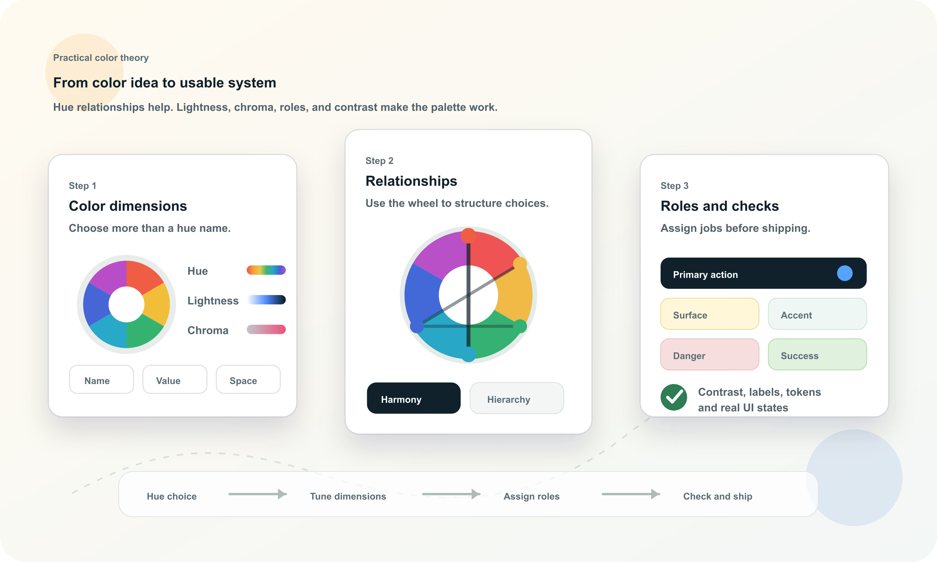
A color is more than a name such as blue, red, or green. The same hue can become pale, dark, muted, vivid, transparent, warm, cool, calm, loud, readable, or unusable depending on the other dimensions.
Designers often start with hue because it is the most recognizable dimension, but production color work usually succeeds or fails because of lightness, chroma, saturation, and contrast. These dimensions decide whether a palette has hierarchy, whether text can be read, and whether UI states remain clear.
| Dimension | Plain-language meaning | Why it matters |
|---|---|---|
| Hue | The color family or direction, such as red, yellow, green, cyan, blue, violet, or magenta | Creates palette direction, harmony, category separation, and brand association |
| Lightness | How light or dark a color appears | Controls hierarchy, surfaces, text colors, disabled states, and many contrast outcomes |
| Saturation | How vivid or washed out a color is in HSL and HSV-style models | Controls intensity, energy, softness, and whether colors feel loud or restrained |
| Chroma | How colorful a color is relative to neutral in perceptual spaces such as LCH and OKLCH | Helps build more consistent modern color scales and avoid uneven vividness |
| Alpha | How transparent a color is when composited over another color | Changes the final visible color and can affect contrast, especially over images or layered surfaces |
| Contrast | How distinguishable two colors are when placed together | Determines readability, affordance visibility, and accessibility for many foreground/background pairs |
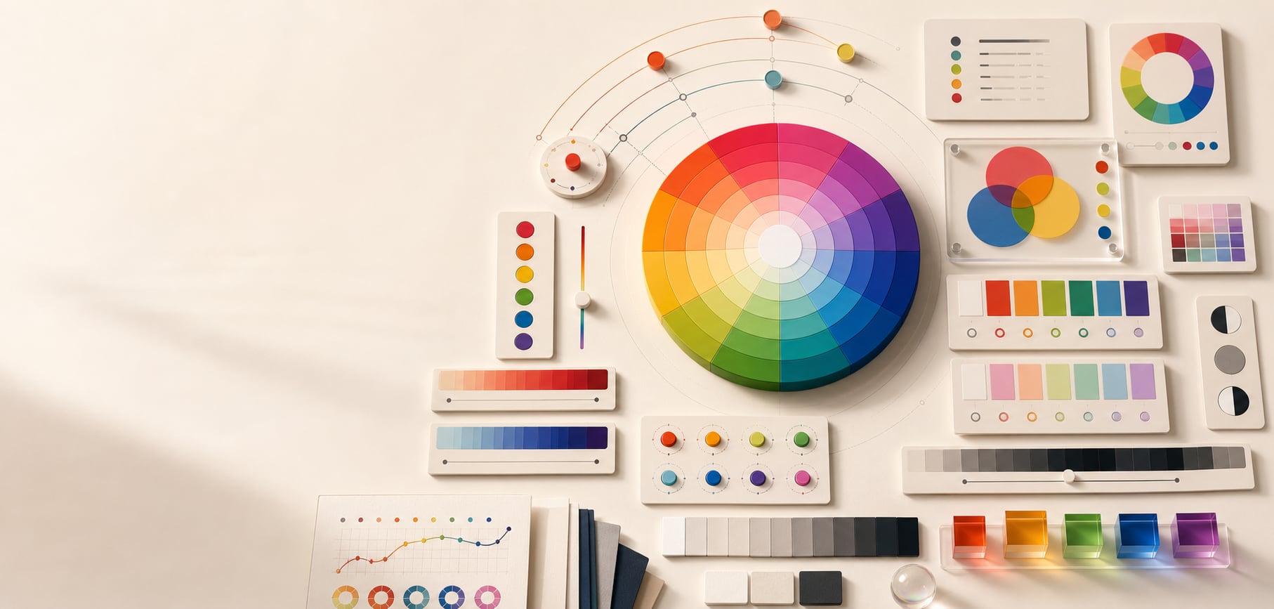
The color wheel is the familiar map of hue relationships. It places hue families around a circle so you can reason about neighbors, opposites, and evenly spaced combinations. In many digital tools, hue is written as an angle from 0 to 360 degrees.
A wheel is useful because color relationships are circular. Red near 0 degrees and red near 360 degrees are next to each other, not far apart. That circular structure is why complements, analogous ranges, triads, and split complements can be described with angle relationships.
A circular coordinate that locates a hue family around a wheel. HSL-style wheels commonly place red near 0 degrees, green near 120 degrees, blue near 240 degrees, and magenta near 300 degrees.
The position of one hue compared with another, such as neighboring, opposite, evenly spaced, or within one hue family.
Hue does not decide readability by itself. Two colors can be opposite on the wheel and still have poor text contrast if their lightness is too similar.
The same visible color can have different numeric hue values in HSL, LCH, and OKLCH because each model organizes color differently.
Color theory changes depending on the medium. A traditional art wheel, a CSS color function, a screen display, and a print workflow do not use the same underlying model, even when they use similar color names.
This is why color theory should be medium-aware. The wheel helps you reason about relationships, but final values still need to be checked in the system that will reproduce them: browser, display, print process, design file, image export, or physical material.
| Model or system | Used for | Practical note |
|---|---|---|
| RYB | Traditional paint and art education | Useful historically, but not the model used by screens or CSS |
| RGB | Additive light on screens | Red, green, and blue channels combine to produce display colors |
| CMY and CMYK | Subtractive print workflows | Ink, paper, profiles, and production conditions change final appearance |
| HSL and HSV | Human-readable digital color picking | Good for hue rotation and quick edits, but not perceptually uniform |
| Lab and LCH | Perceptual color work and color difference | Useful when visual lightness and chroma matter more than raw RGB channels |
| OKLab and OKLCH | Modern perceptual UI color systems and CSS | Helpful for building more predictable lightness and chroma scales |
Color harmonies are structured hue relationships. They are useful because they give a palette an intentional starting point instead of a random collection of swatches. The most common patterns are complementary, analogous, triadic, tetradic, split-complementary, and monochromatic.
A harmony is not a finished palette. It only describes where hue candidates sit. You still need to decide which hue is dominant, which hue is supporting, which hue is an accent, and how each value changes in lightness, chroma, and contrast.
| Harmony | Wheel relationship | Best use |
|---|---|---|
| Complementary | Two hues opposite each other | High-energy accents, comparison states, before/after moments, strong brand contrast |
| Analogous | Neighboring hues | Calm palettes, gradients, editorial systems, related product surfaces |
| Triadic | Three hues spaced around the wheel | Charts, categories, playful brands, illustration systems, feature groups |
| Tetradic | Four hues, often two complementary pairs | Expressive systems that need many distinct families and strong hierarchy |
| Split complementary | One base hue plus the two hues near its direct complement | Flexible accent systems with less harsh tension than a direct complement |
| Monochromatic | One hue varied by lightness, saturation, chroma, tint, shade, tone, or alpha | Focused interfaces, subtle brands, quiet editorial palettes, single-hue systems |
Lightness is one of the most important parts of usable color theory because people do not only see hue. They also see value structure. A page with clear light and dark relationships can be readable even with restrained color. A page with beautiful hues but weak lightness contrast can be difficult to scan.
Contrast is a relationship between two colors, not a property of one color in isolation. A blue can be readable on white and unreadable on black. A yellow can be vivid and still fail as white-button text. Always test the final foreground and background pair.
Readable body text usually depends more on relative luminance difference than on hue distance around a wheel.
Surfaces, cards, borders, disabled controls, hover states, and focus states need enough lightness separation to be understood quickly.
Chart marks, icons, control boundaries, and selection indicators need contrast against adjacent colors, not just attractive palette membership.
Saturation and chroma control how colorful a hue feels. High-intensity colors can feel energetic, youthful, urgent, playful, or synthetic. Lower-intensity colors can feel calm, premium, mature, technical, organic, or quiet. Neither is automatically better.
The mistake is using every color at maximum intensity. Strong chroma is powerful in small accents, data highlights, calls to action, and expressive brand moments. It can become tiring when applied to large surfaces, dense dashboards, or long-reading environments.
| Intensity choice | Usually feels | Watch for |
|---|---|---|
| High saturation or chroma | Active, bright, playful, urgent, bold | Visual noise, vibration, low readability on text, overuse of attention |
| Moderate saturation or chroma | Balanced, clear, flexible, designed | Can feel generic if roles are weak |
| Low saturation or chroma | Calm, mature, technical, premium, editorial | Can feel dull or hard to separate without lightness contrast |
| Mixed intensity | Hierarchical and practical | Needs rules so accents do not feel arbitrary |
Warm and cool color language is useful shorthand, but it is not universal law. Reds, oranges, and yellows often feel warm, active, sunny, human, urgent, or appetizing. Blues, cyans, greens, and violets often feel cool, calm, technical, distant, clean, or stable. Context can reverse or complicate those associations.
The same color can mean different things by industry, culture, surrounding palette, copy, product category, and user expectation. A red can mean celebration, danger, sale, romance, error, or appetite. A green can mean success, finance, sustainability, medical care, or availability.
Let color associations guide exploration, then validate against audience, category, accessibility, and competitor context.
If a color carries status meaning, do not also use it casually everywhere as decoration.
A palette is easier to maintain when the team knows why each color family exists and where it should not be used.
A palette becomes useful when colors have jobs. A row of pleasing swatches is not yet a design system. The palette needs approved relationships such as background and text, primary action and button label, warning surface and warning text, chart series and labels, or focus ring and adjacent component.
Role assignment also prevents color drift. When the same blue is used for links, primary actions, info states, decorative backgrounds, chart series, and selected navigation, the system can become confusing. Roles let teams preserve meaning.
| Role | What it does | Color theory concern |
|---|---|---|
| Text | Carries readable content | Needs strong contrast against every approved background |
| Surface | Creates page, card, panel, and input backgrounds | Needs enough value separation without creating clutter |
| Primary | Signals the main action or brand interaction | Needs emphasis, contrast, hover behavior, and disabled variants |
| Accent | Adds controlled emphasis or personality | Should be constrained so it does not compete with primary actions |
| Semantic state | Communicates success, warning, danger, info, selected, or unavailable | Needs non-color cues and consistent meaning |
| Border and divider | Separates regions and controls | Needs subtle but visible contrast against adjacent surfaces |
| Chart series | Distinguishes data categories | Needs labels, order, lightness differences, and color-vision support |
Accessible color theory is not a separate topic from good color theory. A palette that cannot be read, scanned, focused, or interpreted is not finished, even if it follows a classic harmony. Accessibility requires contrast, non-color cues, visible states, and testing of actual use cases.
Color should not be the only visual means of communicating information. Error messages need text, icons, or structure. Links in paragraphs often need underlines. Charts need labels, patterns, ordering, or direct annotations. Form states need more than red and green.
Measure the final foreground and background colors, including hover, focus, selected, disabled, and dark-mode states.
Use labels, icons, shapes, underlines, position, or patterns when color communicates meaning.
Increase lightness separation, add direct labels, and avoid status systems that depend only on red versus green.
Icons, focus outlines, chart marks, input borders, selected states, and control boundaries need enough contrast to be perceivable.
Modern CSS makes color theory more explicit because color formats can expose hue, lightness, chroma, alpha, and interpolation. HSL is approachable for quick hue and lightness edits. OKLCH is useful when perceptual lightness and chroma consistency matter.
Production systems should store final colors as semantic tokens, not only as raw color names or wheel coordinates. A token such as color.action.primary.background communicates intent. A paired token such as color.action.primary.text helps teams repeat accessible combinations.
| Theory decision | Token decision | Production check |
|---|---|---|
| Base hue | color.brand.primary | Does it reproduce well across screens, exports, and brand contexts? |
| Lightness scale | color.blue.50 through color.blue.950 | Do steps feel visually even and useful for surfaces, borders, and text? |
| Semantic role | color.state.danger.background | Does meaning remain clear with labels and non-color cues? |
| Accessible pair | color.action.primary.text on color.action.primary.background | Does the foreground/background pair meet the target contrast? |
| Chart family | color.chart.series.1 | Can categories be distinguished with labels and color-vision support? |
Use role tokens for application code and document color-space logic separately. Raw color names rarely explain enough on their own.
The safest way to use color theory is to move from exploration to verification. Start broad enough to discover good relationships, then narrow the palette into tested roles. That keeps color creative without letting it become arbitrary.
This workflow works for interfaces, logos, charts, editorial pages, dashboards, marketing pages, and design systems. The outputs differ, but the underlying questions are similar: what is the palette trying to communicate, which colors do which jobs, and can users perceive the result?
Most color theory mistakes happen when a helpful concept is treated as a complete answer. A wheel can suggest relationships, a mood chart can suggest direction, and a palette generator can produce candidates, but none of them know the final content, audience, accessibility target, interaction states, or brand constraints.
Complementary or triadic colors can still fail text contrast. Harmony is about hue relationship, not readable luminance difference.
Exploration creates options. Production palettes need restraint, hierarchy, and roles.
Most strong color systems need neutral surfaces, text, borders, and dividers so the hue colors have room to work.
Equal chroma can flatten hierarchy and create visual noise. Choose dominant, supporting, and accent intensity.
A token named color.blue.500 may be useful in a scale, but role tokens explain how the color should be used.
Associations are contextual. Validate them against brand, category, culture, accessibility, and real layouts.
Different design contexts emphasize different parts of color theory. A logo may need memorability and reproduction. A dashboard may need scanability and chart differentiation. A dark-mode UI may need controlled lightness and reduced glare. A print piece may need ink and paper checks.
This is why definitive color work combines theory with output-specific testing. The right palette is not only attractive. It survives the medium where people will use it.
| Context | Most important concern | Useful Hue Codex follow-up |
|---|---|---|
| User interface | Readable pairs, state clarity, tokens, focus visibility | Check contrast and generate CSS-ready values |
| Logo and brand | Recognition, reproduction, one-color versions, supporting palette | Build logo color systems and supporting palettes |
| Data visualization | Category separation, order, labels, color-vision support | Test series colors and avoid color-only meaning |
| Dark mode | Lightness range, glare control, semantic state consistency | Tune tints, shades, and accessible text pairs |
| CMYK conversion, paper, ink, proofing, spot colors | Compare screen values and print constraints |
Hue Codex treats color theory as a practical workflow. Start with a color, inspect its values, explore relationships, generate tints and shades, compare color models, check accessibility, and export values that can be used in CSS, brand documentation, or color roles.
The goal is not to make color decisions automatic. The goal is to make them visible, testable, and easier to explain. Good color theory gives you language; good tools let you verify that the language survives real use.
This guide is written from practical design-system usage and cross-checked against primary web color and accessibility references.
Use the free tools to test the idea immediately: pick a color, convert it, generate harmonies, build tints and shades, check contrast, and export practical CSS or palette data.
Quick answers
Color theory is a framework for understanding how colors are described, related, combined, adjusted, perceived, and used in design. It covers hue, lightness, saturation, chroma, contrast, harmony, context, accessibility, and palette roles.
Color theory helps people make deliberate color decisions instead of choosing isolated swatches. It supports hierarchy, readability, brand consistency, accessibility, chart clarity, and reusable design systems.
The main elements of practical color theory are hue, lightness, saturation, chroma, contrast, color harmony, temperature, context, palette roles, and accessibility.
Hue is the color family or direction, such as red, green, blue, or violet. A complete color also includes other properties such as lightness, saturation, chroma, alpha, and its contrast relationship with nearby colors.
Color harmonies are structured hue relationships on a color wheel. Common harmonies include complementary, analogous, triadic, tetradic, split-complementary, and monochromatic palettes.
No. Harmony gives useful hue structure, but a good palette also needs lightness balance, chroma control, accessible contrast, semantic roles, neutrals, and real layout testing.
Contrast between actual foreground and background colors is usually the most important color factor for readability. Accessible color work also requires non-color cues, visible focus states, and testing beyond body text.
No. Color psychology focuses on possible associations and emotional responses. Color theory is broader and includes color dimensions, relationships, contrast, palette structure, color spaces, accessibility, and practical usage.
There is no single best model for every task. HEX and RGB are common for stable sRGB values, HSL is readable for quick edits, and OKLCH is useful for perceptual lightness and chroma scales in modern CSS workflows.
Start with the brand or mood, choose hue relationships, tune lightness and chroma, assign roles such as text, surface, primary action, accent, and semantic states, then check contrast and test the colors in real layouts.
Most practical palettes need a small set of key hue families plus neutrals, semantic state colors, and lightness or chroma scales. The right number depends on roles, not on a fixed rule.
The biggest mistake is treating a color wheel or palette generator as a finished answer. Production color still needs hierarchy, roles, contrast checks, accessibility, and context-specific testing.