Quick answer
A color blindness simulator palette workflow previews key palette roles through common color-vision simulations, then checks whether meaning still survives with contrast, labels, icons, shape, and context. Simulation is useful for finding likely hue-only risks, but it does not prove a palette is accessible by itself.
A color blindness simulator palette review is useful whenever color is doing a job: separating chart series, marking errors, showing success, identifying selected states, or making links stand out. The point is not to ban certain hues. The point is to find places where two colors stop carrying distinct meaning after simulation.
For Hue Codex, that review starts with roles rather than loose swatches. A red and a green accent may be harmless as decoration, but risky when they are the only difference between failed and successful validation. A blue and violet chart pair may look distinct in a palette strip, then become hard to track when the lines overlap in a dense graph.
Start With Roles, Not Loose Swatches
Paste the colors into the Hue Codex color blindness simulator, then review them as the roles people actually see: error, success, warning, selected, link, disabled, chart series, map region, and brand accent. This keeps the review tied to decisions instead of treating a simulated swatch as a final verdict.
What to Check in the Simulation
| Palette role | Simulation risk | Better fix |
|---|---|---|
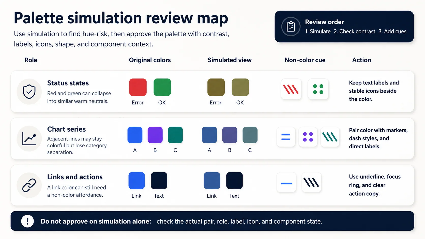
| Error and success states | Red and green can become too similar, especially when the component only changes a small icon, border, or badge color. | Add visible text, stable icons, and shape differences; keep the exact foreground/background pair contrast-checked. |
| Chart series | Blue, violet, teal, red, and green series may remain colorful but lose category separation when adjacent or overlapping. | Use direct labels, marker shapes, line styles, ordering, and enough lightness separation. |
| Links and actions | A link color may pass contrast while still being hard to distinguish from surrounding text by color alone. | Use underline, focus styles, placement, and clear action copy instead of relying only on hue. |
| Warnings and alerts | Yellow, orange, and red alerts can blur into a general warm signal if the message depends on severity color alone. | Pair color with heading text, icon shape, and explicit severity wording. |
| Brand accents | A brand pair can look distinct in isolation but become ambiguous when used as tabs, pills, or selected states. | Reserve brand color for clear roles, and use contrast, labels, and state styling to carry meaning. |
Simulation is a triage step, not approval. If a simulated pair looks risky, record the role, the affected colors, and the non-color cue that resolves the decision.
A Hue Codex Review Workflow
- List the palette roles before testing: text, surface, link, primary action, error, success, warning, chart series, selected state, and focus indicator.
- Run the role colors through protanopia, deuteranopia, tritanopia, and achromatopsia-style previews.
- Mark any pair that becomes hard to distinguish, especially when the pair communicates different categories or states.
- Check the actual foreground and background contrast for text, icons, component boundaries, and focus indicators.
- Add a redundant cue where color carries meaning: label, icon, pattern, line style, underline, position, shape, or direct annotation.
- Document the final decision as a palette note so the fix stays attached to the role, not only the color value.
The color accessibility guide is a useful companion because it covers contrast, focus, links, state clarity, and color-only meaning beyond the simulator view. The color-vision simulation methodology explains Hue Codex's local simulation limits and why simulated results should be treated as screening signals rather than clinical or standards-based proof.
Contrast Still Has to Be Checked
A palette can look safer under simulation and still fail as text. WCAG 2.x contrast checks are based on the actual rendered foreground and background colors, while Use of Color guidance addresses cases where color is the only visual cue. Keep those checks separate: simulation helps find hue-risk, contrast testing checks readable pairs, and non-color cues preserve meaning.
| Role | Foreground | Background | Contrast ratio | Use note |
|---|---|---|---|---|
| Body text | #111827 | #F9FAFB | 16.98:1 | Normal text on a quiet page surface. Passes the 4.5:1 WCAG 2.x threshold for normal text. |
| Action link | #2563EB | #FFFFFF | 5.17:1 | Linked text with underline or another cue. Passes contrast, but the underline keeps the link from depending on color alone. |
| Button label | #FFFFFF | #2563EB | 5.17:1 | White text on a blue primary action. Passes the normal-text contrast threshold for this exact pair. |
| Alert text | #111827 | #FDE68A | 14.24:1 | Dark text on a yellow warning surface. Strong contrast, while the warning copy and icon should carry meaning too. |
Non-Color Cues That Make Palettes Safer
- Use text labels for status chips, form messages, legends, map regions, and selected states.
- Pair state colors with stable icons, but do not make the icon the only place where the message appears.
- Add line styles, marker shapes, hatching, or direct annotations to charts and maps.
- Keep links identifiable with underline, placement, focus styles, and surrounding copy.
- Use consistent lightness order for sequential scales so magnitude remains clearer in grayscale-style review.
- Document the role and context where a color pair is approved, because the same colors may behave differently in another component.
Common Mistakes
- Approving a palette because the simulated swatches are not identical.
- Testing only brand colors while ignoring charts, form validation, focus rings, and selected states.
- Treating simulated contrast on transformed colors as a WCAG conformance result.
- Fixing every risky pair by changing hue instead of adding labels, icons, shape, or direct annotation.
- Using a distant chart legend when direct labels would make categories easier to follow.
FAQ
Can a color blindness simulator prove that a palette is accessible?
No. A simulator can reveal likely hue-only risks, but accessibility also depends on contrast, labels, component context, interaction states, display conditions, and real user perception.
Should I change every color that looks similar in a simulation?
Not always. First ask whether those colors communicate different meanings. If they do, improve the design with labels, icons, pattern, lightness, or layout changes rather than relying only on hue changes.
Which palette colors should be tested first?
Start with colors that carry meaning: error, success, warning, selected, focus, link, chart series, and map categories. Decorative accent colors are lower risk unless they also define state or hierarchy.
Does contrast checking replace color-vision simulation?
No. Contrast checking verifies actual foreground and background readability. Color-vision simulation helps find hue distinctions that may become unreliable, especially in charts, status colors, and role-based palettes.
Final Takeaway
A color blindness simulator palette review is strongest when it turns a visual warning into a concrete decision: this role needs a label, this chart line needs a different marker, this link needs an underline, and this text pair needs a verified contrast ratio. As a next step, run one active palette through the simulator and document the two highest-risk role pairs before approving the next version.
Spot an issue or want a color topic covered?Send a correction or request a post.