Quick answer
CSS color-mix() with OKLCH mixes two colors in a perceptual color space to derive related UI tints, surfaces, borders, and states. Treat mixed colors as candidates, keep fallbacks where needed, and verify computed output and contrast before shipping.
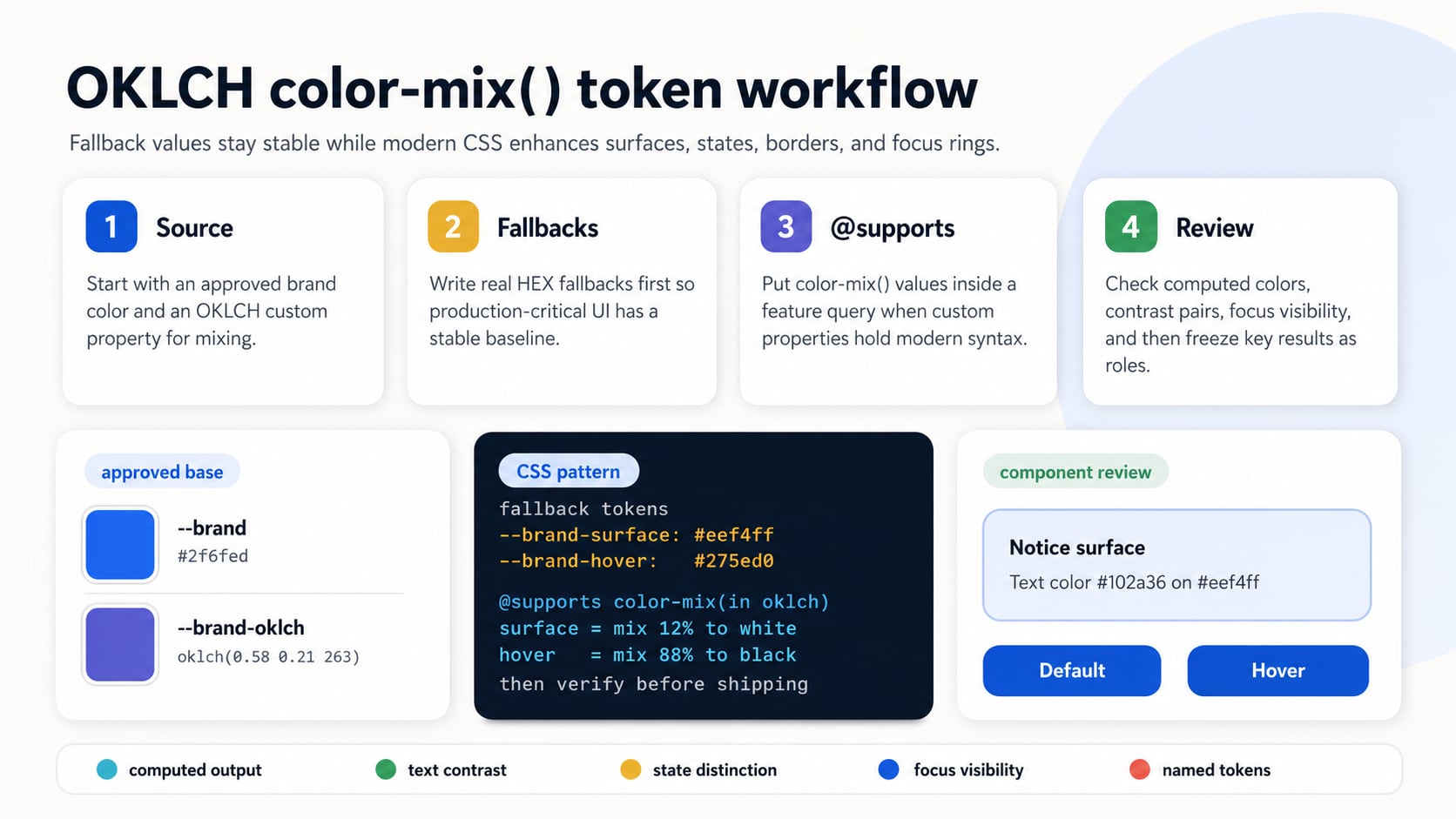
This tutorial shows how to use CSS color-mix() with OKLCH to create practical UI colors from one base color. By the end, you will have a small token set for hover states, soft surfaces, borders, and focus outlines, plus fallback declarations and an @supports pattern for environments where you do not want to rely only on modern color syntax.
The goal is not to use a new CSS feature just because it exists. The goal is to make related UI colors easier to maintain, review, and test. OKLCH is useful because it organizes color around perceptual lightness, chroma, and hue, which often makes ramps feel more even than quick mixes in sRGB or HSL.
This workflow is especially helpful for systems that need repeated color decisions: hover states, selected states, alert surfaces, quiet borders, and preview components that should feel related without hand-picking every single value.
The CSS snippets below are starting patterns, not drop-in production tokens. Treat the generated values as candidates until you have checked computed output, contrast, browser support targets, and real component context.
Prerequisites
- A base brand or accent color you already trust.
- A stylesheet where CSS custom properties are allowed.
- A fallback color for each important token.
- A contrast checker for any text, icon, or UI state that must remain readable.
If you need a quick refresher on modern color syntax, the CSS color formats guide covers HEX, RGB, HSL, OKLCH, color-mix(), alpha, and fallback context before you start wiring tokens into a UI.
Why Mix in OKLCH
color-mix() asks for an interpolation space. That space decides how the browser travels from one color to another. Mixing in srgb can be fine for small utility effects, but RGB channels are not organized around human perception. OKLCH gives you a more design-friendly way to think about the result: lightness, chroma, and hue.
That does not mean OKLCH magically fixes every palette. It means the intermediate colors are often easier to reason about when you care about perceived lightness and colorful intensity. You still need to check contrast, gamut, and final appearance in the real component.
How color-mix() Percentages Work
In a color-mix() expression, percentages describe how much of each color participates in the mix. If you provide one percentage, the remaining share is assigned to the other color. For example, mixing a brand color at 20% with white creates a very pale tint. Mixing the brand color at 85% with black keeps the brand dominant while darkening it.
:root {
  --brand-tint: color-mix(in oklch, var(--brand-oklch) 20%, white);
  --brand-hover: color-mix(in oklch, var(--brand-oklch) 85%, black);
  --brand-muted: color-mix(in oklch, var(--brand-oklch) 55%, gray);
}
Step 1: Start with a Stable Base Color
Start with one approved color and store it as a custom property. The fallback can be a HEX value, while the modern value can be OKLCH. Keeping both close together makes the intent easier to review.
:root {
  --brand: #2f6fed;
  --brand-oklch: oklch(0.58 0.21 263);
}
Step 2: Mix Toward White for Soft Surfaces
A common use for color-mix() is creating a soft background from an accent color. In OKLCH, mixing toward white can create a lighter surface that keeps more of the original hue direction.
:root {
  --brand-surface: #eef4ff;
  --brand-surface-strong: #d9e6ff;
}

@supports (background-color: color-mix(in oklch, black 50%, white)) {
  :root {
    --brand-surface: color-mix(in oklch, var(--brand-oklch) 12%, white);
    --brand-surface-strong: color-mix(in oklch, var(--brand-oklch) 24%, white);
  }
}
Step 3: Mix Toward Black for Hover and Active States
For button hover and active states, mix the base color toward black in small steps. Keep the movement modest. Large jumps can make the UI feel inconsistent and may change contrast more than expected.
.button-primary {
  background-color: var(--brand);
  color: white;
}

.button-primary:hover {
  background-color: #275ed0;
}

.button-primary:active {
  background-color: #214fae;
}

@supports (background-color: color-mix(in oklch, black 50%, white)) {
  .button-primary {
    background-color: var(--brand-oklch);
  }

  .button-primary:hover {
    background-color: color-mix(in oklch, var(--brand-oklch) 88%, black);
  }

  .button-primary:active {
    background-color: color-mix(in oklch, var(--brand-oklch) 78%, black);
  }
}
Step 4: Create Borders and Focus Rings
Borders and focus rings need enough contrast to be perceived against adjacent surfaces. A useful pattern is to mix the base color toward white for subtle borders and use a stronger, less diluted mix for focus outlines.
.field {
  border: 1px solid #b8c9ef;
}

.field:focus-visible {
  outline: 3px solid #5f8df5;
  outline-offset: 3px;
}

@supports (outline-color: color-mix(in oklch, black 50%, white)) {
  .field {
    border-color: color-mix(in oklch, var(--brand-oklch) 35%, white);
  }

  .field:focus-visible {
    outline-color: color-mix(in oklch, var(--brand-oklch) 76%, white);
  }
}
Step 5: Keep Fallbacks Close to the Modern Value
A fallback should be a real color, not a placeholder. For simple properties, a fallback declaration followed by a modern declaration can work well. For custom-property token systems, an @supports block is clearer because unsupported modern color functions inside variables can be harder to reason about than a plain ignored declaration.
.notice {
  background-color: #eef4ff;
  border-color: #b8c9ef;
  color: #102a36;
}

@supports (background-color: color-mix(in oklch, black 50%, white)) {
  .notice {
    background-color: color-mix(in oklch, var(--brand-oklch) 12%, white);
    border-color: color-mix(in oklch, var(--brand-oklch) 35%, white);
  }
}
Step 6: Verify the Result
After generating colors, test the actual pairs. color-mix() can make a palette easier to maintain, but it does not guarantee accessible contrast, brand fit, or good dark-mode behavior. Use the CSS color generator to inspect generated values, then check important foreground and background pairs before shipping.
- Inspect the computed color in browser dev tools.
- Check text contrast on every mixed background.
- Check focus rings against both the component and surrounding surface.
- Test hover and active states with keyboard and pointer interaction.
- Keep documented fallbacks and @supports coverage for production-critical colors.
Step 7: Freeze Important Results as Tokens
Generated colors are convenient, but important product colors should still become named tokens once they are approved. That gives designers, developers, and reviewers a stable contract. The color can be produced with color-mix() during exploration and then documented as a named role such as --color-action-primary-hover or --color-info-surface.
This is especially useful when a mixed value affects accessibility, brand review, screenshots, or exported design documentation. A formula explains where the color came from, but a token explains how the color should be used.
Example Token Set
| Token | Purpose | Example formula | Review note |
|---|---|---|---|
| --color-brand-surface | Soft background | color-mix(in oklch, var(--brand-oklch) 12%, white) | Check text placed on top. |
| --color-brand-surface-strong | Stronger tint | color-mix(in oklch, var(--brand-oklch) 24%, white) | Useful for selected or emphasized surfaces. |
| --color-brand-border | Subtle border | color-mix(in oklch, var(--brand-oklch) 35%, white) | Verify it is visible against the surrounding surface. |
| --color-brand-focus | Focus outline | color-mix(in oklch, var(--brand-oklch) 76%, white) | Check against both the component and page background. |
| --color-brand-hover | Button hover | color-mix(in oklch, var(--brand-oklch) 88%, black) | Check label contrast and state distinction. |
| --color-brand-active | Button active | color-mix(in oklch, var(--brand-oklch) 78%, black) | Avoid jumps that feel disconnected from the base color. |
Common Mistakes
- Mixing every state by the same percentage without checking contrast.
- Assuming OKLCH hue numbers match HSL hue numbers exactly.
- Using color-mix() output for text without testing the final foreground/background pair.
- Removing fallbacks before confirming the site's support target.
- Putting modern color functions inside custom properties without a feature-query plan.
- Treating generated ramps as final design tokens without review.
- Using the background shorthand when only background-color should change.
For deeper implementation details around interpolation and color-space choice, Hue Codex documents its approach in the color mixing and gradients methodology.
FAQ
Why use OKLCH with color-mix()?
OKLCH organizes color around lightness, chroma, and hue, which can make generated UI ramps easier to reason about than channel-based mixes in sRGB.
Does color-mix() guarantee accessible colors?
No. color-mix() can generate related colors, but every important foreground and background pair still needs to be checked for contrast and real component context.
Should I keep fallback colors?
Yes, if your production support target includes browsers, renderers, email clients, screenshots, or tooling where modern CSS color support is uncertain. Use stable fallback values and consider @supports when custom properties contain modern color functions.
Should generated colors become design tokens?
Yes for important UI roles. A formula explains how a color was produced, but a named token explains how the color should be used.
Final Takeaway
CSS color-mix() with OKLCH is strongest when it supports a clear token workflow: start with an approved base color, generate related surfaces and states, keep fallbacks nearby, and verify the actual UI pairs. As a next step, generate one surface, one hover state, one border, and one focus outline, then freeze only the values that pass contrast, support, and component review.
Spot an issue or want a color topic covered?Send a correction or request a post.