
Color guide
How to use a color wheel
A color wheel helps you choose hue relationships deliberately. It can show which hues are near, opposite, or evenly spaced around a circle, but a finished palette still needs lightness, chroma, contrast, accessibility, and role decisions before it works in a real interface.
Short answer
Use a color wheel by choosing a base hue, selecting a relationship such as complementary, analogous, triadic, tetradic, split complementary, or monochromatic, then tuning the resulting colors for lightness, chroma, saturation, contrast, and palette roles. The wheel gives hue structure; accessibility and design-system decisions make the palette usable.
- A color wheel organizes hues around a circle so relationships are easier to see.
- Complementary colors sit opposite each other and create strong tension, but they often need lightness and chroma tuning.
- Analogous colors sit next to each other and feel cohesive, but they may need neutral support and contrast checks.
- Triadic and tetradic palettes add range for charts, categories, illustrations, or expressive brands.
- Monochromatic palettes use one hue with varied lightness, chroma, saturation, tint, shade, or tone.
- A wheel is a starting point, not a pass/fail tool. Always test foreground/background contrast and avoid color-only meaning.
Standards status
Badges mark whether this guide relies on stable standards, draft or preview specifications, primary or model sources, Hue Codex guidance, approximations, or browser-dependent behavior.
What a color wheel is
A color wheel is a circular map of hue relationships. Instead of treating colors as isolated swatches, the wheel places color families around a loop so you can see which hues are adjacent, opposite, or evenly spaced.
Designers use color wheels to start palettes, build contrast between categories, choose accent colors, explain brand direction, create gradients, and reason about warm, cool, calm, energetic, related, or high-tension combinations.
A color wheel is a circular arrangement of hues that helps people choose relationships such as complementary, analogous, triadic, tetradic, split-complementary, and monochromatic color schemes.
Start with a base hue
The simplest way to use a color wheel is to choose one base hue. That base hue can come from a logo, product category, campaign mood, interface state, photograph, existing brand token, or user-selected seed color.
Once the base hue is chosen, the wheel helps you explore possible supporting hues. The important part is that the first decision is hue direction, not the final production color. A base blue might eventually become a navy button, a pale blue surface, a saturated data color, or a muted gray-blue border.
Brand seed
Start from the main logo or brand color, then look for supporting hues that feel intentional.
Semantic seed
Start from a function such as success, warning, danger, selected, or information.
Visual seed
Start from an image, illustration, product material, or editorial mood, then map the dominant hue to the wheel.
Hue angle and digital color wheels
In many digital tools, hue is written as an angle from 0 to 360 degrees. The circle wraps, so 0 degrees and 360 degrees point to the same red direction. HSL and similar color models commonly place red near 0 degrees, yellow near 60 degrees, green near 120 degrees, cyan near 180 degrees, blue near 240 degrees, and magenta near 300 degrees.
These angles are practical landmarks, not universal laws of perception. HSL, HSV, HWB, LCH, and OKLCH can all expose hue as an angle, but they organize color differently. A hue relationship can remain useful even when the exact numeric angle changes between color spaces.
| Hue angle | Common family | Possible role or association |
|---|---|---|
| 0 or 360 | Red | Danger, urgency, warmth, expressive accent |
| 30 | Orange | Friendly energy, calls to action, active states |
| 60 | Yellow | Highlights, caution, optimism, warm accents |
| 120 | Green | Success, growth, nature, available states |
| 180 | Cyan | Freshness, data, cool support color |
| 240 | Blue | Trust, links, product UI, primary actions |
| 300 | Magenta | Expression, creativity, accent contrast |
Hue angles are circular. The distance from 350 degrees to 10 degrees is 20 degrees through red, not 340 degrees around the long way. The role and mood examples are prompts, not universal color meanings; validate them for the audience and context.
The main color wheel harmonies
Color harmonies are common hue patterns around the wheel. They are useful because they create structure before you start tuning lightness, chroma, saturation, and contrast.
A harmony does not automatically produce a finished palette. It tells you where candidate hues sit in relation to each other. The final values still need roles, neutral support, state colors, accessible text pairings, dark-mode behavior, and brand judgment.
| Harmony | Wheel pattern | Best use |
|---|---|---|
| Complementary | Two hues opposite each other | High-energy accents, before/after states, strong visual contrast |
| Analogous | Neighboring hues | Calm palettes, gradients, product surfaces, related illustrations |
| Triadic | Three hues spaced around the wheel | Charts, categories, playful brands, broad illustration systems |
| Tetradic | Four hues in two complementary pairs | Expressive systems that need many distinct roles |
| Split complementary | One hue plus two hues near its opposite | Flexible contrast with less harsh tension than a direct complement |
| Monochromatic | One hue varied by lightness, chroma, saturation, tint, shade, or tone | Focused UI systems, subtle brand families, quiet editorial palettes |
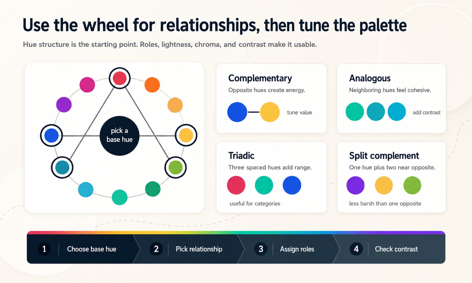
Complementary colors
Complementary colors sit opposite each other on the wheel, roughly 180 degrees apart. They create strong visual tension because the hues pull in different directions. This can be useful for emphasis, contrast, alerts, comparisons, and active versus inactive states.
The most common mistake is using both complements at full intensity. Pure blue and pure orange, red and green, or violet and yellow can compete for attention unless one color becomes dominant and the other becomes an accent. Lightness and chroma control are what make complements usable.
Use one as the lead
Let one color carry the main brand or UI role, then use its complement for small accents, highlights, or comparison states.
Tune lightness
A dark blue and a pale orange may work better than two equally vivid mid-tone complements.
Check color-vision context
Red-green complements need labels, icons, or shape differences because hue alone may not communicate meaning reliably.
Analogous colors
Analogous colors sit near each other on the wheel. They often feel related because they share nearby hue directions. Green, teal, and cyan can feel fresh and cool; red, orange, and yellow can feel warm and active; blue, violet, and magenta can feel expressive or editorial.
Analogous palettes are good for calm interfaces, gradients, illustrations, and brand systems that need cohesion. Their weakness is that similar hues can blur together if their lightness and chroma are also similar. Neutral colors and clear contrast ratios help keep the system legible.
Use a narrow range for calm
Two or three neighboring hues can create a quiet, controlled system.
Use a wider range for expression
A broader analogous arc can support illustrations, editorial layouts, or gradient-heavy moments.
Separate roles by value
If hues are close, make text, surfaces, borders, and accents distinct through lightness and contrast.
Triadic and tetradic palettes
Triadic palettes use three hues spaced around the wheel. Tetradic palettes use four hues, often as two complementary pairs. These schemes create more range than complementary or analogous palettes, which can be useful when a product needs categories, chart series, feature groups, game elements, or expressive brand moments.
The risk is visual noise. When many hues compete at equal intensity, the palette can feel loud or arbitrary. Mature triadic and tetradic systems usually choose one dominant hue, one or two supporting hues, and one carefully constrained accent.
| Scheme | Strength | Control rule |
|---|---|---|
| Triadic | Balanced hue variety with three clear families | Give each hue a distinct role or category |
| Tetradic | Large expressive range with two opposing pairs | Reduce saturation or chroma so colors do not all shout at once |
| Both | Useful for charts and categories | Use labels and patterns when color carries meaning |
Split complementary palettes
A split complementary palette starts with a base hue, then uses the two hues on either side of the direct complement. This keeps some opposite-side contrast while softening the hard tension of a single direct complement.
Split complements are useful when a palette needs energy but still needs flexibility. They can support a main brand hue plus two accent families for badges, data, illustrations, or campaign variants.
Good for flexible accents
Two near-opposites give you more options than one complement.
Less brittle than direct complements
The contrast feels lively without always creating a sharp two-color rivalry.
Still needs role control
Treat the split colors as candidates, then decide which ones become background, text, border, accent, or chart colors.
Monochromatic palettes
A monochromatic palette uses one hue family and changes the supporting channels. In traditional language, that can mean tints, shades, and tones. In digital design, it can also mean varying lightness, saturation, chroma, alpha, or perceptual color coordinates.
Monochromatic palettes are strong for focused product interfaces because they reduce hue competition. Their challenge is hierarchy. If every color is a blue, you need enough lightness and contrast range for surfaces, borders, text, hover states, selected states, and disabled states.
Use neutrals generously
A one-hue system usually works best with white, black, gray, or near-neutral surfaces.
Create a real scale
Include pale surfaces, readable text colors, active accents, hover states, and strong emphasis values.
Do not rely on hue alone
One hue cannot distinguish every state. Use labels, icons, spacing, borders, and contrast.
A practical color wheel workflow
The wheel becomes most useful when it is part of a repeatable workflow. Start with hue relationships, then turn those relationships into a palette with jobs. Without role assignment, a harmony is just a group of attractive swatches.
A production palette usually needs a primary color, secondary or accent colors, surface colors, text colors, borders, focus colors, success, warning, danger, info, chart colors, and sometimes light and dark mode variants. The wheel can suggest hue families for those roles, but it cannot finish the system by itself.
- Pick a base hue from brand, product category, mood, or existing palette requirements.
- Choose a relationship: complementary for tension, analogous for cohesion, triadic or tetradic for range, split complementary for flexible accents, or monochromatic for focus.
- Decide which hue is dominant, which hue supports, and which hue is only an accent.
- Tune lightness, chroma, saturation, and alpha until the colors feel balanced.
- Assign semantic roles such as surface, text, border, action, warning, success, danger, selected, and chart category.
- Check contrast for every foreground/background pair, especially text, icons, focus indicators, and controls.
Color wheel palettes and accessibility
Color wheel relationships do not guarantee accessibility. Accessibility depends on contrast, readable typography, non-color cues, semantic markup, focus states, and not using color as the only way to communicate meaning.
Two colors can be opposite on the wheel and still fail text contrast if their relative luminance is too similar. Two neighboring hues can be usable if one is dark and the other is pale. Always test the final foreground and background pair, not just the hue relationship.
Contrast is not hue distance
Blue and orange may be opposite, but the chosen blue text can still fail on the chosen orange background.
Color should not be the only signal
Errors, required fields, chart categories, status badges, and links need labels, shapes, underlines, icons, or patterns in addition to hue.
Test actual states
Hover, focus, active, selected, disabled, success, warning, danger, and dark-mode states can each change the contrast pair.
Using a color wheel with CSS and color roles
CSS color syntax can express hue directly in functions such as hsl(), hwb(), lch(), and oklch(). That makes a color wheel useful during design-system planning because hue relationships can be documented as part of the palette logic.
For production systems, store approved colors as semantic tokens rather than raw wheel positions alone. A token named color.primary.background tells the team more than a token named color.blue.500, and a paired text token makes accessible usage easier to repeat.
| Wheel decision | Token decision | Production check |
|---|---|---|
| Base hue | color.action.primary.bg | Button text contrast and hover behavior |
| Complement accent | color.accent.strong | Accent size, contrast, and visual priority |
| Analogous surface | color.surface.info.subtle | Readable text and border contrast |
| Triadic chart hue | color.chart.series.3 | Direct labels and color-blind-safe support |
Common color wheel mistakes
Most color wheel mistakes come from treating the wheel as a finished answer. The wheel is excellent for exploring hue relationships, but it does not know your brand, audience, content density, accessibility target, typography, screen environment, or product states.
Mistake: using every generated color
A harmony gives options. You do not need every color in the final interface.
Mistake: keeping all hues equally vivid
Equal saturation or chroma can make a palette noisy. Choose hierarchy and reduce intensity where needed.
Mistake: using complements as text/background pairs
Opposite hues can still fail contrast. Test the final pair before using it for text.
Mistake: ignoring neutrals
Most useful UI palettes need neutral surfaces, text, borders, and dividers to give hue room to work.
Mistake: assuming HSL is perceptually even
HSL is convenient, but equal lightness values do not always appear equally light. OKLCH can be better for perceptual scale work.
Mistake: color-only meaning
A red badge and a green badge should still include text or icons so meaning survives color-vision differences.
How Hue Codex uses the color wheel
Hue Codex treats the color wheel as a palette-structure tool, not a magic palette generator. The color harmonies tool can generate complementary, analogous, triadic, tetradic, split-complementary, and monochromatic candidates from a seed color.
The rest of the workflow matters just as much: convert formats, build tints and shades, inspect CSS syntax, check contrast, suggest readable text colors, and export palette data. That is how a wheel relationship becomes a usable design system rather than a pretty set of swatches.
Sources and further reading
This guide is written from practical palette and design-system usage and cross-checked against primary CSS color and accessibility references.
Try it in Hue Codex
Use the free tools to test the idea immediately: pick a color, convert it, generate harmonies, build tints and shades, check contrast, and export practical CSS or palette data.
Quick answers
How to use a color wheel FAQ
How do you use a color wheel?
Choose a base hue, select a relationship such as complementary, analogous, triadic, tetradic, split complementary, or monochromatic, then tune the resulting colors for lightness, chroma, contrast, and palette roles.
What is a color wheel used for?
A color wheel is used to understand hue relationships, build palette ideas, choose accent colors, create harmonies, plan gradients, separate categories, and explain why colors feel related or contrasting.
What are complementary colors?
Complementary colors sit opposite each other on a color wheel, roughly 180 degrees apart. They create strong visual tension but still need lightness and contrast tuning for real design use.
What are analogous colors?
Analogous colors sit next to each other on a color wheel. They often feel cohesive and calm, but they may need neutrals and stronger value contrast to stay readable.
What is a triadic color scheme?
A triadic color scheme uses three hues spaced around the wheel. It can be useful for charts, categories, playful brands, and illustration systems when each hue has a clear role.
What is a tetradic color scheme?
A tetradic color scheme uses four hues, often as two complementary pairs. It offers a lot of range but needs hierarchy so the colors do not all compete at equal intensity.
What is a split complementary color scheme?
A split complementary scheme uses one base hue plus the two hues near its direct complement. It keeps contrast while feeling less harsh than a strict complementary pair.
What is a monochromatic color scheme?
A monochromatic color scheme uses one hue family and varies lightness, chroma, saturation, tint, shade, tone, or alpha to create a usable range.
Are color wheel harmonies automatically accessible?
No. Accessibility depends on the final foreground/background contrast, readable typography, focus states, labels, and not relying on color alone to communicate meaning.
Should I use HSL for color wheel palettes?
HSL is useful for quick hue rotations and readable CSS, but it is not perceptually uniform. For precise UI scales, OKLCH or hand-tuned palettes can be more reliable.
How many colors should I choose from a color wheel?
Start with one base hue and one to three supporting hues. Most interfaces also need neutral colors, semantic state colors, and accessible text/background pairs.
What is the biggest mistake when using a color wheel?
The biggest mistake is treating a harmony as a finished palette. A harmony gives hue structure; production design still needs roles, hierarchy, neutrals, contrast checks, and real UI-state testing.