Use sRGB for stable defaults
HEX and ordinary rgb() values are familiar, compact, easy to copy, and still ideal for many color roles, content systems, and brand handoffs.

Color guide
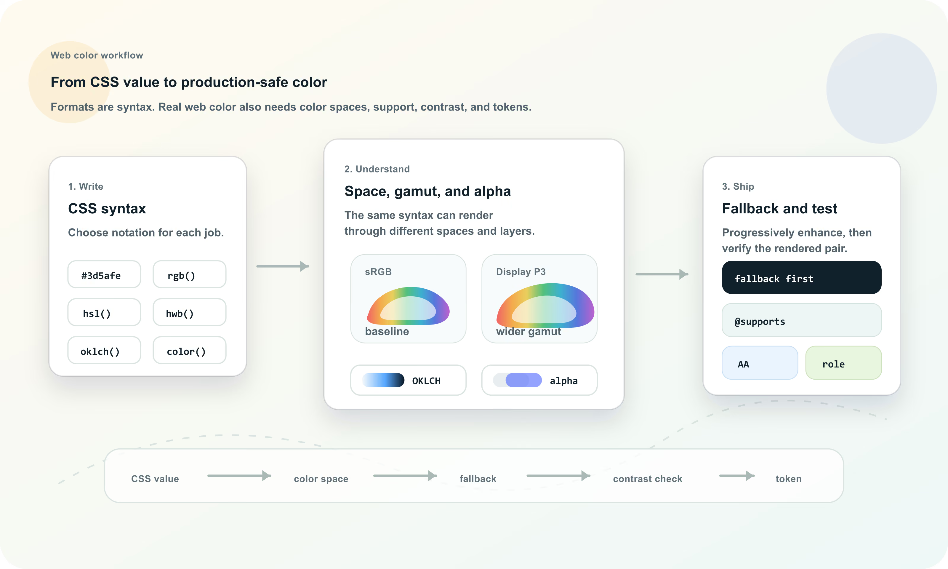
Web color is the way browsers represent, render, adapt, and expose colors through CSS, images, user preferences, display capabilities, and accessibility constraints. The practical skill is knowing which syntax to use, which color space it belongs to, how it degrades, and whether the final foreground/background pair works for real users.
Web color is more than a HEX value. Modern CSS can express sRGB colors, alpha, HSL and HWB channels, perceptual Lab, LCH, OKLab, and OKLCH colors, explicit spaces such as display-p3, color mixing, relative colors, theme-aware choices, and custom-property tokens. Use simple sRGB fallbacks where needed, progressive enhancement for modern syntax, and always test the rendered foreground/background pair for contrast and meaning.
Web color is the complete color workflow that happens in browsers: CSS values, color spaces, images, gradients, interpolation, transparency, user preferences, display capabilities, operating-system settings, and accessibility constraints all influence what a user finally sees.
A color written in CSS is only the beginning. The browser parses the syntax, resolves variables and cascade rules, handles color spaces, composites alpha, applies theme or media-query logic, clips or maps out-of-gamut colors, and paints the final result on a particular display. A good web color system plans for that whole path.
Web color is the use of standards-defined color values, color spaces, rendering rules, accessibility checks, and role-based workflows to display reliable colors in browsers and web interfaces.
sRGB is still the practical baseline for most web color. Traditional HEX values, ordinary rgb() values, many design exports, and a huge amount of web tooling assume sRGB channel values. If you need the broadest mental model and compatibility story, start there.
The important limitation is that sRGB is a gamut, not every color humans can see and not every color modern displays can show. A bright Display P3 orange or green may sit outside sRGB. If that wider color matters, document it explicitly and provide a fallback.
HEX and ordinary rgb() values are familiar, compact, easy to copy, and still ideal for many color roles, content systems, and brand handoffs.
Wide-gamut displays can show colors outside sRGB, especially in saturated reds, oranges, greens, and cyans.
A color can be in sRGB, Display P3, or OKLCH and still fail contrast if the final rendered pair is too close in luminance.
Modern CSS supports a wide color toolbox. Some formats are compact. Some expose familiar numeric channels. Some expose perceptual dimensions. Some identify an explicit color space. Some derive one color from another. The best syntax depends on the job you need the color to do.
A useful web color system often keeps more than one representation: a canonical token, an sRGB fallback, a modern CSS value, and exported formats for design tools or other platforms.
| Syntax | Best for | Example |
|---|---|---|
| Named colors | Small demos, browser defaults, examples, currentColor inheritance | red, white, transparent, currentColor |
| HEX | Compact sRGB brand values and static tokens | #3d5afe or #3d5afecc |
| rgb() | sRGB channel values, alpha overlays, generated output | rgb(61 90 254 / 72%) |
| hsl() | Manual hue, saturation, and lightness edits | hsl(232 99% 62% / 72%) |
| hwb() | Whiteness and blackness edits around a hue | hwb(232 24% 0%) |
| lab() and lch() | Perceptual lightness, chroma, and hue in CIE Lab based spaces | lch(54% 94 295) |
| oklab() and oklch() | Modern perceptual scales and smoother UI color work | oklch(0.62 0.22 264) |
| color() | Explicit color spaces such as display-p3 | color(display-p3 0.95 0.38 0.2) |
| color-mix() | Derived tints, shades, tones, hovers, and surfaces | color-mix(in oklab, var(--brand) 80%, white) |
| light-dark() | Theme-aware values for light and dark schemes | light-dark(#ffffff, #10151f) |
HEX, RGB, HSL, and HWB are still the everyday vocabulary of web color. HEX is short and handoff-friendly. rgb() exposes red, green, blue, and alpha clearly. hsl() exposes hue, saturation, and lightness for quick human edits. hwb() exposes hue, whiteness, and blackness, which can feel intuitive when thinking about tint-like and shade-like changes.
These formats are useful, but they are not interchangeable as workflows. A HEX value is easy to copy but hard to adjust by eye. HSL is easy to rotate but not perceptually uniform. RGB is excellent for generated channel output but awkward for palette reasoning.
| Format | Strength | Weakness |
|---|---|---|
| HEX | Compact, common, easy to paste into design tools and docs | Does not reveal hue, lightness, chroma, or alpha clearly |
| rgb() | Clear channel and alpha control | Poor for human color relationships and palette tuning |
| hsl() | Readable hue and lightness edits | Equal steps do not look visually even across all hues |
| hwb() | Intuitive whiteness and blackness adjustments | Less common in production systems and still not a full perceptual model |
Perceptual color spaces are useful because people do not experience raw RGB channels as equal visual steps. Lab, LCH, OKLab, and OKLCH give teams better ways to reason about perceived lightness and colorfulness.
OKLCH is especially useful for interface palettes because it exposes lightness, chroma, and hue in a form that maps well to design-system tasks. You can plan pale surfaces, strong accents, muted borders, and dark foregrounds with more predictable lightness relationships than raw RGB or HSL.
The perceived light or dark dimension. It is central for UI hierarchy and contrast planning.
The perceived colorfulness dimension. It helps control whether a color feels muted, vivid, loud, or restrained.
The color-family direction. Hue still matters for brand, mood, states, and chart categories, but it is not the whole color.
Some OKLCH combinations are outside a target gamut. Production tools need to handle clipping, mapping, or alternate values.
Wide-gamut color lets capable screens show colors outside sRGB. Display P3 is a common wider-gamut space for modern displays. In CSS, color(display-p3 ...) can express Display P3 values directly, while an sRGB fallback can protect users and browsers that cannot represent the same color.
Wide-gamut color is not automatically better. It can make brand accents, illustrations, gradients, and media feel richer, but it can also create inconsistent appearance across devices, exported assets, screenshots, and design handoff if the team does not document the intended fallback.
| Decision | Why it matters | Production move |
|---|---|---|
| Use sRGB fallback | Not every environment renders wider-gamut values the same way | Declare the sRGB value first, then override with display-p3 or another modern value |
| Check color-gamut support | Some experiences should adapt to display capability | Use support checks or media queries when the wide-gamut treatment changes the design |
| Avoid semantic dependence | A richer color should not be the only way meaning is communicated | Keep labels, icons, contrast, and state language stable across gamut |
| Document exports | Screenshots, CSS, PNGs, design files, and printed material can diverge | Record canonical values and conversion assumptions |
Alpha is part of a color. Opacity is a property that affects an entire element and its descendants. That distinction matters on the web because opacity can accidentally make text, icons, borders, and children less readable.
Slash alpha is the modern CSS pattern for color transparency: rgb(0 0 0 / 50%), hsl(0 0% 0% / .5), and oklch(0.62 0.22 264 / 70%) all express alpha inside the color value. Eight-digit HEX can also encode alpha, but it is usually less readable for humans.
Use alpha inside the color when only a background, border, or shadow color should be transparent.
opacity fades the full element, including content that might need to remain readable.
A transparent color depends on whatever sits behind it, including images, gradients, dark mode surfaces, and scrolled content.
CSS Color Module Level 5 defines newer color tools such as color-mix() and relative color syntax. These features can derive useful variants from a base color: tint-like surfaces, shade-like hovers, tone-like muted accents, and adjusted OKLCH lightness or chroma.
Generated variants should still be reviewed. The interpolation space affects the result, out-of-gamut values can happen, and a derived color can fail contrast or look wrong in a real component. Treat these functions as controlled production logic, not magic palette approval.
| Goal | Example pattern | Check before shipping |
|---|---|---|
| Tint surface | color-mix(in oklab, var(--brand) 16%, white) | Text contrast on the tinted surface |
| Hover shade | color-mix(in oklab, var(--brand) 84%, black) | Button text contrast and brand fit |
| Muted tone | color-mix(in oklab, var(--brand) 55%, gray) | Whether the color still communicates its role |
| OKLCH adjustment | oklch(from var(--brand) calc(l + .08) c h) | Browser support, gamut, and resulting contrast |
Web color is often theme-aware. CSS can use color-scheme, media queries, custom properties, and light-dark() to choose different values for light and dark contexts. This is not only a styling preference. It affects readability, glare, semantic states, focus indicators, and perceived brand color.
Dark mode is not just inverted light mode. A saturated color that works on white may glow too strongly on a dark surface. A subtle border that works in light mode may disappear in dark mode. A semantic red may need a different lightness and chroma to remain clear without becoming harsh.
Use semantic variables for page, surface, text, border, action, focus, and state roles in each scheme.
Use light-dark() or media-query overrides when a single token should resolve differently by color scheme.
A brand color can have light and dark mode variants while preserving the same design intent.
Fallbacks are part of responsible web color. A modern value can be excellent for browsers that support it, while an older syntax keeps the interface usable where support, tooling, or rendering is limited. The common pattern is to declare the simpler value first, then declare the modern value after it or inside @supports.
Fallbacks are not only for browsers. They can also support email clients, CMS previews, screenshot tools, role-based exports, visual review systems, and older paths that do not understand every modern CSS feature.
| Need | Pattern | Example |
|---|---|---|
| Modern color value | Declare sRGB first, modern value second | color: #3d5afe; color: oklch(0.62 0.22 264); |
| Feature-gated value | Use @supports for the modern rule | @supports (color: oklch(0.6 0.2 240)) { ... } |
| Wide-gamut accent | sRGB fallback plus display-p3 override | background: #ff6b4a; background: color(display-p3 1 .38 .22); |
| Generated states | Store approved fallback tokens | --hover: #243fd6; --hover: color-mix(in oklab, var(--brand) 82%, black); |
The web color system is not finished until users can read, perceive, and interpret it. A CSS color value does not become accessible because it is modern, wide gamut, or perceptual. Accessibility depends on final rendered contrast, visible states, text size, non-text components, and whether meaning survives without hue alone.
Always test the actual foreground/background pair after variables, alpha, gradients, images, themes, and state changes are applied. Also check focus outlines, links, icons, chart marks, selected states, error states, and controls.
Normal text generally needs stronger contrast than decorative color. Check the final text and background values that users see.
Important icons, boundaries, focus indicators, and chart marks need enough contrast against adjacent colors.
Do not rely on hue alone for errors, links, required fields, chart categories, selected states, or financial gains and losses.
Hover, active, focus, selected, disabled, loading, success, warning, danger, and dark-mode states each deserve checks.
CSS custom properties let a site store and reuse color values, but variables are not automatically a design system. A durable web color system uses semantic tokens that describe jobs: action background, action text, page surface, warning border, focus ring, chart series, muted text, and so on.
Role tokens reduce misuse. A component that consumes --color-action-primary-bg and --color-action-primary-text is easier to keep accessible than a component that grabs --blue-500 and hopes it works. Appearance scales can still exist, but production components should usually point to semantic roles.
| Token layer | Example | Purpose |
|---|---|---|
| Raw value | #3d5afe or oklch(0.62 0.22 264) | Canonical color data |
| Palette scale | --blue-500 | Organized family or ramp for designers and utilities |
| Semantic role | --color-action-primary-bg | Approved meaning and usage |
| Paired role | --color-action-primary-text | Foreground value that belongs with the background |
| Theme alias | --color-surface-page | Light and dark mode adaptation |
| Export value | RGB, HEX, OKLCH, JSON, CSS | Handoff to other tools and platforms |
Web color is not limited to flat CSS fills. Images, SVGs, canvas, gradients, shadows, filters, and blend modes all participate in the final color experience. Gradients and mixes are especially sensitive to interpolation space, because the path between two colors can change the perceived middle colors.
When a brand relies on a gradient or image overlay, test the actual rendered result. A contrast value measured on a flat token may not represent text over a photographic image, a transparent overlay, or a gradient whose middle passes through unexpected colors.
Choose interpolation deliberately when the midpoint matters, and inspect the full ramp for muddy or over-bright transitions.
Text over images needs overlays, scrims, or constrained art direction to preserve contrast.
currentColor is useful when icons should inherit text color, but meaningful icon states still need contrast checks.
A strong web color workflow separates exploration from production. Explore with the format that helps you reason, then approve values as roles. The final system should be testable, documented, and resilient when browsers, displays, themes, or content change.
This workflow is intentionally conservative. It does not assume every modern feature is wrong, and it does not assume every modern feature is safe. It gives teams a way to use new color capabilities while preserving access, meaning, and maintenance.
Most web color mistakes come from treating a syntax choice as a finished design decision. A modern color function can make a system more expressive, but it can also create surprises if support, contrast, gamut, alpha, and tokens are not managed.
OKLCH, color(), color-mix(), relative colors, and light-dark() are powerful, but audience and tooling support still matter.
Opacity can make text unreadable and fade child content. Prefer explicit disabled tokens and test the resulting contrast.
Richer colors can be inconsistent or too intense if they are not constrained and documented.
A button can pass at rest and fail on hover, focus, disabled, selected, or dark-mode states.
Status systems, charts, links, and forms need labels, icons, underlines, shapes, or position in addition to color.
If CSS, design files, JSON tokens, and docs are hand-maintained separately, they will drift.
Hue Codex is designed to make web color decisions visible. You can pick a color, convert it across HEX, RGB, HSL, HWB, Lab, LCH, OKLab, and OKLCH, generate palettes and tints, compare formats, check WCAG contrast, simulate color-vision differences, and export values for CSS or token documentation.
The point is not to choose a syntax because it is fashionable. The point is to understand what the color means, how browsers will render it, what fallback protects it, and whether the final result works for people.
This guide is written from practical web design-system usage and cross-checked against current primary CSS and WCAG references.
Use the free tools to test the idea immediately: pick a color, convert it, generate harmonies, build tints and shades, check contrast, and export practical CSS or palette data.
Quick answers
Web color is the use of CSS color values, color spaces, browser rendering rules, display capabilities, accessibility checks, and role-based workflows to create reliable color on websites and web apps.
sRGB HEX or rgb() values are usually the safest baseline because they are familiar and broadly supported. Modern CSS formats can be layered on top with fallbacks when they help the design system.
sRGB is the standard baseline color space used by traditional web colors such as HEX and ordinary rgb() values. It is widely supported but smaller than some modern display gamuts.
Display P3 is a wider-gamut color space that can represent some richer colors than sRGB on capable displays. CSS can express it with color(display-p3 ...), usually with an sRGB fallback.
OKLCH is useful for building perceptual color scales because it separates lightness, chroma, and hue in a way that maps well to UI color decisions. It still needs support checks, gamut handling, and contrast testing.
Use HEX for compact stable sRGB values and handoff. Use OKLCH when perceptual lightness, chroma, hue, or scale generation matters. Many systems store canonical values and export both.
color-mix() is a CSS function that mixes two colors in a chosen color space. It can derive tints, shades, tones, hover states, and subtle surfaces, but the result still needs visual and contrast checks.
Relative color syntax derives one color from another by reading and adjusting its channels. It is useful for systematic variants, but support, gamut, and accessibility still need verification.
Alpha is transparency inside a color value. Opacity is a CSS property that fades the entire element and its descendants. For readable UI layers, color alpha is often safer than element opacity.
Use fallbacks when your audience, tooling, browser matrix, email clients, or export pipeline might not support the modern syntax or gamut. A common pattern is an sRGB declaration followed by a modern override.
The notation itself does not make a color accessible. Accessibility depends on the final rendered foreground and background colors, contrast, non-color cues, focus visibility, and actual UI states.
Store colors as semantic roles such as --color-action-primary-bg and --color-action-primary-text. Palette scale tokens can support the system, but production components should usually consume role tokens.
No. Color should not be the only cue for status or meaning. Use text, icons, labels, shape, position, or patterns so meaning survives color-vision differences and low-quality displays.
Choose the role first, author in the color space that fits the task, provide fallbacks, store semantic tokens, test contrast in real states, and document approved values and pairings.