Surface systems
Use lighter steps for page backgrounds, cards, panels, disabled fills, and quiet interface regions.
Lightness ladder
Generate a 5, 7, or 9 step color ladder from one HEX seed, then compare HSL and OKLCH lightness spacing for UI surfaces, borders, text colors, and state tokens. Hue Codex previews each swatch with contrast against a dark ink color and exports copy-ready CSS custom properties.
Free color utility
Inputs update live, exports are copy-ready, and the color math stays deterministic.
Scale
How it fits
Hue Codex treats each color as part of a larger workflow: conversion, accessibility, palette roles, CSS syntax, shareable URLs, and production exports.
Color conversion follows CSS Color 4 conventions, including D50 Lab/LCH, D65 OKLab/OKLCH, and WCAG contrast thresholds.
Every result is formatted for clear reading, project notes, documentation, and assistive technology.
Palette URLs can be bookmarked and sent without an account, making color decisions easy to revisit.
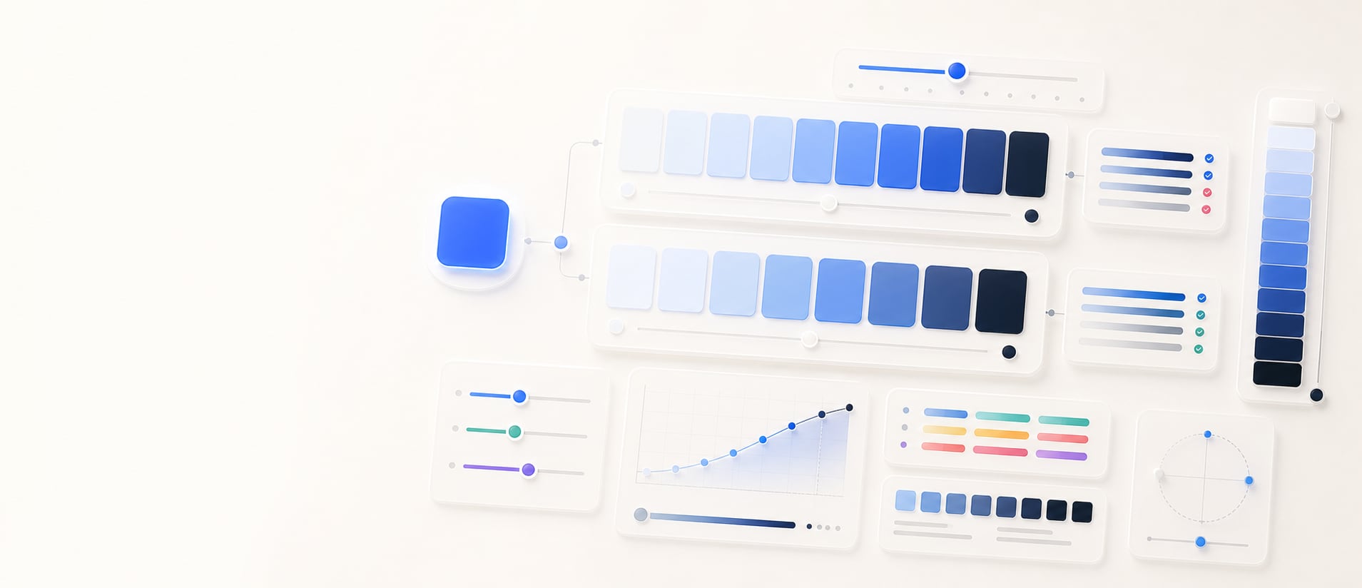
Hue Codex Lightness Ladder Generator is a free browser-based tool that creates 5, 7, or 9 step UI color scales from one HEX color. It can generate the ladder in OKLCH or HSL, previews each swatch with contrast against dark ink, and exports copy-ready CSS custom properties.
The Hue Codex lightness ladder generator takes one HEX color and creates an ordered set of lighter-to-darker swatches. You can choose 5, 7, or 9 steps and switch between OKLCH and HSL generation.
Each generated color is shown as a swatch with a contrast note against dark ink. The export panel writes the ladder as CSS custom properties, making it easy to test the scale in a design system or web project.
A lightness ladder is a set of related colors that share a hue family while stepping from light to dark values. It is commonly used for UI surfaces, borders, text, emphasis levels, and state colors.
Hue Codex lets you build the ladder in either HSL or OKLCH. Both modes keep the seed color as the source of the hue family, but the lightness and colorfulness behavior differs.
| Mode | How it builds the ladder | When it helps |
|---|---|---|
| OKLCH | Uses OKLCH lightness from very light to dark, keeps the seed hue, and caps chroma for practical UI output. | Useful for modern interface scales where perceptual spacing and steady color behavior matter. |
| HSL | Uses HSL lightness from very light to dark, keeps the seed hue, and preserves at least a small amount of saturation. | Useful for familiar CSS-style color scales and quick comparisons with existing HSL workflows. |
| Contrast note | Shows each swatch contrast against the dark ink color used by the tool preview. | Useful for quickly spotting light steps that may support dark text before doing final contrast checks. |
| CSS variables | Exports the ladder as --color-ladder-1, --color-ladder-2, and so on. | Useful for moving the generated scale into color roles, mockups, or project notes. |
The ladder spaces lightness from a very light value at the first step to a dark value at the final step. A 5-step ladder gives a compact scale, 7 steps give a balanced UI range, and 9 steps provide finer control for more detailed systems.
The generated labels include the selected model and rounded lightness value, which makes the ladder easier to scan when comparing HSL and OKLCH output.
A lightness ladder is most useful when one hue family needs to support several interface roles. Instead of hand-picking unrelated colors, the ladder gives you a structured starting point from light surfaces to dark emphasis colors.
Use lighter steps for page backgrounds, cards, panels, disabled fills, and quiet interface regions.
Use middle-light steps for borders, dividers, input outlines, and low-emphasis separators.
Use darker steps for labels, headings, icons, emphasis states, and high-contrast accents.
Copy the exported CSS variables into token drafts and rename them to match your product naming system.
Generated ladders are strong starting points, not final accessibility decisions. The contrast note shown in the tool uses one dark ink color, so text, icon, and control colors should still be tested against their real backgrounds.
Some seed colors behave differently in HSL and OKLCH. Highly vivid colors may need chroma or saturation tuning after the ladder is generated, especially when a brand color must stay recognizable across very light and very dark steps.
Quick answers
Hue Codex Lightness Ladder Generator is a free browser-based tool that turns one HEX color into a 5, 7, or 9 step UI color scale in OKLCH or HSL.
A lightness ladder is a set of related colors that move from light to dark while staying connected to the same hue family.
OKLCH mode uses perceptual lightness with the seed hue and capped chroma, while HSL mode uses HSL lightness with the seed hue and saturation. The two modes can produce different-looking scales.
Use 5 steps for a compact scale, 7 steps for a balanced general-purpose UI scale, and 9 steps when you need finer distinctions for surfaces, borders, text, and states.
Yes. Each swatch includes a contrast ratio against the dark ink color used in the preview, which helps you quickly scan which lighter steps may support dark text.
Yes. The tool exports the generated ladder as CSS custom properties named --color-ladder-1, --color-ladder-2, and so on.
You can use it as a token draft. Rename the CSS variables to match roles such as surface, border, text, accent, hover, or selected after checking them in your real interface.
Yes. The preview contrast note is useful, but final text and UI pairs should be checked against their actual backgrounds with a contrast checker.