Ordered values
Use a sequential palette when values move from low to high, small to large, early to late, or weak to strong.
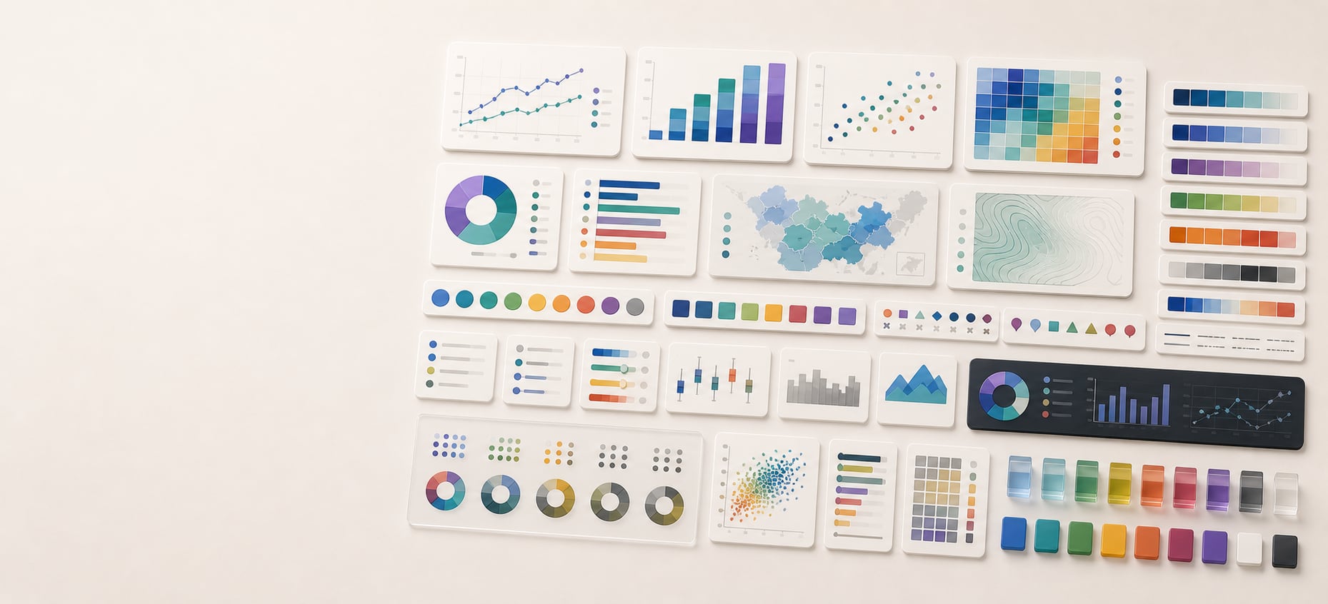
Color guide
Chart color should explain the data relationship, not decorate the chart. Good visualization palettes start with the kind of data being shown, then use lightness, hue, labels, contrast, and accessibility checks to make the message clear.
Choose data visualization colors by data relationship first. Use sequential palettes for ordered low-to-high values, diverging palettes when values move away from a meaningful midpoint, categorical palettes for distinct groups, cyclic palettes for values that wrap, semantic palettes for known states, and highlight colors to direct attention. Then test lightness, labels, contrast, color-vision resilience, dark mode, and chart-specific roles before shipping.
Data visualization color is the use of hue, lightness, saturation, contrast, and repetition to encode relationships in data. It can show magnitude, category, change, rank, uncertainty, risk, selection, highlight, region, status, or comparison.
The best chart colors are not simply attractive. They reduce interpretation time, support the chart title, survive different screens, remain readable in light and dark contexts, and avoid making users decode meaning from color alone.
A data visualization color palette is a role-based set of colors chosen to communicate a specific data relationship, such as order, difference from a midpoint, category membership, status, or emphasis.
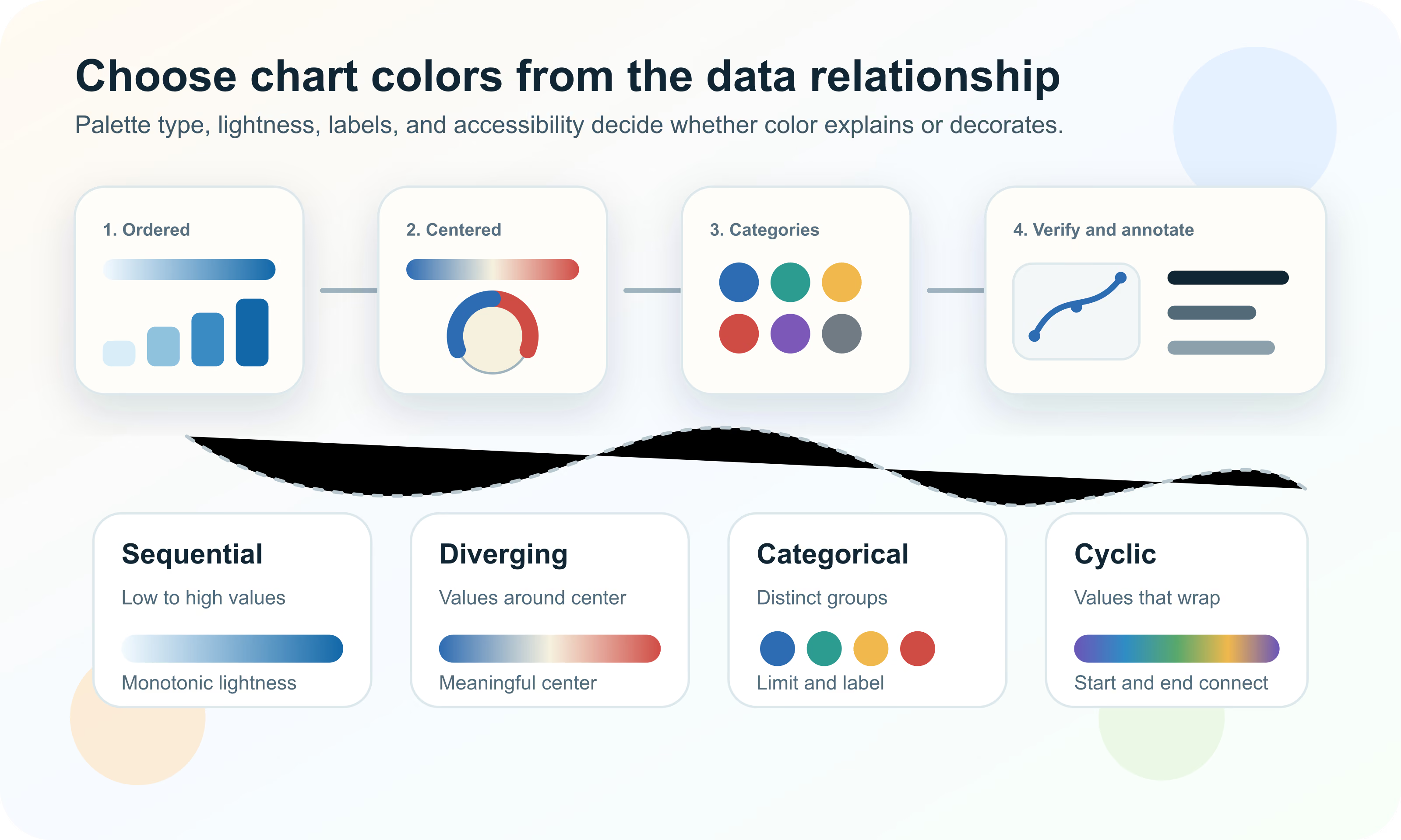
Before choosing colors, decide what the viewer must compare. Is the chart showing low-to-high magnitude? Values above and below a target? Several unrelated categories? A status state? A single highlighted series? A value that wraps, like compass direction or time of day?
This decision matters because each relationship needs a different visual structure. Ordered data needs a clear progression. Diverging data needs a neutral center. Categories need separable colors. Highlights need quiet context. Status colors need learned meaning and non-color support.
Use a sequential palette when values move from low to high, small to large, early to late, or weak to strong.
Use a diverging palette when values move in two directions from a meaningful midpoint such as zero, average, baseline, or target.
Use a categorical palette when colors identify groups that have no natural order.
Use semantic colors when values already carry meaning, such as success, warning, danger, selected, missing, forecast, or actual.
The fastest way to improve chart color is to stop asking whether a palette is pretty and ask whether it fits the data. The table below is the working decision map.
| Palette type | Use for | Avoid when |
|---|---|---|
| Sequential | Ordered numeric values from low to high | The data has unrelated categories or a meaningful midpoint |
| Diverging | Values above and below a meaningful center | There is no meaningful center or neutral point |
| Categorical | Distinct unordered groups | The data is ordered or has too many groups to distinguish |
| Cyclic | Values that wrap around to the start | The value has a true beginning and end |
| Semantic | Known states such as success, warning, danger, missing, selected | The colors are arbitrary or culturally risky without labels |
| Highlight | One series, category, region, or range needs attention | Every category needs equal attention |
| Neutral support | Gridlines, axes, labels, baselines, inactive context | The neutral values compete with the data marks |
Sequential palettes show ordered values. They usually move from light to dark, low saturation to higher saturation, or both. Lightness is the primary cue because people can compare light and dark more reliably than arbitrary hue order.
Use sequential palettes for heatmaps, choropleth maps, completion, volume, density, revenue, age, risk score, temperature when it is not centered on a baseline, and any measurement where one direction means more.
Diverging palettes show values that move in two directions away from a meaningful center. Common examples include profit and loss, above and below target, hotter and colder than average, positive and negative change, surplus and deficit, and sentiment above or below neutral.
The center is the key. A diverging palette should not be used just because it looks dramatic. If the midpoint is arbitrary, the chart will imply a split that may not exist.
| Center type | Example | Design implication |
|---|---|---|
| Zero | Profit and loss, net change, variance | Two directions can use balanced color arms |
| Target | Performance above or below quota | Make the target visually explicit with a label or line |
| Average or median | Regional values above or below typical value | Explain whether the center is mean, median, or benchmark |
| Neutral response | Survey sentiment or rating scale | Ensure the middle reads as neutral rather than missing |
| Safety threshold | Above or below recommended range | Pair color with text because risk should not rely only on hue |
Categorical palettes identify distinct groups. They are useful for product lines, regions, teams, departments, survey groups, platforms, segments, or named series. Unlike sequential palettes, categorical palettes should not imply order unless the data has one.
The hard part is scale. People can distinguish a handful of colors in a legend, but many categories quickly become hard to track. The more categories a chart has, the more it needs direct labels, grouping, ordering, filtering, or small multiples.
If a chart needs more than six to eight category colors, consider grouping minor categories, filtering, faceting, or using interaction.
Use lightness, saturation, shape, line style, marker, position, and labels so categories remain distinguishable.
A product, region, or status should keep the same color across related dashboards unless there is a strong reason to change it.
Keep the most saturated or attention-grabbing colors for the most important series, not arbitrary legend order.
Cyclic palettes are for values that wrap back to the beginning: compass direction, angle, phase, time of day, day of year, circular movement, or periodic signal. The first and last colors must connect visually because the data has no hard end.
Do not use a cyclic palette for ordinary low-to-high data. A cyclic palette can imply that the highest value returns to the lowest value, which is wrong for many measures.
Semantic colors use learned meaning: green for success, red for danger, yellow or amber for warning, blue for information, gray for disabled or unknown. They are useful in dashboards and product analytics because people often need to scan for state quickly.
Semantic colors are risky when they become the only cue. A red dot and a green dot should still have labels, icons, tooltips, table text, or shape differences. This is especially important for operational dashboards, healthcare, finance, safety, accessibility, and international audiences.
| Role | Common use | Required support |
|---|---|---|
| Success | Healthy, passed, complete, on target | Label, status text, or check icon |
| Warning | Near threshold, needs attention, incomplete | Label and threshold explanation |
| Danger | Failed, critical, loss, unsafe, error | Text, icon, and clear recovery or context |
| Info | Reference, forecast, neutral callout | Legend or annotation |
| Missing | No data, unknown, suppressed, unavailable | Do not use the same color as zero |
| Selected | Active filter, highlighted series, chosen region | Keep distinct from semantic state colors |
A highlight palette intentionally makes one item stand out while the surrounding data stays quiet. It is one of the most effective chart color strategies because it reduces legend work and tells the viewer where to look first.
Use highlight color when the chart has a clear message: one region changed fastest, one product is the focus, one month is abnormal, one value crosses a threshold, or one segment is being compared against the rest.
Use gray, low-saturation colors, or lighter strokes for background series and categories.
Apply the strongest color to the series, point, range, or region that the title and annotation discuss.
A highlight should usually be paired with a label, callout, or title that explains why it matters.
Legends force the viewer to look back and forth between color and meaning. Direct labels reduce that work. They are especially valuable for line charts, maps, small category sets, and charts viewed on mobile screens.
A legend is still useful when labels would clutter the chart, but it should be close to the data, ordered like the data, and visually consistent with the marks. Do not make users decode ten similar colors from a legend placed far away from the plot.
Accessible chart color means people can read, compare, and interpret the chart under different visual conditions. Contrast matters, but it is not the whole job. Color-vision differences, low vision, small screens, printouts, projector glare, dark mode, and cognitive load all affect whether a chart works.
WCAG guidance is especially relevant when chart color conveys information. Important graphical objects and UI components need sufficient contrast, and color should not be the only visual means of conveying information.
Chart contrast is more complex than a single text pair. A line must contrast against the plot background, gridlines, neighboring lines, and shaded regions. A data label must contrast against a bar fill, map region, or tooltip surface. A selected point must contrast against both its series color and surrounding points.
Thin marks need more practical contrast than large areas because there is less visual mass. This is why a pale line can disappear even when the same color feels visible as a large filled rectangle.
| Element | Check against | Common failure |
|---|---|---|
| Axis labels | Page, plot, or panel background | Muted text becomes unreadable |
| Gridlines | Plot background and data marks | Grid is too loud or disappears entirely |
| Lines | Plot background and neighboring series | Thin strokes blend into the grid |
| Points | Plot background and selected states | Small dots vanish on dense scatter plots |
| Bars and areas | Background, labels, and adjacent segments | Labels fail on saturated fills |
| Map regions | Neighboring regions and borders | Adjacent values are impossible to separate |
| Tooltips | Tooltip surface and chart beneath | Floating labels lose readability |
A color palette that looks distinct to one designer can collapse for people with color-vision differences. Red and green are the familiar example, but many other hue pairs can become hard to distinguish depending on lightness, saturation, size, and background.
The solution is not to ban specific colors. The solution is redundancy. If the chart is important, color should be supported by labels, order, direct annotation, lightness separation, line style, marker shape, pattern, or interaction.
Preview palettes under common color-vision simulations before finalizing dashboard or report colors.
Colors that differ in both hue and lightness are usually easier to distinguish than colors that differ only in hue.
Line dash, marker shape, labels, grouping, facets, or order can preserve meaning when hues collapse.
A palette may be distinguishable in large swatches but fail as thin lines, small dots, or tiny legend chips.
For ordered data, lightness usually does the heavy lifting. A good sequential palette should still communicate low-to-high order when converted to grayscale. This is a quick way to detect palettes where hue looks interesting but order is ambiguous.
Perceptually uniform palettes are designed so equal steps in data produce more even visual steps. They are useful for heatmaps, scientific plots, density displays, and continuous scales where viewers may compare subtle changes.
| Check | Why it matters | Fix |
|---|---|---|
| Monotonic lightness | Viewers need clear low-to-high order | Use a sequential ramp with steady lightness change |
| No false bands | Abrupt hue jumps can imply boundaries that are not in the data | Smooth the ramp or use fewer explicit classes |
| Readable endpoints | Very light or very dark ends may vanish on the background | Adjust endpoints for the actual plot surface |
| Perceptual evenness | Uneven ramps exaggerate some ranges and hide others | Use a perceptual color space or tested colormap |
| Grayscale survival | Printouts and color-vision differences may reduce hue cues | Review the chart without hue |
Rainbow palettes are familiar, but they often make ordered data harder to read. Hue changes can create artificial boundaries, uneven emphasis, and ambiguous order. Viewers may see sharp transitions that do not exist in the numbers.
A rainbow-like palette can be appropriate for cyclic data, known scientific convention, or cases where hue categories are explicitly meaningful. For ordinary low-to-high data, a perceptually ordered sequential palette is usually clearer.
The problem is not that many hues are always bad. The problem is using hue variety where the data needs reliable order.
Map color adds geographic adjacency, borders, projection, and region size to the normal chart color problem. A choropleth map usually needs a sequential palette for rates or densities, a diverging palette for values around a meaningful center, or a categorical palette for region type.
Avoid using raw counts on choropleth maps when region size or population varies dramatically. The color may end up showing population or area rather than the pattern the viewer expects. Normalize where appropriate and label the measure clearly.
Heatmaps can show patterns quickly, but color scale choices can change the story. The main questions are whether the values are ordered, whether a midpoint matters, whether outliers should dominate, and whether small differences should be visually amplified.
Use sequential palettes for values that rise from low to high. Use diverging palettes when the heatmap has a meaningful neutral point. If many values cluster in a narrow range, consider transforming or binning the data rather than forcing color to solve the distribution alone.
A scale tied to the current filter can make comparisons unstable. A fixed domain supports comparison across panels or time.
Extreme values can compress the visible differences in the rest of the heatmap. Consider clipping, annotation, or separate treatment.
Color can show the pattern, but exact interpretation often needs labels, tooltips, or annotations.
Dashboards reuse color across many charts, so consistency matters. A green line should not mean revenue in one chart, success in another, and a selected filter in a third unless the context is unmistakable. Dashboard color needs role governance.
Create chart tokens for category series, semantic states, highlights, gridlines, labels, axis text, plot backgrounds, tooltips, comparison bands, and selected states. This keeps the system maintainable and makes accessibility checks repeatable.
| Token group | Example roles | Why it matters |
|---|---|---|
| Series | chart-series-1 through chart-series-n | Keeps categorical colors stable across charts |
| Sequential | chart-seq-low, chart-seq-mid, chart-seq-high | Supports ordered values and heatmaps |
| Diverging | chart-div-negative, chart-div-neutral, chart-div-positive | Keeps centered values consistent |
| Semantic | chart-success, chart-warning, chart-danger, chart-info | Separates status meaning from category meaning |
| Highlight | chart-highlight-primary, chart-highlight-muted | Supports attention without recoloring everything |
| Structure | chart-grid, chart-axis, chart-label, chart-background | Makes chart scaffolding testable |
| Interaction | chart-selected, chart-hover, chart-focus, chart-tooltip | Keeps interactive states visible |
A chart palette that works on white may fail in dark mode. Muted colors can disappear, saturated colors can glow, gridlines can become too bright, and labels can become too dim. Dark-mode charts need their own backgrounds, gridlines, labels, series colors, and tooltip surfaces.
Do not simply invert a light chart. Tune the plot surface, text, grid, marks, fills, borders, and selected states together. If a dashboard supports both light and dark themes, test every chart type in both themes.
Small multiples reduce the need for many colors because position and repetition do some of the work. Instead of showing twelve colored lines in one plot, twelve small charts can use one highlight color and a shared scale.
Layered encodings also help. Shape, size, line style, position, label, and grouping can support color. The goal is not to make charts visually busy; it is to avoid asking hue to carry every dimension of meaning.
If too many colors are competing, split the chart into repeated panels with consistent scales.
Solid, dashed, and dotted lines can distinguish a few series, but too many styles become noisy.
Marker shape can help categorical scatter plots remain readable under color-vision simulation.
Sorting bars or categories can communicate more clearly than adding another color.
Neutral colors are part of the chart palette. Backgrounds, gridlines, axes, borders, inactive marks, confidence bands, comparison ranges, and tooltip surfaces can either support the data or compete with it.
Most charts benefit from quiet scaffolding. The grid should help estimation without becoming the main visual texture. Axis text should be readable but not heavier than the data. Inactive comparison data should stay available without stealing attention from the current message.
| Role | Purpose | Guidance |
|---|---|---|
| Plot background | Surface behind marks | Keep it clean and high enough contrast for marks |
| Gridlines | Support estimation | Lower emphasis than data marks |
| Axis text | Explain scale and categories | Readable but visually secondary to data |
| Inactive marks | Provide context | Use gray or lower opacity carefully |
| Bands and ranges | Show thresholds or confidence | Avoid hiding marks or labels |
| Tooltip surface | Show detail on demand | Needs strong text contrast and clear boundary |
The safest workflow is disciplined but not slow. Start with the question, match the palette to the data relationship, test the chart at real size, and document the final colors as roles so future charts do not start from scratch.
Most chart color mistakes come from treating color as styling instead of encoding. If the palette does not match the data relationship, the chart can look polished while quietly misleading the viewer.
Hue Codex can help turn chart color decisions into repeatable values. Use the picker and converter to inspect colors, the palette tools to explore ramps, the contrast checker to test labels and marks, the color blindness simulator to preview category separation, and CSS tools to export chart tokens.
The most useful process is to test colors in the chart context. A swatch set is only a candidate. The real question is whether the final chart, legend, label, tooltip, background, and interaction state communicate the data clearly.
Use palette, tint, shade, tone, and color model tools to create sequential, diverging, and semantic scale candidates.
Use contrast tools to test labels, tooltips, data labels, and foregrounds on chart backgrounds.
Use color-vision simulation and accessible pair tools to catch category and state colors that collapse.
Document chart colors as reusable CSS variables or color roles so dashboards stay consistent.
This guide is written from practical chart design and dashboard color work and cross-checked against accessibility standards, palette tools, and official visualization library documentation.
Use the free tools to test the idea immediately: pick a color, convert it, generate harmonies, build tints and shades, check contrast, and export practical CSS or palette data.
Quick answers
There is no universal best palette. The right palette depends on the data relationship. Use sequential for ordered values, diverging for values around a meaningful center, categorical for distinct groups, cyclic for wrapping values, semantic for known states, and highlight colors for attention.
A sequential palette changes steadily from low to high, usually through lightness and sometimes saturation or hue. It is used for ordered numeric data such as density, volume, score, completion, or rate.
Use a diverging palette when values move in two directions from a meaningful center such as zero, target, average, baseline, or neutral. Do not use it when the center is arbitrary.
A categorical palette uses distinct colors for unordered groups such as teams, products, regions, or segments. It should not imply low-to-high order unless the data is actually ordered.
Use as few as the chart needs. Many charts become hard to read beyond six to eight categories unless they use direct labels, grouping, filtering, small multiples, or interaction.
Rainbow palettes are often poor for ordered data because hue changes can create false boundaries and uneven emphasis. They can be useful for cyclic data or specific scientific conventions, but sequential palettes are usually clearer for low-to-high values.
It means the chart remains interpretable for people with color-vision differences. The practical approach is to test simulations and support color with labels, lightness differences, line styles, markers, patterns, position, or annotation.
Yes, but red and green should not be the only way meaning is communicated. Add labels, signs, icons, shape, or position, especially for financial, safety, healthcare, and status charts.
Important chart text and meaningful graphical objects should be checked for contrast against their actual backgrounds. WCAG also warns against using color as the only visual means of conveying information.
Use a sequential palette for low-to-high values and a diverging palette only when the heatmap has a meaningful midpoint. Check the domain, outliers, labels, and grayscale readability.
Missing data should have its own treatment, usually a neutral pattern or color with a clear legend label. Do not color missing data like zero unless zero and missing truly mean the same thing.
Often yes. Dark mode changes contrast, saturation, gridline visibility, label readability, and tooltip surfaces. Test chart colors separately for light and dark themes.
Use direct labels when space allows because they reduce lookup effort. Use a legend when labels would clutter the chart, but keep it close, ordered, and visible in exports.
Chart color tokens are named reusable color roles such as chart-series-1, chart-grid, chart-label, chart-success, chart-highlight, and chart-tooltip. They keep dashboard color consistent and easier to test.