Audience
Define the people who will see the color: location, language, age, community, profession, accessibility needs, and familiarity with the category.
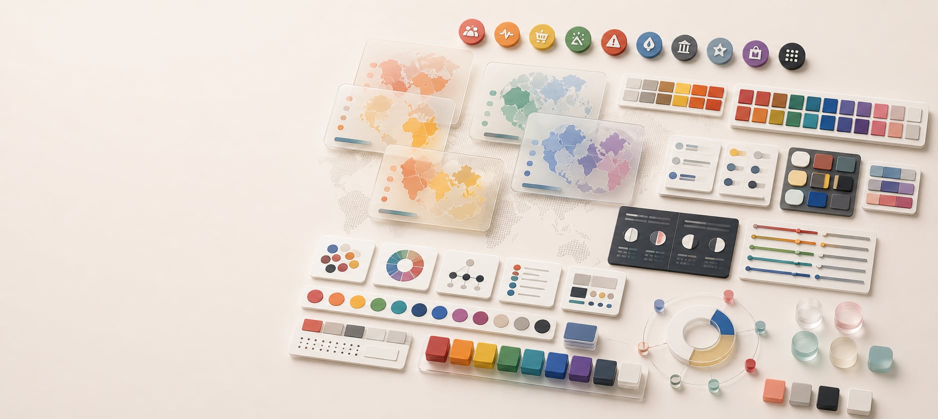
Color guide
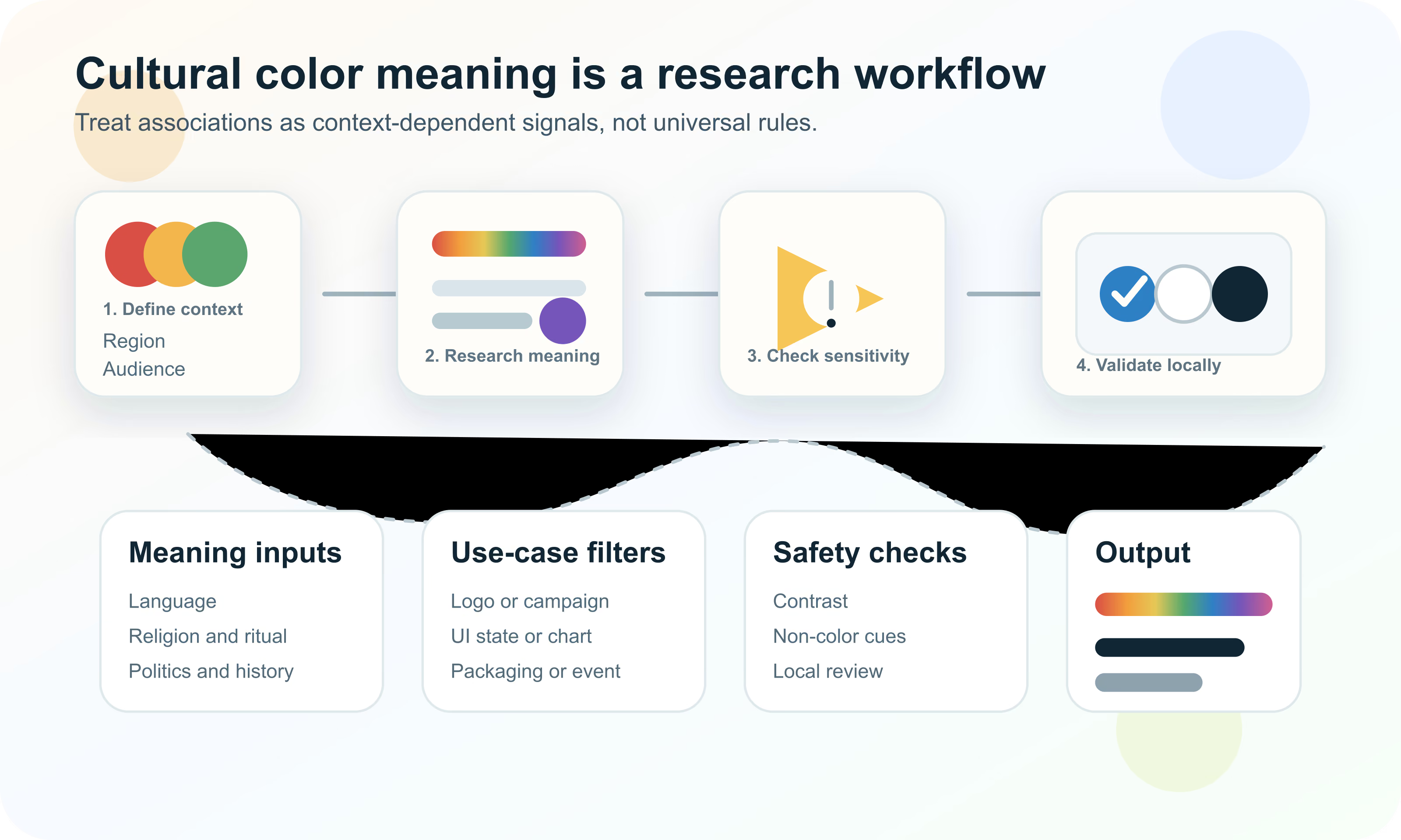
Cultural color associations can help teams ask better questions, but they are not universal rules. The same hue can change meaning across language, region, religion, politics, history, product category, price point, and interface context. Responsible color work treats cultural meaning as evidence to research, test, and document.
Cultural color notes should be used as research prompts, not fixed translation tables. Before assigning meaning to red, white, black, green, yellow, blue, purple, orange, pink, gray, or any other color, define the audience, region, language, product category, use case, and risk level. Then validate the palette with local review, user testing, accessibility checks, non-color cues, and documented assumptions.
Cultural color notes are documented observations about how a color may be interpreted by a specific audience in a specific context. They can include associations with celebration, mourning, status, religion, politics, safety, money, purity, luck, nature, health, gender, age, and product category.
The word notes matters. A note is not a universal law. A color association may be common in one region, limited to a particular ritual, stronger among one age group, relevant only in a campaign, or irrelevant inside a utilitarian software interface. The responsible use of cultural color meaning starts by narrowing the question.
Cultural color meaning is the interpretation people may attach to a color because of shared language, history, religion, ritual, media, politics, commerce, category conventions, or lived experience in a particular context.
A simple color meaning chart can be tempting, but it usually hides too much. Red might suggest danger, urgency, love, celebration, luck, discounting, politics, heat, or appetite. White might suggest simplicity, purity, clinical cleanliness, minimalism, mourning, luxury, or emptiness. Green might suggest nature, finance, approval, illness, agriculture, politics, growth, or religious identity.
Those interpretations can also change with saturation, lightness, neighboring colors, typography, imagery, product category, and medium. A deep green on a banking app does not behave the same way as a neon green gaming accent, a pale green hospital wall, or a green data point on a map.
Use broad color associations only to form hypotheses. The actual design decision should be supported by local context, examples, research, and testing.
The first responsible question is not "What does this color mean in Asia, Europe, Africa, or Latin America?" Those regions are far too broad. Start with the exact market, language, audience, product, and use case.
A color for a global enterprise dashboard can usually prioritize clarity, contrast, and design-system consistency. A color for a funeral service, wedding campaign, religious holiday, civic announcement, health warning, political message, food package, or financial signal needs a much more specific cultural review.
Define the people who will see the color: location, language, age, community, profession, accessibility needs, and familiarity with the category.
Separate brand identity, interface states, packaging, advertising, charts, maps, alerts, event materials, and editorial imagery. The same color can be fine in one and risky in another.
Raise the review standard for topics tied to death, celebration, religion, medicine, money, politics, public safety, children, identity, or crisis communication.
A good workflow helps teams avoid both extremes: ignoring culture entirely or overconfidently assigning one meaning to a whole population. Treat cultural meaning as a research layer that sits beside accessibility, brand strategy, competitor analysis, and product usability.
The goal is not to find a perfectly neutral color. No color is neutral in every situation. The goal is to understand the likely interpretations and decide whether the palette supports, distracts from, or harms the intended message.
The table below is not a meaning dictionary. It is a checklist of questions. Each color family can carry many meanings, and the safest interpretation depends on market, language, category, and application.
| Color family | Signals to investigate | Design caution |
|---|---|---|
| Red | Urgency, danger, celebration, love, luck, politics, heat, appetite, discounting, error states | Do not assume red always means stop or error. In some contexts it may be festive, prestigious, political, or commercially loud. |
| White | Purity, simplicity, cleanliness, emptiness, luxury, mourning, spirituality, medical sterility | White space can feel premium in one context and cold, sparse, or ritual-sensitive in another. |
| Black | Luxury, authority, grief, formality, rebellion, elegance, severity, night, technology | Black can feel premium, but it may also carry mourning, danger, or exclusionary signals depending on use. |
| Green | Nature, health, growth, approval, money, agriculture, sustainability, religion, politics | Green is often overloaded. Clarify whether the palette means eco, finance, wellness, success, or a local identity cue. |
| Yellow and gold | Warmth, optimism, caution, wealth, value, divinity, harvest, attention, affordability | Yellow can have weak contrast on white and may shift from premium gold to warning yellow with small changes. |
| Blue | Trust, calm, water, technology, finance, healthcare, corporate order, authority, distance | Blue can be safe and globally familiar, but it may also become generic in trust-heavy categories. |
| Purple and violet | Royalty, spirituality, creativity, luxury, mourning, mystery, youth, beauty | Purple is especially sensitive to saturation and context. It can feel premium, ceremonial, playful, or somber. |
| Orange | Energy, friendliness, affordability, warning, appetite, youth, activity, harvest | Orange often feels approachable but can become bargain-coded or warning-coded depending on category. |
| Pink | Care, sweetness, youth, beauty, romance, gender coding, softness, play | Pink may carry gendered assumptions. Test whether that helps, excludes, or distracts in the target market. |
| Gray and silver | Neutrality, professionalism, age, technology, modesty, restraint, uncertainty | Gray can calm a palette, but too much gray may feel inactive, bureaucratic, or low-energy. |
Mourning and celebration are two of the highest-risk areas for cultural color meaning. A color used for weddings, festivals, memorials, religious observance, national ceremonies, or seasonal events can carry meanings that are much stronger than the same hue in everyday UI.
Avoid relying on broad claims such as "white means purity" or "red means luck" without asking where, for whom, and in what ceremony. Even within one country, customs can vary by religion, region, community, family, generation, and event type.
Colors can become political through parties, movements, national symbols, protest identities, historical periods, or current events. These meanings can change quickly, and they may be very different from the same color in a commercial brand palette.
Public-sector, nonprofit, media, election, healthcare, education, and crisis communication materials deserve extra review. A color choice that looks neutral to a remote design team may be read locally as partisan, official, oppositional, or insensitive.
Review local news, official communications, civic campaigns, and recent events before using colors in public-facing or issue-based work.
A palette can resemble a party, campaign, flag, protest color, or government identity even when no affiliation is intended.
Use clear labels, balanced palettes, neutral surfaces, and explicit language when the design must remain nonpartisan.
Religious and spiritual associations are not decorative extras. Colors may be connected to ritual clothing, sacred periods, mourning, celebration, rank, purity, divinity, restraint, or taboo use. These associations can be specific and meaningful, so they should be handled with care.
If the design touches religious holidays, worship, donations, memorials, wellness, meditation, education, food restrictions, or cultural heritage, do not rely on a generic color chart. Ask informed reviewers and provide realistic layouts, not isolated swatches.
When cultural or religious meaning is central to the communication, local expert review is not optional decoration. It is part of the design requirement.
Color is not only visual. Color names, product names, role names, and campaign language can also create cultural meaning. A palette named "pure white," "imperial purple," "lucky red," or "native green" may read differently across languages and communities.
For international design systems, internal role names should usually describe function rather than cultural promise. Names such as color-success, color-warning, brand-primary, surface-raised, or chart-series-3 travel better than names based on emotion, nation, identity, or ritual.
| Avoid relying on | Use instead | Why it helps |
|---|---|---|
| Cultural claims in role names | Functional names such as action-primary or status-success | The system describes use rather than assuming meaning. |
| Emotion-only names | Role plus scale, such as accent-warm-600 | Teams can reuse the color without inheriting an untested mood. |
| Country or identity labels | Market-specific notes in documentation | A note can explain context without embedding stereotypes in the color system. |
| Translated color idioms | Local copy review and plain labels | Idioms may not carry the same meaning across languages. |
Global brands often need a stable core palette and flexible local expression. The core palette protects recognition. Local accent rules, campaign palettes, imagery, and content guidelines allow the brand to adapt to market context without fragmenting.
The safest structure is usually not a separate brand for every region. Instead, create a documented system: core brand colors, allowed local accents, sensitive-use notes, accessibility requirements, dark-mode behavior, chart palettes, and approval rules for high-risk campaigns.
The colors that identify the brand globally and should remain stable across regions unless there is a serious legal, cultural, or accessibility issue.
Approved secondary colors for regional campaigns, events, partnerships, seasonal messages, or market-specific category expectations.
Guidance for religious events, public health, politics, mourning, memorials, holidays, crisis communication, and other high-risk contexts.
In software, color often has a job before it has a cultural association. Buttons, links, errors, warnings, success states, selected tabs, charts, badges, focus rings, and disabled controls must be understandable. A cultural association is not enough if the interface fails as an interface.
Teams should test whether status colors make sense in context. Red and green state systems may be common in many software products, but users with color vision deficiencies, different financial conventions, or different local expectations may need labels, icons, shapes, patterns, or text to interpret the state reliably.
A culturally appropriate palette can still fail if people cannot read it. Accessibility rules do not erase cultural meaning, but they set a minimum usability floor. Body text, button text, links, form controls, focus indicators, charts, alerts, and data labels need enough contrast and non-color support.
The principle is simple: do not make users decode meaning from color alone. Cultural symbolism should reinforce the message, not carry the entire message. This is especially important for alerts, medical instructions, public notices, education, financial risk, maps, and data visualization.
| Element | Check | Why it matters |
|---|---|---|
| Text and buttons | Contrast against each background state | Color meaning is useless if the content is unreadable. |
| Links and states | Underline, icon, label, or clear state text | Users should not need color perception to identify interaction. |
| Charts and maps | Legend, labels, patterns, ordering, and contrast | Regional or political color meanings can conflict with data colors. |
| Warnings and errors | Icon, message, focus, and field-level text | Safety and recovery should not depend only on red or yellow. |
| Dark mode | Separate role review | A color that works in light mode may shift mood or contrast in dark mode. |
Maps and charts are especially sensitive because color can imply category, value, geography, politics, risk, or identity. A color that feels harmless in a brand palette may become loaded when applied to countries, regions, demographic groups, health outcomes, or elections.
For cross-cultural data design, prioritize clarity and fairness: use legends, direct labels, colorblind-aware palettes, neutral sequential scales when possible, and careful review of categorical colors. Avoid assigning culturally meaningful colors to groups without a reason and a review process.
Packaging and retail color often carries stronger cultural meaning than interface color because it sits near taste, ritual, gifting, freshness, health, status, value, gender expectations, and holidays. The same product color may signal premium quality in one market and low price in another.
Food is especially contextual. Red, green, brown, white, black, gold, and bright artificial colors can suggest freshness, spice, tradition, sweetness, natural ingredients, indulgence, luxury, warning, or unfamiliarity depending on the category and culture.
Look at real local packaging, category blocks, price tiers, seasonal displays, and online marketplaces before choosing retail colors.
A color may work as a brand accent but fail when it is expected to describe flavor, freshness, heat, or dietary position.
Gift packaging, holiday campaigns, and ceremonial products can carry stronger color expectations than everyday commerce.
Good evidence is local, current, and tied to the actual use case. A ten-year-old blog list of color meanings is weaker than recent local examples, user interviews, market research, search behavior, public communications, retail shelves, app screenshots, and review by people who understand the context.
Do not ask reviewers whether a color is "good" in isolation. Show the logo, screen, package, chart, notification, ad, or event material. Ask what the design appears to communicate, whether anything feels inappropriate, what alternatives are common, and whether meaning changes for older, younger, rural, urban, professional, or community-specific audiences.
The best cultural color notes are humble and useful. They say what is known, what is uncertain, where the evidence came from, and how the decision should be revisited. This turns color culture from folklore into an auditable design practice.
A documentation template also prevents future teams from flattening nuance. Instead of writing "white means mourning," write a more precise note: market, audience, context, source, date, confidence, reviewer, affected components, and approved alternatives.
| Field | What to record | Example of the kind of detail needed |
|---|---|---|
| Market and audience | Country, region, language, segment, age, category, and channel | Not just "global" or "Asia." |
| Color and role | Hue family, exact value if known, and where it appears | Brand primary, warning state, packaging foil, chart series, campaign background. |
| Possible association | What the color may imply in this use case | Celebration, mourning, politics, money, nature, danger, status, purity. |
| Evidence | Sources, examples, interview notes, reviewer comments, and dates | Screenshots, competitor examples, research links, local review notes. |
| Confidence and risk | High, medium, low confidence and likely impact if wrong | Low-risk UI accent versus high-risk memorial campaign. |
| Decision | Approve, avoid, adapt, test again, or create a local variant | Include owner and next review date. |
Most cultural color mistakes come from treating color meaning as a shortcut. The team wants a quick answer, finds a generic chart, and turns it into a rule. That can lead to stereotypes, poor accessibility, local confusion, or a palette that copies competitors without understanding why.
If the color is decorative, low-risk, accessible, and not tied to identity, religion, politics, mourning, celebration, medicine, safety, or money, a light review may be enough. If the color carries the message or appears in a sensitive context, raise the evidence requirement.
The decision should be proportional to risk. A hover accent on a settings page does not need the same cultural review as a healthcare alert, memorial campaign, election map, religious holiday campaign, or international product launch.
| Risk level | Examples | Recommended review |
|---|---|---|
| Low | Neutral UI surfaces, secondary illustrations, internal tools, utility accents | Check contrast and avoid obvious category conflicts. |
| Medium | Public brand accents, ecommerce campaigns, charts, packaging variants, onboarding flows | Review competitors, local examples, accessibility, and user interpretation. |
| High | Religion, politics, mourning, celebration, healthcare, finance, safety, civic messages, maps | Use local expert review, user testing, documentation, and approval rules. |
Hue Codex cannot tell you what every color means to every audience, and no responsible tool should claim that. What it can do is help you make better palette decisions once you have cultural notes: compare colors, create alternatives, test contrast, generate roles, and document values that can be reviewed by local teams.
Use cultural notes to choose the candidate direction, then use practical color tools to make the decision usable. A respectful palette still needs readable text, resilient UI states, exportable CSS, alternate accents, dark-mode checks, chart colors, and clear documentation.
Use the picker, harmonies, tint and shade tools, and palette generator to create culturally safer variants without losing brand continuity.
Use contrast, color blindness simulation, and accessible pair tools to make sure cultural intent does not weaken comprehension.
Use CSS, color-role, and converter tools to document approved colors precisely for the team.
This guide is written from practical brand, UX, localization, and accessibility workflows and cross-checked against color psychology, cross-cultural marketing, internationalization, cultural diversity, and WCAG references.
Use the free tools to test the idea immediately: pick a color, convert it, generate harmonies, build tints and shades, check contrast, and export practical CSS or palette data.
Quick answers
No. Cultural color meanings vary by audience, region, language, religion, history, category, use case, and current context. Treat them as research prompts, not universal rules.
There is no single safest global color. The safer strategy is to use accessible contrast, clear labels, non-color cues, local review, and flexible palette roles that can adapt to specific markets.
Usually not. Most brands need stable core colors and documented local flexibility. Use local accents or campaign palettes when the market context requires adaptation.
Define the exact audience and use case, collect local examples, review competitors and public communications, look for sensitive associations, ask local reviewers, and test realistic mockups with target users.
No. Red can signal warning, error, love, celebration, urgency, discounting, appetite, politics, luck, or status depending on context. Use labels and icons when red communicates a state.
No. White can suggest purity, simplicity, cleanliness, luxury, emptiness, spirituality, or mourning depending on the audience and setting.
No. Green can support nature and sustainability, but it can also suggest finance, health, approval, agriculture, politics, religion, or generic eco-claims. The context decides.
Use them only as starting points. Generic charts often flatten nuance and ignore region, category, audience, accessibility, saturation, lightness, and local convention.
They are separate but connected. A color may be culturally appropriate and still inaccessible. Always check contrast and provide non-color cues for meaning.
Sometimes, but state colors should remain clear and accessible. If market conventions differ, pair the color with text, icons, patterns, and documentation rather than relying on hue alone.
Avoid treating countries or communities as monoliths, cite sources, use local review, describe evidence precisely, and document uncertainty instead of turning broad associations into rules.
Include the market, audience, color value, role, possible association, evidence, source date, reviewer, confidence level, risk level, decision, and next review point.
Yes. Political events, media, product trends, public health events, fashion, technology, and generational changes can shift color associations. Review notes periodically.
Hue Codex can help test and document colors, but cultural safety requires audience-specific research, local review, and user testing in the actual context.