Good fit
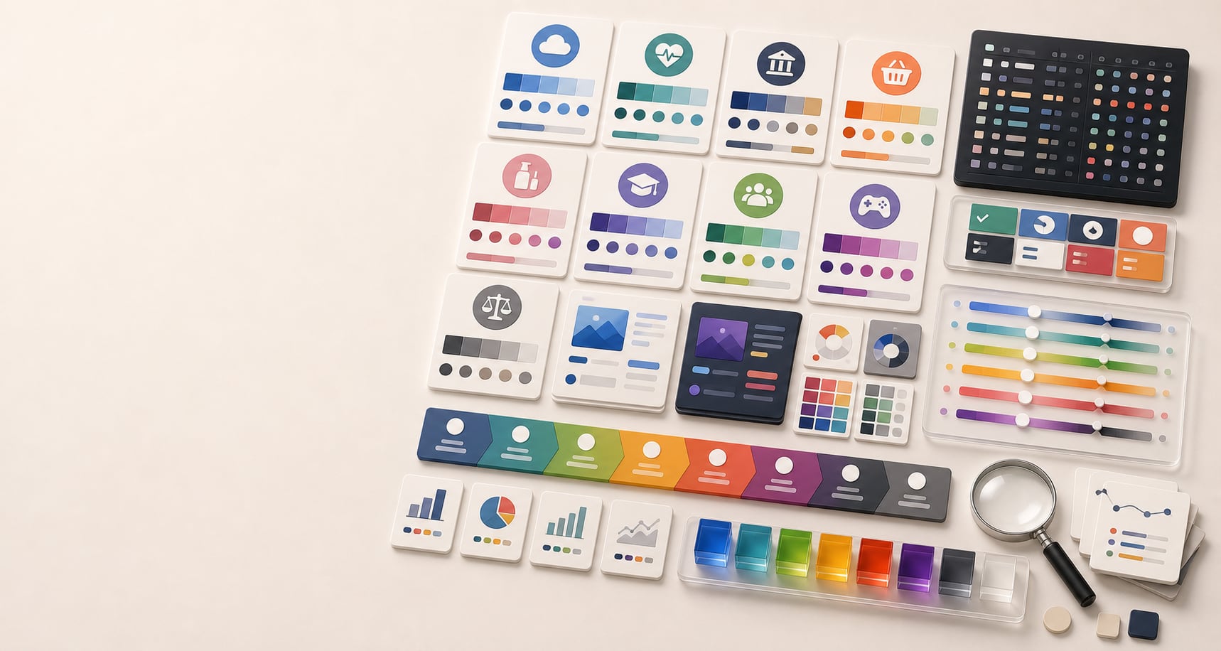
Dashboards, analytics, security, productivity, AI tools, CRM, and enterprise software.
Color guide
Industry color choices work best when they balance category recognition with brand differentiation. The palette should help people understand what kind of organization they are seeing, then use lightness, chroma, contrast, palette roles, accessibility, and distinctive accents to avoid looking interchangeable.
Industry color guidance should start with category expectations, but it should not stop there. SaaS, healthcare, finance, food, beauty, education, nonprofits, gaming, legal, real estate, and ecommerce each have familiar color patterns. Use those patterns to orient users, then differentiate with saturation, lightness, chroma, accent color, typography, imagery, palette roles, accessibility checks, and a documented color-role system.
Industry color guidance is the practice of choosing colors with category expectations in mind. People bring assumptions to healthcare, finance, SaaS, restaurants, beauty, education, nonprofits, entertainment, legal services, real estate, and ecommerce. Color can help confirm that a brand belongs in the category.
The risk is sameness. If every finance app uses the same navy and green, every healthcare brand uses the same blue and teal, or every SaaS product uses the same blue gradient, color stops helping the brand become memorable. The goal is fit plus distinction.
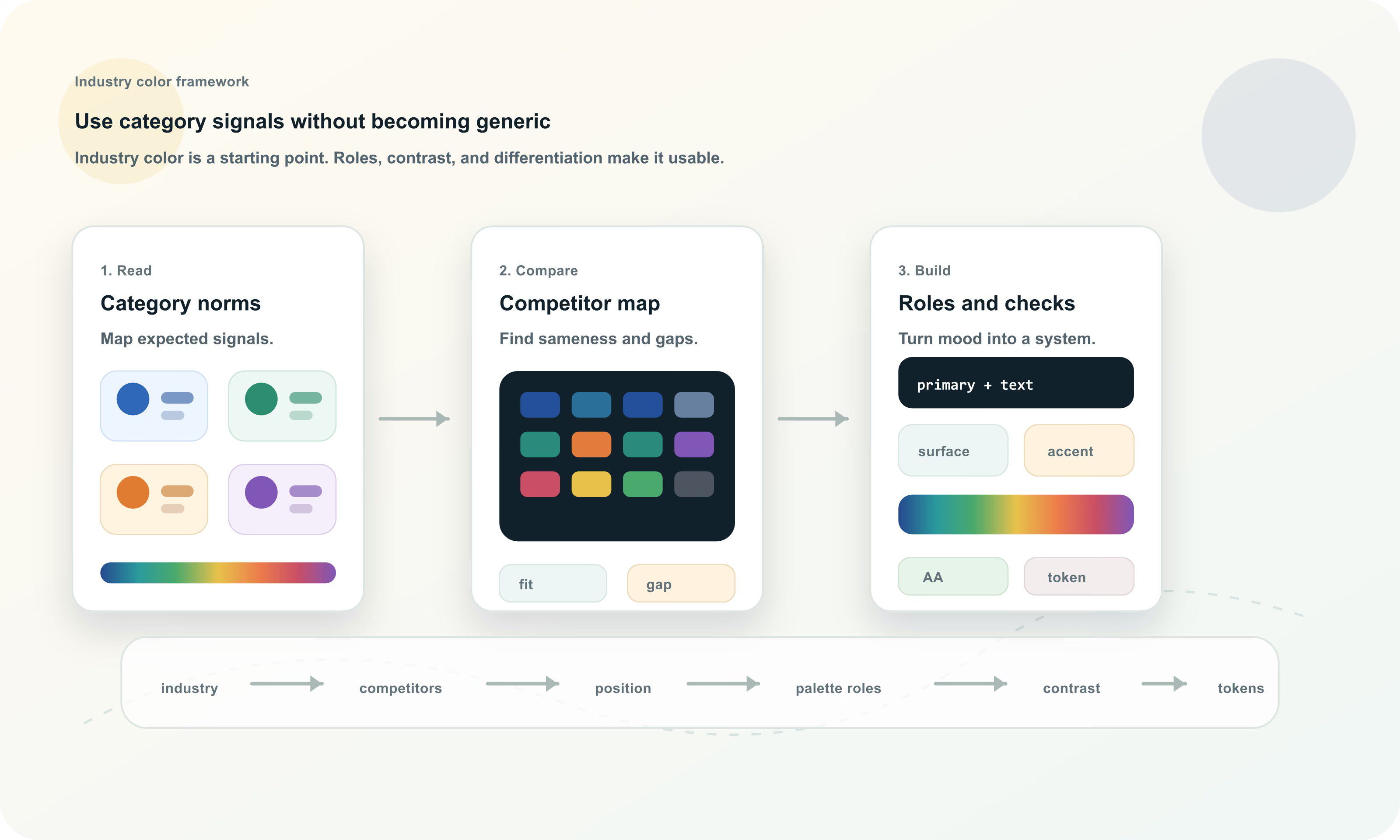
Industry color strategy is the process of using category color expectations, competitor research, brand positioning, accessibility, and palette roles to build colors that feel appropriate and distinctive in a specific market.
Category fit helps users understand what kind of product, service, or organization they are seeing. Differentiation helps them remember which one it is. Industry color work is the balance between those two needs.
A new healthcare brand may need enough blue, green, white, or calm neutral structure to feel credible. A new finance product may need stability and trust. A restaurant may need appetite and warmth. But if the palette only copies the category, it may feel safe and forgettable.
| Move | When it helps | Risk |
|---|---|---|
| Follow the category | The brand is new, complex, regulated, or trust-sensitive | The palette may look generic next to incumbents |
| Bend the category | The brand needs familiarity with a memorable tone | The change may be too subtle if competitors are clustered |
| Break the category | The brand has a disruptive position or expressive audience | The palette may confuse users if the brand story is weak |
| Own an accent | The brand wants category fit plus a recognizable signal | The accent needs consistent role rules or it becomes decoration |
Before choosing industry colors, collect the visible palettes of direct competitors, adjacent competitors, and aspirational brands. Look at logos, websites, apps, packaging, ads, social headers, category pages, app icons, charts, and call-to-action colors. The goal is to see the color landscape, not to copy it.
Sort competitors by dominant hue, accent hue, lightness, saturation, background style, UI density, and emotional tone. Then decide where the brand should sit: familiar, sharper, warmer, calmer, more premium, more playful, more technical, or more human.
The table below gives common starting points, not rules. Each industry has exceptions, subcategories, cultures, and audience expectations. Use the pattern to orient your thinking, then tune the palette for the exact brand position.
| Industry | Common direction | Differentiation move |
|---|---|---|
| SaaS and B2B software | Blue, cyan, violet, clean neutrals, high-contrast UI accents | Add warmth, stronger typography, distinctive OKLCH scale, or a memorable accent |
| Healthcare and wellness | Blue, teal, green, white, soft neutrals | Use human warmth, calming surfaces, inclusive contrast, or less clinical accent choices |
| Finance and fintech | Blue, green, navy, black, white, restrained metallic cues | Sharpen data colors, add a distinctive accent, or use warmer trust cues |
| Legal and professional services | Navy, charcoal, burgundy, forest green, ivory, restrained neutrals | Modernize with cleaner contrast, lighter surfaces, or a controlled accent |
| Restaurants and food | Red, orange, yellow, green, brown, cream, ingredient-led color | Use cuisine-specific cues, appetite-friendly contrast, and readable commerce flows |
| Beauty and personal care | Black, white, blush, muted neutrals, pastels, jewel accents, metallic cues | Stand apart with unexpected accent, editorial contrast, or category-specific texture |
| Education and learning | Blue, green, yellow, orange, friendly neutrals | Balance trust with energy; separate grade level, audience, and subject matter |
| Nonprofits and public good | Green, blue, warm human colors, hopeful accents | Avoid generic virtue signals by tying color to mission and community |
| Gaming and entertainment | High chroma, dark surfaces, neon accents, genre color cues | Use genre expectations while preserving UI readability and state clarity |
| Real estate and property | Navy, green, gray, black, cream, gold, local material colors | Differentiate by market: luxury, family, commercial, local, or modern |
| Ecommerce and retail | Brand-led palettes, strong CTA color, category-specific accents | Keep action colors clear and avoid overusing urgency colors everywhere |
SaaS and B2B software often lean on blue, cyan, violet, and clean neutrals because those colors can signal trust, clarity, data, technology, and calm. The risk is obvious: many products in the category use the same cues.
Operational software should prioritize scanability, repeated use, and clear state meaning. Keep large surfaces quiet, reserve high-chroma colors for priority actions or states, and make sure charts and badges do not compete with core workflow controls.
Dashboards, analytics, security, productivity, AI tools, CRM, and enterprise software.
Use a warmer accent, distinctive typography, unusual neutral temperature, or a controlled violet, green, or amber system.
Blue sameness, low-contrast muted text, too many chart colors, and decorative gradients that distract from work.
Healthcare colors often use blue, teal, green, white, and soft neutrals because they can suggest calm, cleanliness, care, stability, and biological freshness. But healthcare is broad. A hospital, mental health app, dental practice, pediatric clinic, wellness coach, pharmacy, and medical device company should not all look the same.
Accessibility is especially important in health contexts. Users may be stressed, tired, older, injured, medicated, using small screens, or trying to understand important instructions. Contrast, labels, non-color cues, and calm hierarchy matter more than decorative softness.
Clinical care, wellness, telehealth, medical tools, mental health, dental, pharmacy, and patient portals.
Add warmer human neutrals, gentle accent colors, calmer dark text, or specialty-specific imagery and material cues.
Overly sterile palettes, pale low-contrast text, red/green-only status, and confusing emergency colors.
Finance brands often use blue, green, navy, black, white, and restrained neutrals because they can suggest trust, stability, growth, money, precision, and security. Fintech products sometimes add brighter accents to feel faster, friendlier, or more modern.
Financial color needs careful semantics. Green and red often carry gain/loss meaning, but color cannot be the only signal. Use signs, labels, arrows, icons, and accessible contrast so people can interpret financial states reliably.
Banking, investing, insurance, payments, budgeting, accounting, payroll, and financial data products.
Use sharper data color systems, warmer trust cues, a distinctive accent, or a premium neutral palette.
Generic navy/green, red-green-only meaning, low-contrast chart series, and trust-eroding novelty.
Legal and professional services often use navy, charcoal, burgundy, forest green, ivory, and restrained neutrals. These palettes can suggest seriousness, authority, discretion, and competence. The risk is looking dated, heavy, or indistinguishable from every other professional firm.
A modern legal palette can still be restrained while improving readability, warmth, and digital usability. Use color to support trust and clarity, not to bury content under heavy dark surfaces or low-contrast beige-gray combinations.
Law firms, accounting, consulting, advisory services, compliance, governance, and B2B professional services.
Use cleaner typography, lighter surfaces, sharper accent color, or specialty-specific cues.
Overly traditional palettes, weak body text contrast, small gold text, and inaccessible PDF or document templates.
Food and restaurant palettes often use warm reds, oranges, yellows, greens, browns, creams, and ingredient-inspired colors. Color can cue appetite, freshness, cuisine, price point, speed, comfort, craft, health, indulgence, or authenticity.
The palette should match the food experience. A quick-service brand, fine dining restaurant, bakery, vegan cafe, coffee brand, cocktail bar, and meal-prep service can all use warmth differently. Commerce still matters: menus, buttons, allergy notes, prices, and ordering flows need contrast.
Restaurants, cafes, packaged food, delivery, beverage, hospitality, and culinary content.
Use ingredient colors, regional cues, material texture, dark editorial contrast, or restrained premium warmth.
Low-contrast yellow, appetite colors used as error states, and photos that make text unreadable.
Beauty and personal care brands often use black, white, blush, muted neutrals, pastels, jewel tones, metallic cues, and soft gradients. The palette may need to signal luxury, care, science, self-expression, sustainability, softness, confidence, or editorial taste.
The same category can support very different color systems. Clinical skincare may use white, blue, green, and precise neutrals. Luxury fragrance may use black, ivory, gold, and deep accents. Youth cosmetics may carry saturated pink, orange, purple, or chrome-like effects.
Skincare, cosmetics, fragrance, salons, wellness, fashion, grooming, and personal care products.
Use unexpected accent color, stronger editorial contrast, material-inspired neutrals, or a signature gradient with fallbacks.
Pale low-contrast text, overused blush palettes, inaccessible metallic simulations, and product photos overpowering UI.
Education palettes often use blue, green, yellow, orange, and friendly neutrals because they can suggest trust, growth, optimism, attention, and approachability. But education brands vary widely: early learning, universities, online courses, tutoring, professional training, and museums all need different tones.
Learning interfaces should be welcoming without becoming noisy. Color can separate subjects, progress, levels, feedback, and navigation, but it should not be the only way students understand status or performance.
Schools, universities, online courses, tutoring, training, libraries, museums, and learning apps.
Tune age level, subject matter, and seriousness through chroma, lightness, and illustration style.
Overly childish palettes for adult learning, red/green-only grading, and too many subject colors without hierarchy.
Nonprofit and public-good palettes often use green, blue, warm human colors, and hopeful accents. The color system should support trust, empathy, urgency, transparency, and action without feeling manipulative or generic.
Mission context matters. Environmental organizations, social services, arts nonprofits, religious organizations, civic technology, disaster relief, and advocacy groups all need different balances of warmth, seriousness, optimism, and clarity.
Charities, NGOs, civic groups, social impact brands, religious organizations, arts groups, and public-service campaigns.
Tie color to mission, audience, region, and action rather than broad virtue signals.
Generic green/blue symbolism, inaccessible donation flows, urgency colors overused as decoration, and culturally sensitive meanings.
Gaming and entertainment brands can often carry more saturated, dark, neon, genre-specific, or high-contrast palettes than operational tools. Color can signal genre, speed, mood, rarity, level, team, platform, or community identity.
Expression does not remove accessibility needs. Menus, settings, chat, purchase flows, status, health, damage, cooldowns, and warnings still need readable contrast and non-color cues. A dramatic palette should not make the product harder to operate.
Games, streaming brands, music, events, creators, esports, film, nightlife, and entertainment platforms.
Use genre-specific lighting, dark surface systems, distinctive accent ramps, and motion carefully.
Neon fatigue, low-contrast text on dark gradients, color-only game states, and inaccessible store flows.
Real estate palettes often use navy, green, gray, black, cream, gold, and local material colors. These can suggest stability, wealth, trust, land, architecture, warmth, or premium service. Subcategory matters: luxury real estate, family homes, rentals, commercial property, property technology, and home services need different cues.
Photography often dominates real estate pages, so brand colors should support listing content without fighting it. Buttons, filters, map pins, status badges, and contact forms need clarity and contrast.
Brokerages, property tech, rentals, home services, architecture, interiors, commercial property, and local agencies.
Use local material cues, architectural neutrals, premium accent color, or warmer human touches.
Gold text with low contrast, photo overlays that hide copy, and map colors that conflict with data categories.
Ecommerce palettes are often brand-led because products vary widely. The critical requirement is clarity: action buttons, price, sale, stock, shipping, reviews, filters, and error states need consistent roles. A beautiful brand palette can still fail if add-to-cart, checkout, and validation colors are unclear.
Retail categories can use expressive color, but conversion flows need restraint. Reserve high-emphasis color for the primary action and meaningful states. Do not make every banner, tag, link, and discount compete for attention.
Online stores, marketplaces, subscription products, direct-to-consumer brands, and retail tools.
Use product material cues, brand story, campaign accents, and consistent action color.
Sale red overuse, low-contrast prices, unclear stock status, and color-only validation.
A useful industry distinction is operational versus expressive. Operational products are used repeatedly to scan, compare, decide, document, or complete work. Expressive products are more likely to sell identity, emotion, entertainment, taste, status, or lifestyle. Most brands sit somewhere between the two.
Operational palettes usually need quieter surfaces, clearer state colors, stronger data discipline, and restraint. Expressive palettes can carry more personality, but they still need enough neutral support and contrast for content, forms, navigation, and commerce.
| Palette type | Works well for | Color rule |
|---|---|---|
| Operational | SaaS, healthcare, finance, legal, admin tools, dashboards | Keep surfaces calm and use color for roles, priority, state, and data |
| Expressive | Food, beauty, gaming, entertainment, retail, lifestyle | Use stronger brand moments while protecting readability and action clarity |
| Hybrid | Education, nonprofits, fintech, wellness, ecommerce | Let brand color carry emotion, then constrain UI and state colors carefully |
Industry color guidance becomes practical only when colors have jobs. A finance palette is not just navy and green. It needs text, surface, border, primary action, secondary action, success, warning, danger, info, chart, focus, and disabled roles. A restaurant palette is not just red and cream. It needs menu readability, order flow, allergen warnings, and photography overlays.
Documenting roles protects both brand meaning and usability. It also gives teams a shared vocabulary for applying color correctly.
| Role | What it does | Industry concern |
|---|---|---|
| Text | Carries readable content | Must pass contrast across pages, forms, cards, menus, and dashboards |
| Surface | Creates page, card, and panel backgrounds | Should match industry mood without reducing scanability |
| Primary action | Signals the main next step | Must stand out without competing with every accent |
| Accent | Adds brand character or campaign energy | Should not be confused with semantic state colors |
| Semantic states | Success, warning, danger, info, selected, disabled | Need labels and non-color cues, especially in finance, health, and education |
| Chart series | Separates data categories | Needs contrast, labels, and color-vision support |
| Focus | Shows keyboard location | Must be visible on every approved surface |
Industry mood never overrides accessibility. A luxury palette still needs readable text. A playful education palette still needs non-color cues. A healthcare palette still needs visible focus and error states. A gaming palette still needs usable settings and purchase flows.
Check contrast, non-text contrast, focus indicators, color-only meaning, dark mode, chart colors, and responsive image overlays. If the industry palette depends on pale, muted, metallic, neon, or photo-heavy treatments, test more carefully rather than assuming the mood is enough.
Check normal text, large text, labels, buttons, prices, alerts, menu items, and captions.
Check borders, focus rings, icons, control boundaries, chart marks, and selected states.
Do not rely only on red, green, yellow, or blue to communicate status, category, required fields, or chart meaning.
The best industry color workflow starts with research and ends with tokens. It lets the palette feel appropriate for the market without becoming a generic industry template.
Most industry color mistakes come from copying category signals without building a real color system. The result may feel familiar, but it often lacks memorability, role clarity, and accessibility.
Borrowing the dominant category color can make the brand look like a weaker version of the incumbent.
A disruptive color should support the brand position, not just avoid competitor colors.
Brand color, action color, state color, and chart color need different jobs.
If everything is emphasized, nothing is. Save high-chroma colors for real priority.
Healthcare, finance, legal, civic, and education color choices can affect trust and comprehension.
Industry mood does not excuse weak text, invisible focus, or color-only meaning.
Hue Codex helps turn industry color strategy into practical palettes. Use the picker and converter to capture competitor values, compare HEX, RGB, HSL, Lab, LCH, OKLab, and OKLCH, build tints and shades, test contrast, generate harmonies, and document palette roles.
That workflow keeps industry color grounded. You can start with category expectations, test whether the colors work in real UI and brand contexts, then export values and tokens that the team can reuse consistently.
This guide is written from practical brand strategy, UI color, and design-system usage and cross-checked against color psychology, marketing, CSS color, and accessibility references.
Use the free tools to test the idea immediately: pick a color, convert it, generate harmonies, build tints and shades, check contrast, and export practical CSS or palette data.
Quick answers
Industry colors are color patterns commonly used in a category, such as blue in SaaS and finance, green in wellness, or warm colors in restaurants. They help users recognize a category, but they are not fixed rules.
Sometimes. Common colors can help recognition and trust, especially in regulated or complex categories. The palette still needs a differentiating point of view so the brand does not look interchangeable.
Start with clarity, trust, and usability. Blue, cyan, violet, and clean neutrals are common, but differentiation can come from a warmer accent, distinctive lightness scale, typography, imagery, or stronger role tokens.
Healthcare often uses blue, teal, green, white, and calm neutrals, but the exact palette should match the specialty, audience, and tone. Accessibility, readable instructions, and non-color cues are especially important.
Finance often uses blue, green, navy, black, white, and restrained neutrals. The palette should support trust, data clarity, accessible gain/loss indicators, and strong contrast.
Restaurants often use warm reds, oranges, yellows, greens, browns, creams, and ingredient-led colors. The palette should match cuisine, price point, and appetite cues while keeping menus and ordering flows readable.
Beauty brands often use black, white, blush, muted neutrals, pastels, jewel tones, metallic cues, or soft gradients. The right palette depends on whether the brand is clinical, luxury, expressive, natural, or youth-focused.
Keep blue if it supports trust, then differentiate with lightness, chroma, accent hue, neutral temperature, typography, imagery, motion, or a more distinctive palette role system.
No. Bright colors can work in SaaS, finance, healthcare, legal, or education, but they should usually be used with restraint for priority, actions, states, charts, or campaign accents.
Most brands need a small core palette plus neutrals, semantic states, chart colors, and accessible foreground/background pairings. The right number depends on roles, not a fixed count.
Audit competitor colors, identify category clusters, choose whether to fit, bend, or break the pattern, and document at least one clear differentiation move.
Yes. Industry color associations are contextual and can vary by audience, culture, region, price point, competitors, and execution. Treat them as research prompts, not universal laws.
Yes. Every industry palette should preserve text contrast, visible focus, non-text contrast, non-color cues, and readable states. Industry mood does not override accessibility.
Document exact values, palette roles, accessible pairings, semantic state colors, chart guidance, background rules, disallowed uses, and the category rationale behind the palette.