Use sRGB as the baseline
sRGB remains the safest screen handoff baseline for most websites, UI tokens, social graphics, and digital brand values.
Color guide
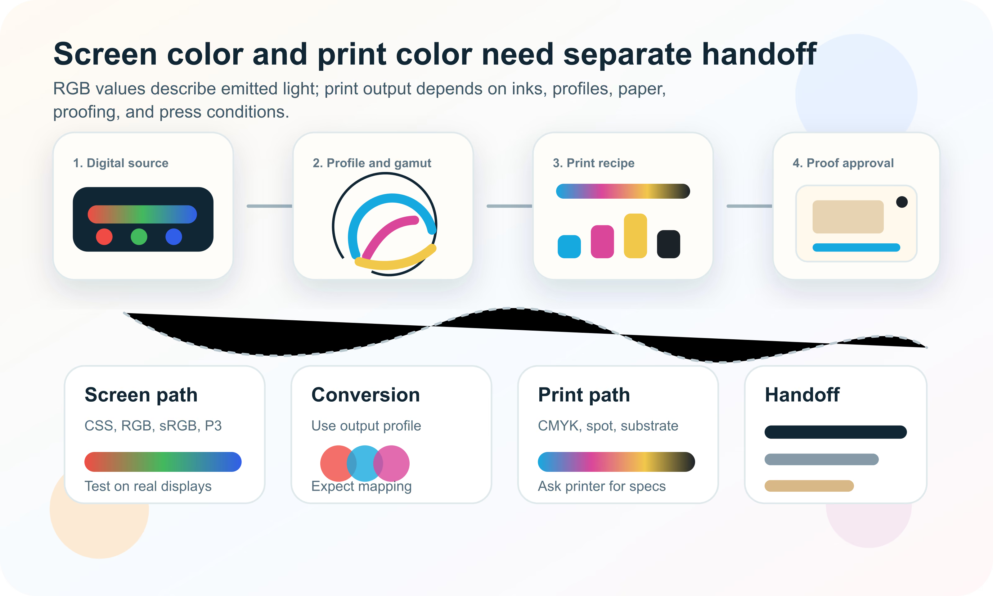
Screen color and print color are different production systems. Screens emit RGB light through device color spaces; print reflects light from ink, toner, paper, coating, substrate, profiles, and press conditions. Good color handoff treats those paths separately instead of expecting one HEX value to work everywhere.
Use RGB, HEX, CSS, sRGB, Display P3, and modern color values for screen work. Use CMYK, spot colors, output profiles, paper specifications, and printer guidance for print work. A screen color cannot be converted to one universal CMYK value because print appearance depends on the output profile, ink set, paper, coating, press process, lighting, and proofing standard. For important brand or production work, separate digital values from print specifications and approve physical proofs.
Print vs screen color is the difference between colors displayed by light-emitting devices and colors reproduced by physical materials. A screen can display color by controlling red, green, and blue light. A printed piece creates color by placing ink or toner on a substrate and reflecting light back to the viewer.
That physical difference creates a production difference. A website, app, presentation, or social graphic can use RGB-oriented values such as HEX, rgb(), sRGB, Display P3, OKLCH, or CSS color(). A brochure, package, poster, label, book, or trade-show panel may need CMYK, spot color, paper stock, coating, output profile, proofing, and vendor instructions.
Print vs screen color is the practical color-management problem of translating a visual identity between emitted RGB display color and reflected print color produced by inks, substrates, profiles, and production conditions.
RGB is an additive color model. Screens create color by adding red, green, and blue light. More light moves toward white. Less light moves toward black. Traditional web HEX and rgb() values usually describe sRGB channel values for digital display.
CMYK is a subtractive print model. Cyan, magenta, yellow, and black ink or toner absorb parts of the light that hits the paper. More ink usually makes the result darker, but the final appearance depends on paper, ink, press, toner, coating, drying, viewing light, and profile assumptions.
| Topic | Screen color | Print color |
|---|---|---|
| Color creation | Emitted light from display pixels | Reflected light from ink, toner, and substrate |
| Common model | RGB and CSS color spaces | CMYK process color and spot color |
| Baseline values | HEX, rgb(), sRGB, Display P3, CSS color() | CMYK percentages, spot formulas, output profiles |
| Main limits | Display gamut, calibration, browser and OS color management | Print gamut, ink limit, paper, coating, press condition |
| Approval method | Device testing, screenshots, contrast checks | Soft proof, contract proof, press proof, vendor approval |
| Failure mode | Looks different across devices | Prints dull, shifts hue, plugs shadows, or loses vivid colors |
Most web and app color starts with sRGB. HEX values such as #3d5afe and ordinary rgb() values are usually interpreted as sRGB. This makes them familiar, compact, and broadly compatible across browsers, design tools, and content systems.
Modern screens and CSS can also use wider-gamut colors such as Display P3. These can make certain reds, oranges, greens, and cyans appear richer on capable displays. The tradeoff is production complexity: wide-gamut colors need fallbacks, visual QA, and documentation so they do not surprise teams working in screenshots, exports, email clients, print, or older tools.
sRGB remains the safest screen handoff baseline for most websites, UI tokens, social graphics, and digital brand values.
Wide-gamut screen color is useful when richer display color matters, but it should come with sRGB fallbacks and browser/device testing.
CSS values describe rendered screen color. Print production still needs output profiles, substrate choices, and printer guidance.
Print color is a production recipe, not just a color notation. A CMYK value tells a print process how much cyan, magenta, yellow, and black to use under an assumed output condition. Change the paper, press, ink, toner, coating, or profile and the same numbers can produce a different appearance.
Spot colors are separate ink formulas used when process CMYK is not enough. They are common for critical brand colors, metallics, fluorescents, special finishes, packaging, and cases where a consistent match is more important than ordinary four-color process efficiency.
| Print path | Best for | Caution |
|---|---|---|
| Process CMYK | Most full-color print jobs, photos, brochures, reports, packaging prototypes | Depends on output profile and may not match vivid screen colors |
| Spot color | Critical brand colors, specialty inks, packaging, stationery, signage | Requires printer support, cost planning, and exact specification |
| Extended gamut ink | Some packaging and high-end print workflows with more than CMYK | Needs vendor-specific guidance and proofs |
| Digital toner or inkjet | Short runs, variable data, fast proofs, office and digital press work | Can differ from offset or screen printing output |
| Specialty finish | Foil, metallic, varnish, white ink, fluorescent, emboss, substrate effects | Often cannot be previewed accurately from a screen alone |
A gamut is the range of colors a device or process can reproduce. sRGB has one gamut. Display P3 has a wider screen gamut. A specific CMYK press condition has another gamut. A spot ink, fluorescent ink, or metallic ink can reach effects that process CMYK cannot.
When a color is outside the target print gamut, it must be clipped, compressed, or mapped to the closest printable color according to the conversion settings. This is why a bright screen cyan, electric green, saturated orange, or glowing blue can print duller or shifted.
A HEX value such as #ff6b00 describes a digital color, usually in sRGB. A CMYK value describes ink percentages for an assumed printing condition. Without the output profile and print process, a HEX-to-CMYK conversion is only a rough estimate.
Different tools can produce different CMYK values from the same HEX input because they use different profiles, rendering intents, black generation rules, total ink limits, and gamut mapping strategies. This does not mean one tool is automatically wrong. It means the missing context matters.
| Variable | What changes | Why it matters |
|---|---|---|
| Source profile | How the RGB value is interpreted | The same numbers can mean different colors in different RGB spaces |
| Destination profile | The target print condition | Coated, uncoated, newsprint, digital, and packaging conditions differ |
| Rendering intent | How out-of-gamut colors are mapped | Perceptual and relative colorimetric conversions can look different |
| Black generation | How much K replaces CMY | Affects neutrality, detail, shadows, and ink behavior |
| Total ink limit | Maximum combined ink allowed | Too much ink can cause drying, smearing, or detail loss |
| Paper and coating | Reflectance, absorption, texture, and color | The same ink can look different on every substrate |
ICC profiles describe how color should be interpreted for a device, working space, or output condition. They let software translate color more predictably between source spaces and destination processes. In print workflows, destination profiles are critical because CMYK values are tied to a specific output condition.
A color-managed workflow still needs judgment. Profiles help the conversion, but they do not remove the effects of display calibration, viewing light, printer drift, substrate choice, ink behavior, and human perception. Treat profiles as necessary production context, not as a magic guarantee.
Describes the color space of the incoming file or value, such as sRGB or Display P3.
Describes the intended print condition, such as a coated offset profile or a vendor-specific digital press profile.
Travels with an image or document so software can interpret its color more predictably.
In production PDF workflows, communicates the intended printing condition for the file.
Soft proofing simulates the print output on a display using a print profile. It is useful for catching obvious gamut shifts and previewing how paper or ink limits may affect the work. It is not a substitute for physical proof approval when color is critical.
A hard proof is a physical proof made under controlled conditions. A press proof is produced on the actual press or production process. The higher the cost, scale, permanence, or brand risk of the job, the more important physical proofing becomes.
| Proof type | Use for | Limit |
|---|---|---|
| Screen preview | Layout, rough color direction, quick review | Depends on display and is not a print proof |
| Soft proof | Profile-based simulation and gamut checks | Still display-dependent and light-dependent |
| Hard proof | Physical color review before production | May use a proofing device rather than the final press |
| Press proof | Critical color approval on actual production process | More expensive and slower |
| Production sample | Packaging, materials, signage, specialty finish approval | May be required when substrate or finish affects color strongly |
Paper is part of the color. Bright white coated paper can make images feel sharper and more saturated. Warm uncoated stock can soften contrast and shift whites. Recycled paper, kraft board, fabric, plastic, metal, glass, and translucent materials all change the final appearance.
This is why print color cannot be separated from substrate. A CMYK value that looks good on coated stock may feel flat on uncoated stock. A spot color can also shift depending on paper and finish, even when the ink formula is consistent.
Paper color affects every printed color because the substrate is the lightest available value.
Uncoated and porous stocks can absorb ink differently from coated papers, changing sharpness and saturation.
Gloss, matte, varnish, lamination, foil, and texture change how light reflects from the surface.
Packaging, signage, textile, plastic, and metal workflows may need vendor-specific samples and ink systems.
A monitor that is too bright can make print look disappointing because the screen is emitting more light than paper can reflect. A warm office lamp, daylight, retail shelf lighting, or trade-show environment can also change the perceived print result.
For serious print approval, review proofs under appropriate lighting and use calibrated equipment when possible. Even then, the goal is controlled prediction, not a promise that every viewer and environment will see the same color.
Spot colors are often the right answer when a brand color matters more than normal process efficiency. They can improve consistency, extend beyond ordinary CMYK in some cases, and support special effects such as metallic or fluorescent color.
Spot colors still need documentation. The brand guide should name the spot system, specify alternatives for CMYK and RGB, show acceptable use cases, and explain when a physical proof is required. A spot color on coated paper may still need a separate uncoated specification.
| Situation | Why CMYK may not be enough | What to do |
|---|---|---|
| Critical logo color | Process CMYK may shift between vendors or substrates | Specify spot color and approved process alternatives |
| Very vivid color | The color may be outside the CMYK gamut | Test spot, extended gamut, or adjusted brand variant |
| Metallic or fluorescent finish | Standard CMYK cannot reproduce the effect | Use specialty ink or finish specifications |
| Packaging system | Substrate and production method strongly affect color | Use printer guidance, drawdowns, and production samples |
| Large flat areas | Process builds can show variation or tint contamination | Consider spot ink for consistency |
Photographs need their own print planning. A camera file, design-tool preview, and web export may be RGB, but print production often requires conversion or output intent handling. Shadows, skin tones, skies, food, product colors, and gradients can shift if conversion is rushed.
Do not use tiny web images for print. Print needs enough resolution at final size, appropriate sharpening, embedded profiles when required, and review of how the image behaves under the target print condition.
Black is a special case in print. Small black text is often safest as black ink only, because four-color registration can create fuzzy edges. Large black areas may need rich black, which adds CMY inks to create a deeper appearance.
Rich black recipes are production-dependent. Too much total ink can create drying, setoff, or detail problems, while the wrong recipe can shift the black toward a color cast. Ask the printer for recommended rich black and maximum ink coverage.
| Use case | Typical approach | Caution |
|---|---|---|
| Small text | Use black ink only | Avoid registration problems from four-color text |
| Large black area | Use printer-approved rich black | Do not exceed total ink coverage |
| Neutral gray | May use K-only or balanced CMY/K depending on job | Color casts can appear if balance is poor |
| Screen black | RGB black or CSS black for digital contexts | Not a print recipe |
| Image shadows | Handled through profile conversion and black generation | Check shadow detail and ink limit |
A good handoff tells the printer what the file is supposed to become. It should not rely on a designer saying "make it match the screen." Include the requested PDF standard or export preset, image resolution, bleed, crop marks, output intent, spot color handling, overprint rules, and proofing expectations.
Ask the printer for specifications before final export. Many production problems happen because a file is technically beautiful but prepared for the wrong process: RGB where CMYK was required, missing bleed, wrong paper assumption, unembedded images, unsupported spot colors, or a profile mismatch.
| Item | Why it matters | Question to ask |
|---|---|---|
| Output profile | Controls conversion expectations | Which profile or output intent should the file use? |
| PDF preset or standard | Controls compatibility and production requirements | Do you require PDF/X or another preset? |
| Bleed and trim | Prevents white edges after cutting | What bleed and safe margin do you require? |
| Image resolution | Controls print sharpness | What effective resolution is expected at final size? |
| Spot colors | Avoids accidental conversion or unexpected plates | Should spot colors remain spot or convert to process? |
| Black handling | Affects text sharpness and large black areas | What rich black and total ink limit should be used? |
| Proofing | Sets approval standard | Will there be soft proof, contract proof, press proof, or production sample? |
A mature brand system documents separate values for separate production contexts. One canonical color decision can have digital values, print process values, spot color values, accessibility pairings, and notes about acceptable variation. That is better than pretending a single HEX value is universal.
Digital values should include HEX or RGB, and sometimes OKLCH, Display P3, or color-role values. Print values should include CMYK guidance tied to a profile or vendor, spot color references when needed, paper and finish notes, and proofing expectations for critical uses.
Document HEX, RGB, CSS tokens, contrast pairings, wide-gamut values if used, and fallbacks.
Document CMYK values only with profile or process context, plus spot colors, paper notes, and proof requirements.
Explain which uses require exact match and which uses can tolerate normal production variation.
Screen previews are useful when they are treated as previews. Use color-managed design software, assign or embed source profiles, use the target output profile for soft proofing, turn on gamut warnings when helpful, and view the work on a calibrated display at realistic brightness.
Then remember the limits. A display cannot perfectly simulate paper texture, ink absorption, metallic effects, fluorescent inks, varnish, embossing, opacity, or every viewing condition. Physical proofing remains the decision point for important print color.
Most print-screen mistakes come from treating color notation as a finished production instruction. The number is only useful when the target context is known.
The safest workflow is to separate intent, digital output, print output, and approval. Keep an RGB source of truth for digital work, then create print-specific specifications only after the output process is known.
Hue Codex can help with the digital side of print-screen planning: capture exact RGB and HEX values, compare color models, inspect gamut warnings for common screen spaces, generate palette variants, document tokens, and check contrast for digital uses.
For print, Hue Codex should be treated as a planning and documentation aid, not a replacement for printer profiles and proofs. Use it to organize source values and candidate conversions, then work with the printer for final CMYK, spot, substrate, and proof approval.
Use the picker and converter to document HEX, RGB, HSL, Lab, LCH, OKLab, and OKLCH values for the digital color source.
Use gamut tools to understand whether a color belongs to common screen gamuts before planning fallbacks.
Use exported values as a starting point for brand documentation, then add printer profiles, proofs, spot colors, and production notes.
This guide is written from practical design handoff and print-production color workflows and cross-checked against CSS color, ICC color management, screen gamut, and print process-control references.
Use the free tools to test the idea immediately: pick a color, convert it, generate harmonies, build tints and shades, check contrast, and export practical CSS or palette data.
Quick answers
Screen color is emitted RGB light from a display. Print color is reflected light from ink, toner, paper, coating, and production conditions. That is why the same design can look different on screen and in print.
You can generate an approximate CMYK value, but accurate print conversion depends on the source color space, destination profile, print process, paper, ink limit, and printer requirements.
Screens emit light and may use a wider or brighter gamut than the target print process. Paper reflects light, and CMYK inks often cannot reproduce the same vivid colors as an illuminated screen.
RGB is used for digital color on screens, including websites, apps, video, presentations, social graphics, and many image workflows.
CMYK is used for many process print workflows. The exact CMYK values should be tied to a specific output profile or printer specification.
sRGB is a specific RGB color space and the common baseline for web color. RGB is the broader model of red, green, and blue channels.
Display P3 is a wider-gamut RGB color space used by many modern displays. It can show some richer colors than sRGB, but those colors may need fallbacks and may not print in CMYK.
An ICC profile describes how color should be interpreted for a device, color space, or output condition. Profiles help software convert colors between screen and print contexts more predictably.
A print proof is a preview of the printed result. A soft proof is simulated on screen, while a hard proof or press proof is physical. Critical color work should use physical proof approval.
Use a spot color when a brand color, specialty effect, metallic, fluorescent, or exact print match cannot be achieved reliably with ordinary process CMYK.
Paper has its own white point, texture, coating, absorbency, and reflectance. The same ink can look different on coated, uncoated, recycled, warm, bright, or textured stock.
Yes. A practical brand guide should document digital values such as HEX and RGB separately from CMYK, spot color, paper, and proofing guidance for print.
Soft proofing is useful for previewing profile-based shifts, but important print color should be approved with a physical proof or production sample whenever possible.
No. Hue Codex can help document digital values and plan conversions, but final print color depends on the printer, profile, substrate, ink, and proof approval.